Project 1 - Concept Art
Introduction
For the first project, we have to create a piece of concept art. The aim is to refine and improve our PS and 3D skills during the project, which will last about 9 weeks. During the first few weeks we are supposed to do research on the topic to find inspiration four our own piece. We started off by analysing a piece of concept art from a game.
Concept Art Analysis
We had to find a concept art piece of any game we like and analyse it in terms of the formal elements. We had to work in pairs.
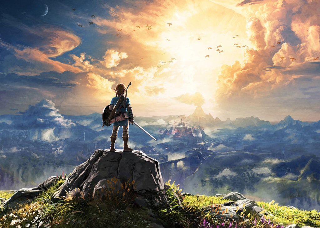
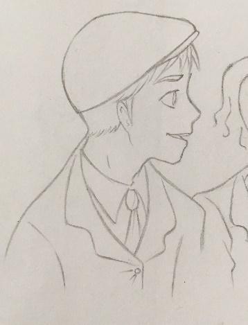
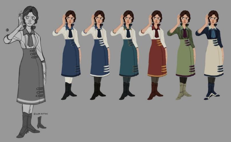
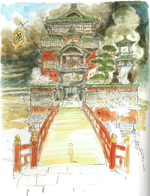
We both chose to analyse the image above, a concept art piece from The Legend of Zelda: Breath of the Wild. Communication within the group was a bit difficult, as the other group member preferred to work individually. We decided to divide the task so that each would analyse four of the eight formal elements. Here is our final interpretation of the concept art piece, but in my own words.
Colour: Many different colours are used, though some more than others. The colours that really dominate the picture are yellow, green and blue. The greens and yellows are very vibrant and bright while the blues are less saturated and more greyish. I feel that the blue colour gives it a very mysterious and almost eerie feeling.
Composition: The artist obviously wants us to focus on the character in the foreground. But he has chosen to place the character off centre so that he is slightly to the left. This is so that the viewer can see what the character is gazing upon, which is the castle in the background. The castle is also off centre, placed slightly to the right of the centre. The artist has deliberately done this so that the viewer focuses on the character, but also what he is looking at. The artist has also used a large depth of field so that you can see more of the land.
Form: The basic shapes that this artwork is built on could be triangles for the castle and mountain in the background and for the character in the foreground. The rectangle could have been the base for the rock that Link is standing on. More complex shapes are used to show the clouds and plants. There is a lot of detail in this piece of art, as the artwork is more realistic (semi-realistic) than cartoony.
Line and pattern: Lines are not really present in this piece of art, as it is more realistic than cartoony. You can see the horizon line and some individual lines on the bridge and in the foreground, but those are more like brush strokes. There are no patterns in this concept art piece as it is made up of individual brush strokes. This goes for the lines as well.
Shape and texture: The individual elements of the image are very detailed. But you can see that they are drawn quite loosely because individual brush strokes can be seen. The artist has used less fine brush strokes for the background, as the detail is focused on the foreground, where finer brushes are used. The background is a bit blobby. If you zoom in, the trees for example are just some dark blobs on a stick. But it is enough to indicate that these blobs on sticks are trees. The blobby texture also goes for other elements in the background, like the mountains and the clouds.
Tone: The artist has used daylight leading to dusk or dawn, which makes the light almost yellow or golden, but it doesn’t give a golden glow.
Back in Norway, I wasn’t taught the formal elements, so I found this introduction task very helpful. It will help me with my research.
Experience Prior to Game Design
I have done some concept art in the past, which can help me for this project. Here are some examples of concept creating that I did prior to attending the Game Design course at Kidderminster.
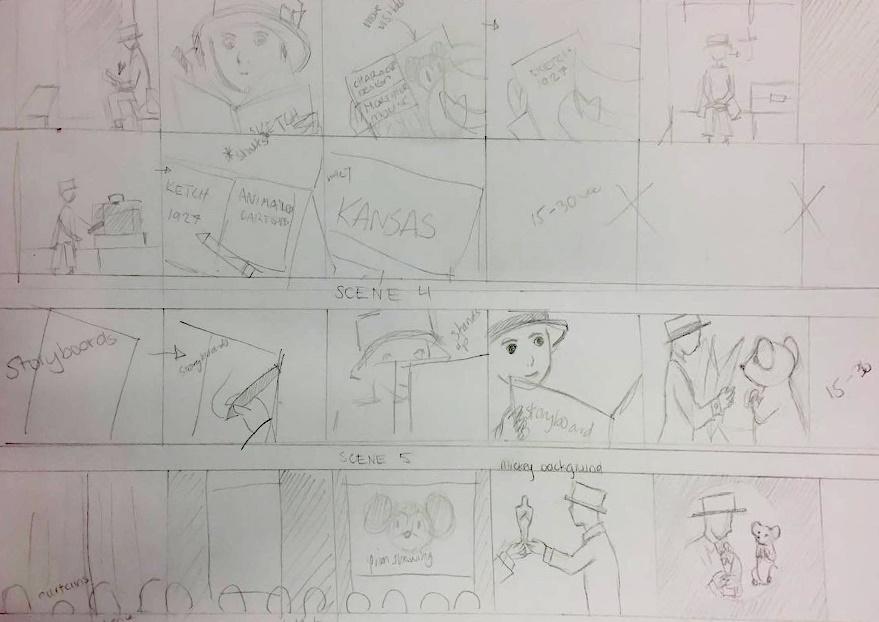
Stop Motion Film
Two years ago, in grade 10 (Norway, age 15-16), I had a one year project in Art. The aim was to make a 2-4-minute stop-motion film about anything. The task was individual, but we had to make everything by ourselves. So every 10th grade student had to do all the jobs that have to be done to create an entire film. That includes being the character designer, set designer, screenwriter, director, set decorator, costume and makeup, cameraman, voice actor and editor, all at once. At the end of the year, we had a film festival where we watched the end products. Then, we had our own little Oscars. I was nominated for best costume design, best plot, and won best picture (yay!).
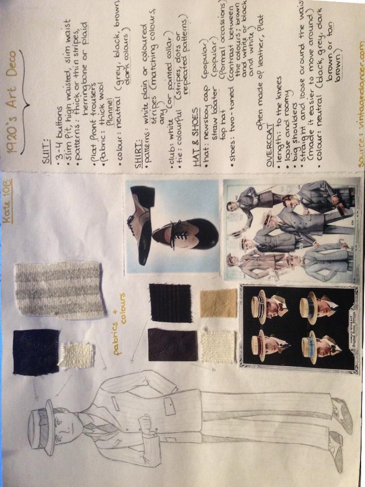
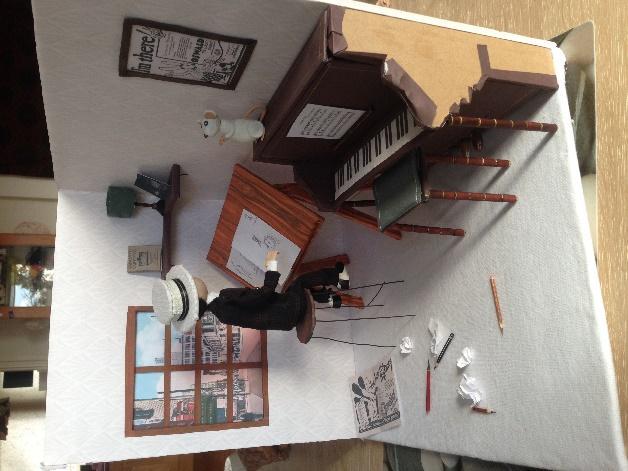
We had to do research on our chosen era as well (we could choose to make a story set in the 1700s, 1800s, 1920s or 1950s). The set, props and characters all had to fit the era we had chosen. My stop-motion film was about how Walt Disney came up with his famous character Mickey Mouse. The film was set in late 1920s Kansas. Here are some pictures of my work:
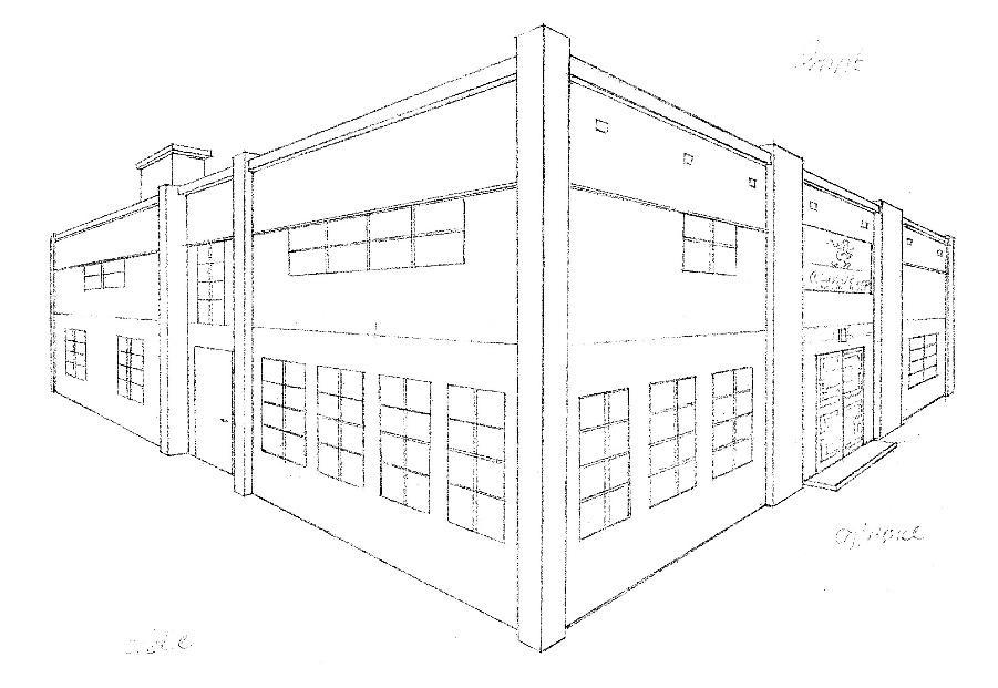
2-point perspective drawing of Disney’s office from the outside.
I realise now that my piece looks more like a prison instead of a
1920s Art Deco office.
I realise now that my piece looks more like a prison instead of a
1920s Art Deco office.

Bird’s eye view of Disney’s office. It has a writing desk, drawing desk, reading chair and piano.
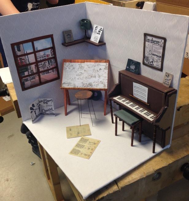
Disney’s office in Kansas, 1928. I consciously gave the drawing desk a colour
that stands out from all the others, because it is the most important element
of the set.
that stands out from all the others, because it is the most important element
of the set.
Character design and choice of texture.
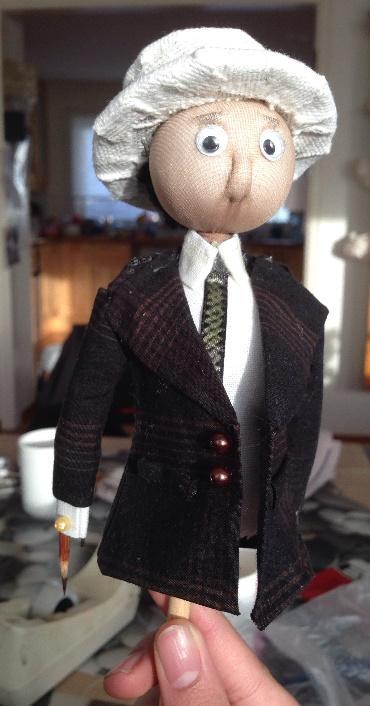

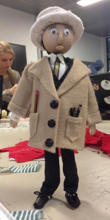
My 1920s Walter Disney doll in the making
Storyboard and shooting
Character Design
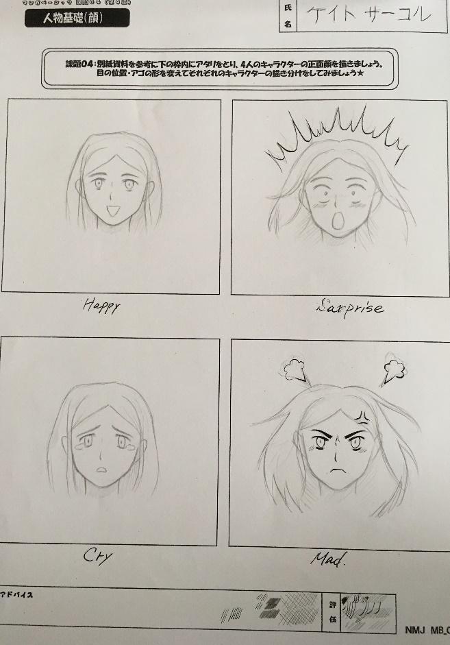
As explained in my Induction Project, I attended a drawing course in Tokyo last summer. My tutors were professional manga artists (don’t remember their works, as I don’t really read manga anymore). They devoted several lessons to character design and human anatomy.
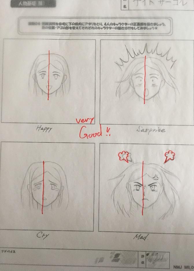
When we finished our work, we had to show it to the tutors, who then gave us live feedback.
The red marks are my tutor’s, the red centre lines were indicating that my work is very symmetric.
The red marks are my tutor’s, the red centre lines were indicating that my work is very symmetric.
Here we had to use the eight heads technique to create our characters.
The red lines are corrections from my tutor. In Japanese style, the legs are
very thin and not muscular (as opposed to my style).
The red lines are corrections from my tutor. In Japanese style, the legs are
very thin and not muscular (as opposed to my style).
Film Poster
In 11th grade (Norway, age 16-17), where I chose Art (Art, Design and Architecture) as my major, we had another concept art project. Every art student had to create three concept film posters for a movie adaptation. The whole class was reading My Brilliant Friend by Elena Ferrante (in Norwegian, of course), and since it was announced that a series would be created, our teachers decided that involving the book in an art project was the perfect idea.

A concept sketch for one of the film posters.

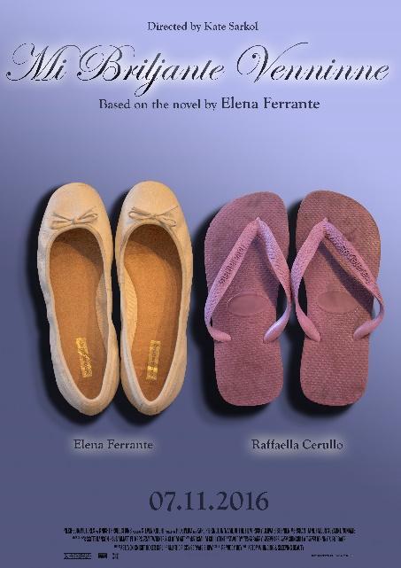
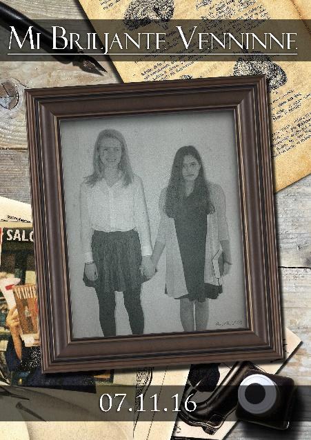
This was my first time using Adobe Photoshop, so the quality isn’t that good. Though the concepts were good in theory.
Free time studies
I also do some character design in my spare time (which I rarely get, nowadays). Last year, I fell in love with the costume design from Assassin’s Creed Unity. Although the controls and plot of the game were horrible, I did like the Baroque style and design, which inspired me to make my own sort of character within the AC universe.
Some of my sketches badly put together in PS (this is from last year, my work to
date is much better anatomy wise. My style has also slightly changed, it has be-
come simpler).
Here are some more sketches or concepts for original characters. I don’t intend to use any of these characters for anything, making them up is just a hobby of mine.date is much better anatomy wise. My style has also slightly changed, it has be-
come simpler).
Some original character design that I did back in 2014. You
can see that my style has changed, and that I have improved
on human anatomy.
can see that my style has changed, and that I have improved
on human anatomy.
In addition to prior experience, I also have many art books at home. Some are from games, like Bioshock Infinite, The Legend of Zelda and The Last of Us. I also have some from films, like Totoro, Spirited Away, The Wind Rises, Dragon Ball Z (TV series that I don’t watch, but a friend in Japan bought it for me). I also have an art book of Norman Rockwell. Unfortunately, I left all my art books at home in Norway, but my mother was kind enough to scan some pages and send them to me so that I can use them for my research.
Research – Week 1
The aim for research task 1 was to find eight different concept artists and describe some of their work.
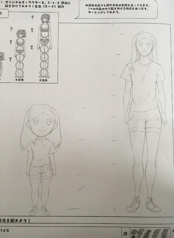
Drawing Tutorial - Faces and 8 Heads Method
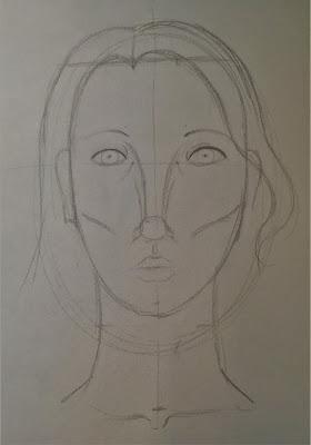
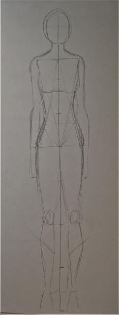
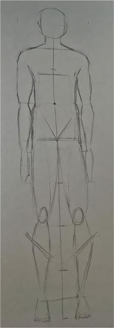
We had a drawing tutorial on Thursday. The aim was to learn how to draw the human face and body using pointillism and the eight heads technique/method. We had to draw both male and female faces and bodies.
Head
We started off with two ellipses, one for the female head and one for the male head. Then we added the centre lines and marked where the edge of the nose should be. Around the marks we drew two curved lines for the edge of the nose and two small ellipses for the eyes. At the edge of the nose, we made a square and two smaller squares for the base of the nose and nostrils.
Under the nose, we drew a line for the mouth and made two marks for the upper lip, which we connected by drawing curved lines. After that, we narrowed the two ellipses for the eyes and kept the guidelines of the ellipses to use them for the eyelids. Above the eyes, we drew two curves for the eyebrows. We also drew curved lines from the two marks we made in the beginning.
To make the faces more three-dimensional, we added cheekbones. Then we had to draw the shape of the head. For the woman, we had to draw straight lines downwards and then curve them and connect them to make the chin. The straight lines were about half an eye’s distance from the eyes. For the man, the distance between the eye and the straight line was the same size as the eyes. We also had to make the chin for the male face less curvy.
We added a straight line for the fringe and then drew the hair on this line. Lastly, we added the neck, which for the woman was very thin, and for the man it was broader with a more defined Adam’s apple.
Our homework for this week was to make a self-portrait using this technique.


Body
Again, we had to draw both male and female. We started with the head and drew a line and made seven marks on it, all the exact same size as the head. On the fourth mark we drew a straight line to mark the centre of the body. On the centre line, we had to draw a V-shape for the groin.
We started drawing the lower part of the body by drawing to ovals for the knees on the centre of the lower part. We then drew the legs and feet and the neck and shoulders. For the man, the shoulders were ‘one head’ broad, while for the woman, we drew the shoulders just slightly broader than the outline of the head.
We connected the lower and upper part of the body by drawing the waistline and hips. The woman’s hips were, of course, broader than the man’s. We then added the pec muscles and breasts and drew the arms below the waist
.
Evaluation
The studies that I made during the tutorial look a bit odd. The heads, especially, like the man and woman have been through plastic surgery a million times. I think they turned out this way because I am not used to the methods that we had to use. I usually only use the centre lines and then go with the flow from there. Another reason as to why the studies turned out this way is because of the style, which is realistic. My style is more cartoony, I tend to exaggerate some of the features like the size of the head, eyes, ears and mouth. I usually also keep detail to a minimum.
The paper that I used during the tutorials did not cooperate with the type of pencil that I was using, either. The lines in my sketchbook are much smoother, as opposed to the paper used for the tutorials. This may also have affected the outcome.
I think that the body studies turned out better because I have practised the eight-heads method before. You can see some examples in my ‘Experience’ section on the blog. Again, I blame the quality of the paper for the bad results. But I know that I can do much better than that.
Eight Concept Artists
1. Andrew Baker
Andrew Baker is a creature and concept artist who currently works for Weta Workshops, a company from New Zealand that produces sets, props and creates characters for films, TV-shows and games. I especially like Andrew Baker’s work for The Hobbit: The Desolation of Smaug, which came out 2 December 2013. Andrew Baker has also done commission work for Ghost in the Shell and Gears of War.
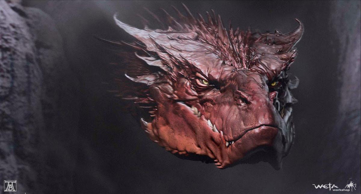

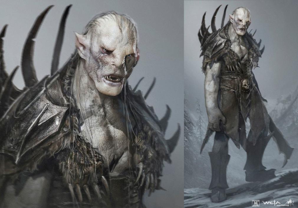
Two strong elements in his designs are colour and texture. As he creates quite hostile characters, his choice of colours really fit well with the designs. Smaug, for example, a huge dragon that breathes fire, has red skin. Red can symbolise both danger and fire, which fits the character. Andrew Baker has used very desaturated colours for Azog, who is also a dangerous creature, but does not breathe fire and is more human-like. His skin is very pale, which makes him seem dead. As for texture, Andrew Baker has successfully created the texture of Azog’s rough skin by using very precise brush strokes. The same thing goes for the texture of Smaug’s skin, which seems thicker and leathery).
Andrew Baker’s designs relate to the project because most of his work is commission work and concept art. He is very good at creating texture, something that is very important in concept work. He successfully suggests metallic, leathery, hairy and skin textures by using specific colours, shadows and highlights. His choice of colour also sets specific moods, which is very important for creating concept art as well.
2. Claire Hummel
Claire Hummel is a visual developer and freelance illustrator. She has created commission concept work for Westworld VR, Ryse: Sword of Damocles and Bioshock Infinite. I especially like her work for Bioshock Infinite (26 March 2013), where she helped design Elizabeth Comstock and the Lutece Twins.


Two strong elements in her design are colour and line. Claire Hummel’s lines can be very loose and abstract, but controlled and precise as well. As for colour, she has chosen bright and lighter tints for the Lutece twins. For Elizabeth, she has chosen white and blue tones, which make her seem very innocent.
Claire Hummel’s designs relate to the project because her work is mostly concept art. Her work is very anatomically correct, even though her style is slightly cartoony. Like Andrew Baker, she suggests textures by using shadows and highlights in different ways in her final pieces. She shows that the most important thing in the sketches is not texture (yet), but colour and design. She shows the many approaches to colour design that she did.
3. Glen Keane
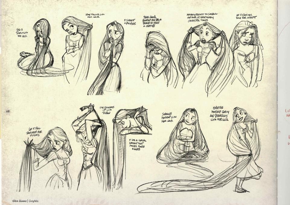
Glen Keane is an American writer and illustrator who currently works as a character designer for Disney. He has helped to design many characters that we remember from our childhood, like Tarzan, the Beast, Aladdin, Rapunzel, Flynn Rider and many more. I especially like his work from Tangled, which was released on November 14 2010, and Paperman which was released along with Wreck it Ralph on 2 November 2012. Here are some of his concept pieces.
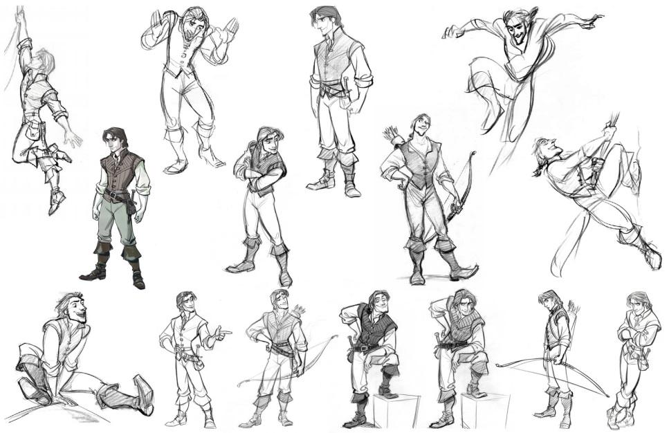
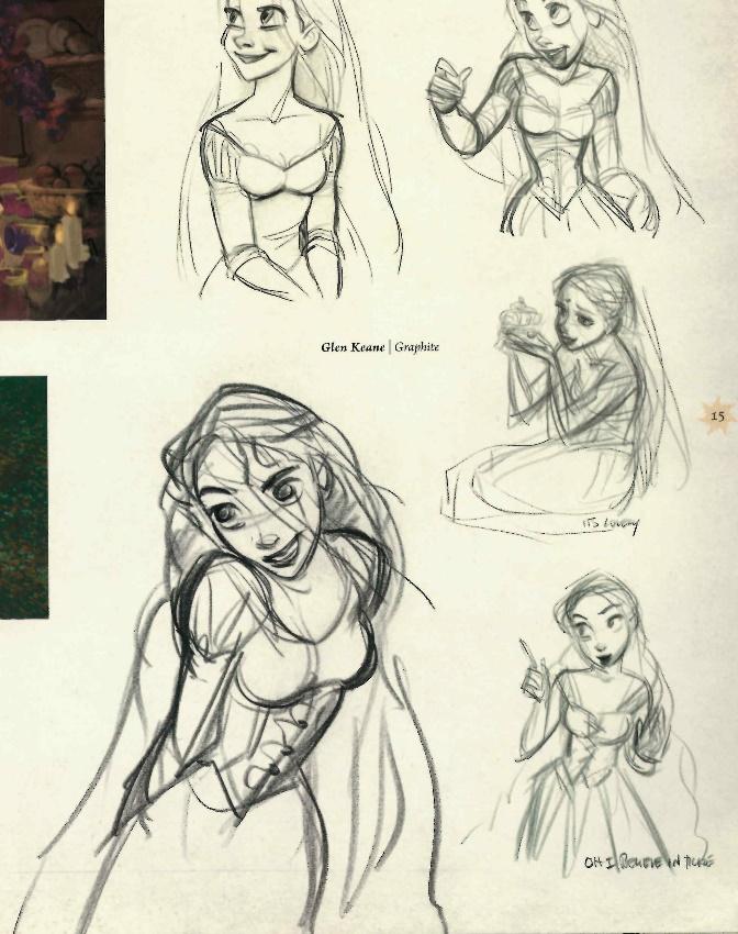
Two strong elements in Glen’s design are line and shape. He uses simple shapes for the base and then creates the designs based on that. With the use of flowy and smooth lines, he exaggerates the shapes to create his characters. His use of line makes the characters seem livelier.
Glen Keane’s work is a perfect example of concept art. His sketches are very rough in the beginning (e.g. Rapunzel sketches) but become more specific, clear and refined in his final concepts (e.g. Flynn Rider). He is very confident in his use of line.
4. Hayao Miyazaki
Hayao Miyazaki is a Japanese film director who owns the animation company Studio Ghibli, which is also known as the Disney of Japan. Miyazaki has directed and designed Spirited Away, Totoro, Howl's Moving Castle and many other animated films from Ghibli. Here are some examples of his concept sketches from Spirited Away, which was first released on July 20th, 2001 in Japan.

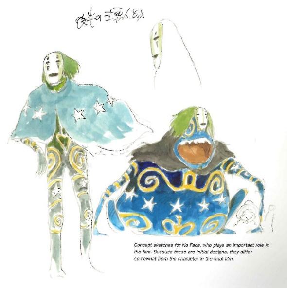
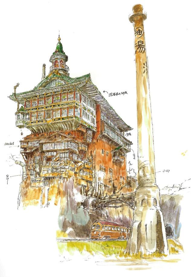
Miyazaki’s strongest elements are the use of colour and line. He uses many different and vibrant colours for his concept work which make the pieces livelier (he also does this because his audience is mainly children). His lines are very loose and a bit all over the place, but still intact and precise enough for the viewer to make out the characters that he creates.
Miyazaki’s work relates to the project because his art is mostly concept art (for his own films). He shows that concept art can be kept very simple, with detail to a minimum, but also extremely detailed and well thought out. The same goes for the colouring, it doesn’t have to look perfect, all within the outline. Miyazaki shows that concept art doesn’t necessarily have to look like a finished piece. After all, they’re just ideas, not final products.
5. John Howe
John Howe, like Andrew Baker, works for Weta Workshops and has created concept art for The Lord of the Rings and The Hobbit. He has done both character design for the creature Smaug, but has also done landscape or environmental design for the Shire, Barad Dur and other places in Tolkien’s Middle Earth. Here are some examples of his work.
John Howe, like Andrew Baker, works for Weta Workshops and has created concept art for The Lord of the Rings and The Hobbit. He has done both character design for the creature Smaug, but has also done landscape or environmental design for the Shire, Barad Dur and other places in Tolkien’s Middle Earth. Here are some examples of his work.


Two strong elements in his designs are line and texture. His lines are very smooth, but strict and controlled at the same time. Even though they are very flowy, they are very precise. He uses shadow and highlight to create texture. In the first piece, for example, he uses highlights to create a reflective and glossy effect.
Hi work is relevant to the project because of his inventiveness. For example, the dragon Smaug seems like a very ordinary and generic conception of what a dragon would look like. But somehow, his design makes the dragon stand out from the ordinary. It could be the extreme level of detail he shows, even to things that will go unnoticed in the films.
6. Norman Rockwell
Norman Rockwell was an American full time freelance painter and illustrator for magazines such as The Saturday Evening Post. He created many covers for the magazine during the 1920s-1960s that depicted the American life, but with a comical twist. You can see some examples from the moodboard. The Saturday Evening Post is the developer of the end products of the examples given below.
Here is when the end products on the moodboard were released:
"Tattoo Artist" cover from March 4th, 1944
"100th Year of Baseball" cover July 8th, 1939
"Triple Portrait" cover February 13th, 1960
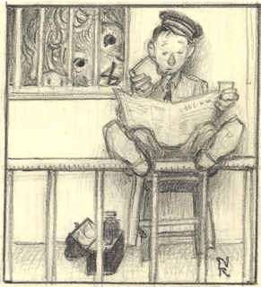
"Lion and Zookeeper" cover January 9th, 1954
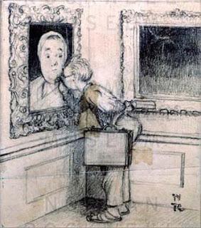
"The Art Critic" cover April 16th, 1955
Rockwell has also created many covers for the magazine Life. I don't read any of the magazines that Rockwell created covers for, I just really admire his work.
Rockwell has also created many covers for the magazine Life. I don't read any of the magazines that Rockwell created covers for, I just really admire his work.
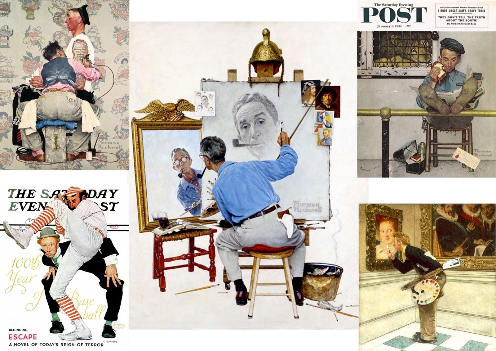
I think the two strongest elements in Rockwell's design are the use of colour and composition. In his pieces, he uses both vibrant and less saturated colours to create balance. It also makes the pieces more realistic. Rockwell uses the colours black and white in every piece, but red and blue are also some of his favourites. The choice of colours makes the pieces very lively, as if it is telling a story. As for composition, Rockwell knows the exact angles and poses that make for a comical art piece. If he had painted the pictures using different angles, there wouldn’t be that humorous effect. If we take “Tattoo Artist” as an example, Rockwell has created it so that you can see what the person in the front is doing, and at the same time you see the anxious look on the other person’s face.
Rockwell’s work relates to the project because the way he worked is a good example of how you can work towards a final product. First, he would take photos for reference, then making rough sketches and trying out different colour schemes and lighting.
7. Rhettaro Bloom
Rhettaro Bloom is a 21-year-old unpaid cartoon artist. He is currently working on a webtoon called Gentleman Town, of which he constantly posts concept designs, commission work and some pages of the soon to be released web toon. Most of his work he posts on Instagram, Tumblr and Deviantart. He has recently released three concept sketchbooks online, which you can access for a few pounds per sketchbook.

Two strong elements in his design are colour and line. Some of his work is entirely in black and white to give that film-noir feeling, which I like. Most of his character design is in colour, as you can see. He colours his pictures the same way that I do, he uses similar but darker colours for the outline. For the blue shirt, for example, he uses a darker shade of blue for the outline, to give that extra indication of what colour the element is supposed to be. His lines are very precise and vary in thickness.
Rhettaro Bloom’s work is relevant for the project because he shows that concept design can be kept very simple but at the same time show finesse. Much like Norman Rockwell, he gives his pieces a very humorous look and his web toon extracts a comical outcome.
8. Robb Waters
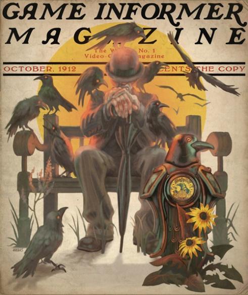
Robb Waters is an American freelance illustrator who works for Irrational, an American game developer. Robb Waters has created concept art for Freedom Force, Bioshock Infinite and the DLC of Bioshock, called Burial at Sea. I especially like his concepts for Bioshock Infinite, where he did a lot of concept artwork for Songbird, the motorized patriot, the boys of silence, the handymen and other NPCs. He also created cover art for Game Informer Magazine and for the game itself.

Two strong elements in his design are colour and texture. He has used the primary colours a lot for the design of Bioshock Infinite, which are complimentary colours. But the tones are very dark and desaturated, which gives a foreboding feeling and eerie tone. As for texture, he has used many individual brush strokes to create the rusty metal texture for the boys of silence. The texture for songbird is much rougher, to indicate that he is made up of leather.
Robb Waters’ designs are relevant to the project because his concept designs are not only original and unique, but at the same time very generic in terms of fashion at the time. Though it fits in with 1910s fashion, he distinguishes the NPCs and important characters by slightly altering the colour scheme, tone and saturation of their designs, which make the important characters look more mysterious.
Other Inspiration
Here are some examples that I find inspiring, but couldn't include as my eight artists, as I couldn't find the artists or exact source.
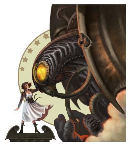
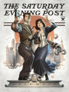
Below we have two fan art pieces for Bioshock Infinite, both are supposed to be imaginative covers for The Saturday Evening Post. I like this idea, as Bioshock Infinite is set in the 1910s, around the time when The Saturday Evening Post was being published. It’s like combining Norman Rockwell, my favourite artist, with my favourite video game. Both pieces look like they were included in the game, which is really cool. The picture on the left is created by Alex Garner, the other one I did not find the original artist or source from.
I also really like The Legend of Zelda games, especially Skyward Sword. The Zelda games are very dear to my heart, as Wind Waker was the first real videogame that I ever played (apart from Nintendogs, Animal Crossing and Super Mario Bros on my old DS), and it was the game that got me into gaming. I have two concept artbooks from the Zelda games at home. Even though I did find the names of the artists, I couldn’t find the artist for the specific concept pieces that I wanted to include in my research.


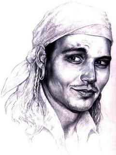
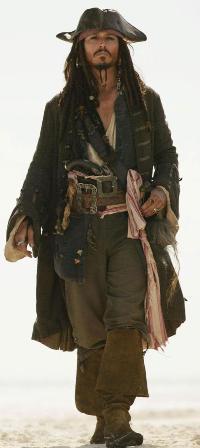
One character that I find particularly inspiring, but wasn’t good enough to be awarded as one of my eight inspirational examples, is Captain Jack Sparrow from Pirates of the Caribbean: The Curse of the Black Pearl (I have only seen the first film). Not only does he look eccentric-even for a pirate in the 1700s- it’s also his off-kilter behaviour that makes him so original and unique. Below is a picture of an early concept for Captain Jack Sparrow, before Johnny Depp came in the picture and changed the whole look.
As stated in my ‘Experience Prior to Game Design’ section, I really love the design of Assassin’s Creed Unity (even though the gameplay was horrible). Again, I find the Baroque style very interesting, but it’s also the setting that really grasped me when I played it, which is during the French Revolution in Paris. I couldn’t find much concept art for the game, let alone the artists, so it couldn’t be included as one of my eight artists in my first task.

3DS Max Tutorial - Tyre
We had the 3D Tyre tutorial on Friday. The aim was to improve our (lvl 3 students) skills in 3DS Max.
I was a bit behind everyone else in the beginning as someone told me that the tutorial was optional, and I wanted to use the time to finish my research. So I had to catch up with the rest very quickly and missed the full intro. I quickly had to create a cylinder, convert to editable poly and select both faces of the tyre with the ‘polygon’ tool.
I quickly had to make the rim of the tyre by using ‘inset’ and ‘extrude’.
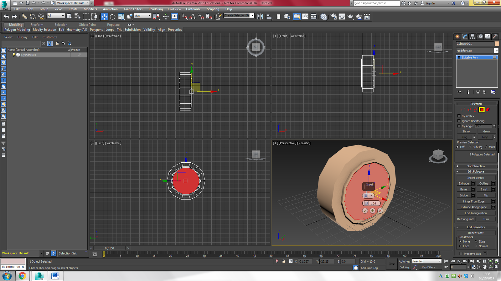
Here, I quickly created the rim of the tyre by using ‘inset’ and ‘extrude’ in different sizes/quantities.

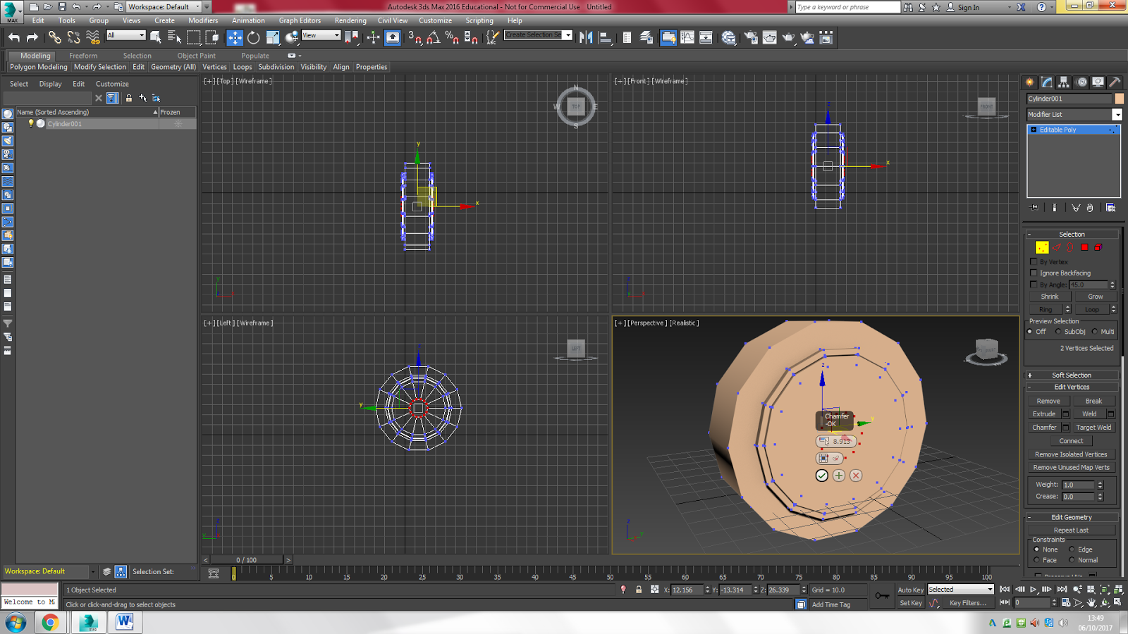
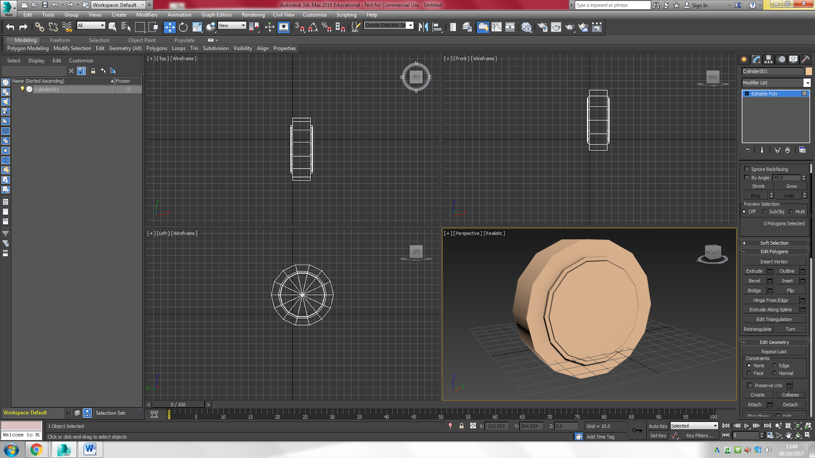
I then changed from the polygon selection to the vertice selection to create the small dots around the edges. I used the ‘chamfer’ tool to create the tiny circle in the middle (on both sides of the tyre).

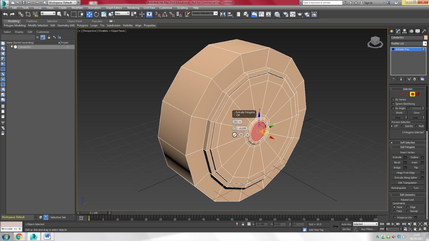

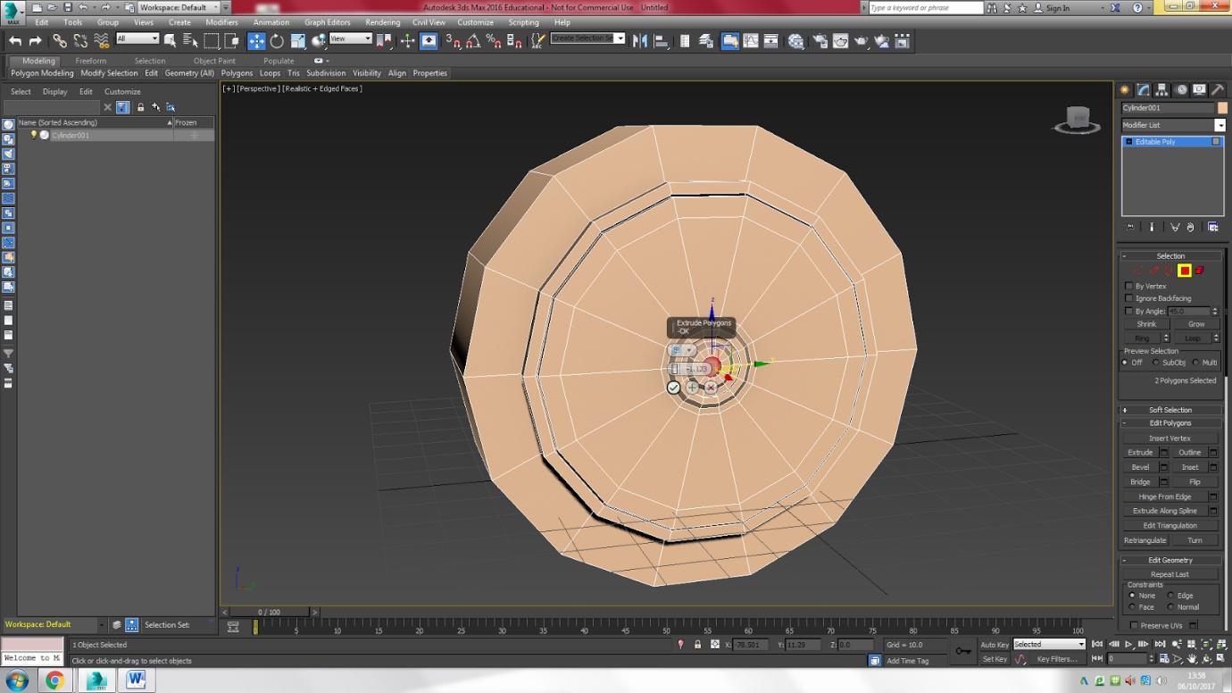
Here I created the geometric contours by using ‘inset’, ‘bevel’ and ‘extrude’.
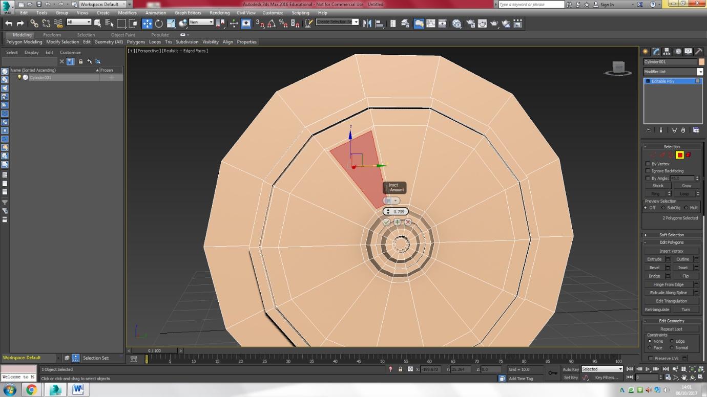
Then I used ‘inset’ to create some slightly smaller polygons.
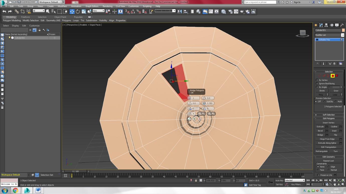

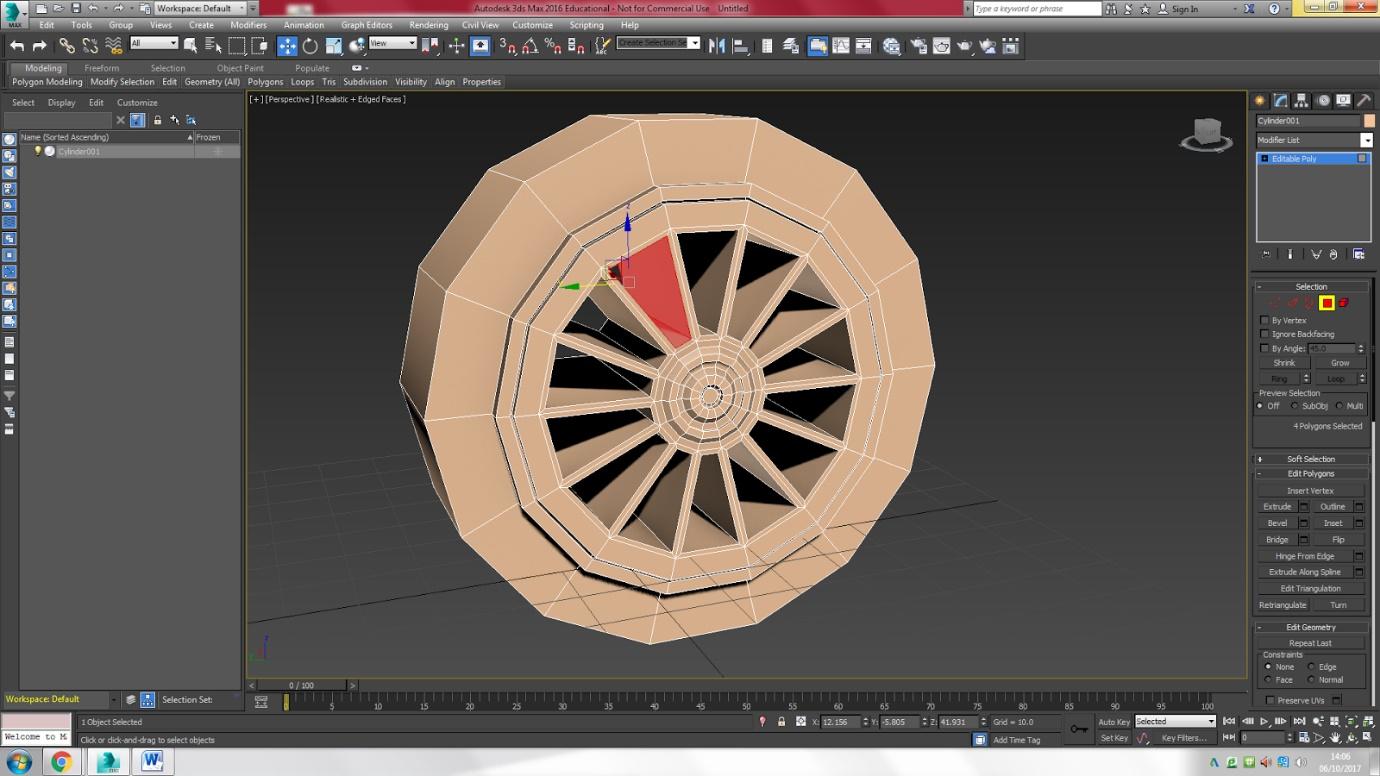
I then had to select each of the polygons on both sides of the tyre, one by one, and use the ‘bridge’ tool to create the holes.

Next, I had to add Mesh Smooth two or three times to make the edges rounder and smoother.

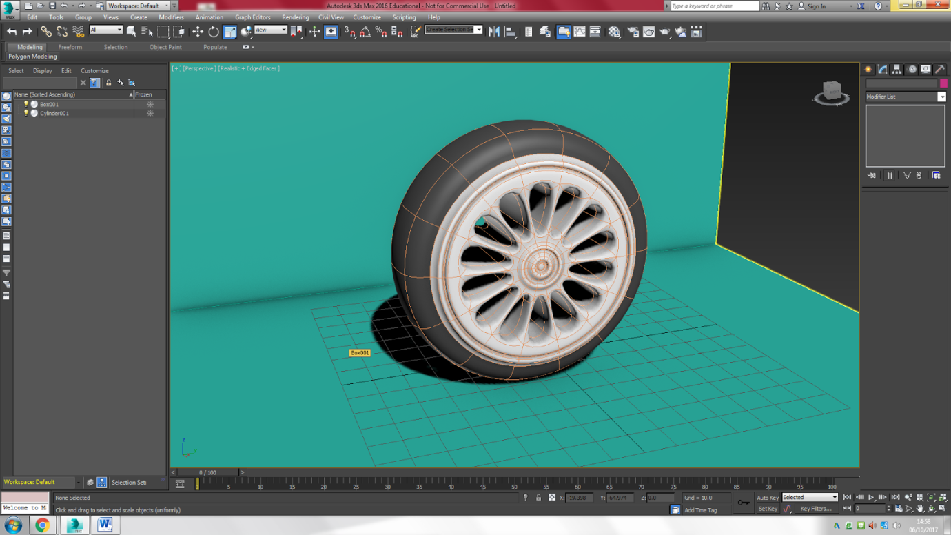
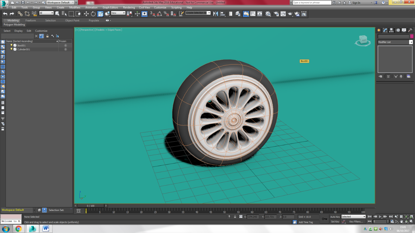
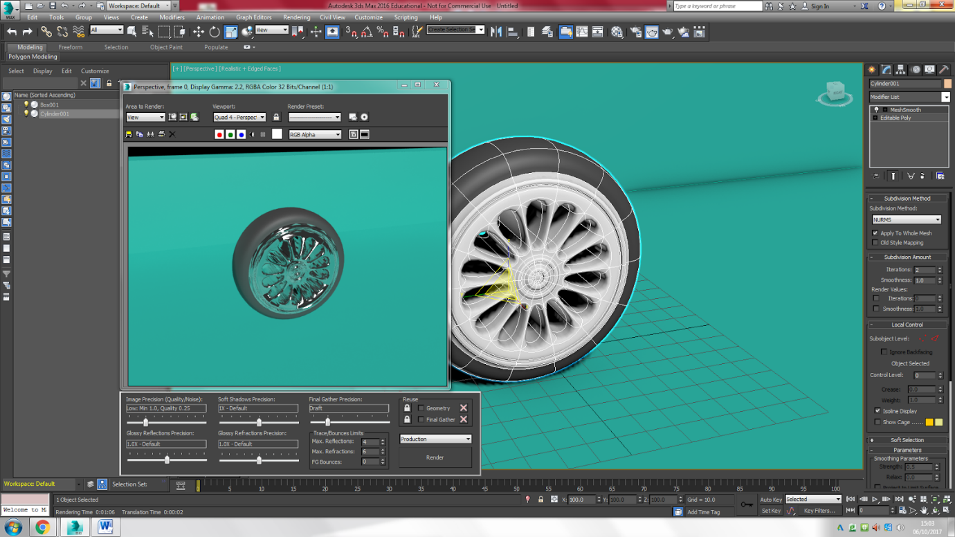

I very quickly gave the tyre some texture. I gave the edge of the tyre the ‘rubber’ texture and the rim a metallic texture (don’t remember which one, it could have been ‘copper’). Because I added them so quickly, I did not look at the glossiness or how reflective the textures should be, so the copper became extremely reflective. The rim looks like it is made of glass, but it is not.
When I rendered the picture, my tutor recommended me to make the rubber of the tyre glossier as well, so that’s what I did.
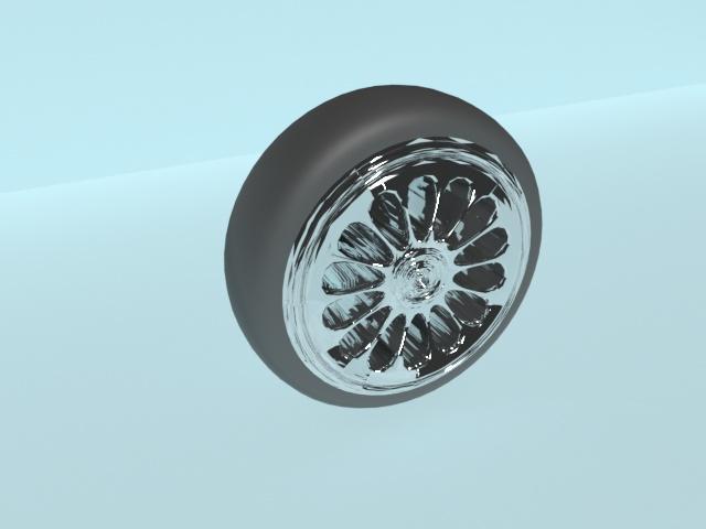
Here is the first rendered picture before I added the gloss to the rubber texture.
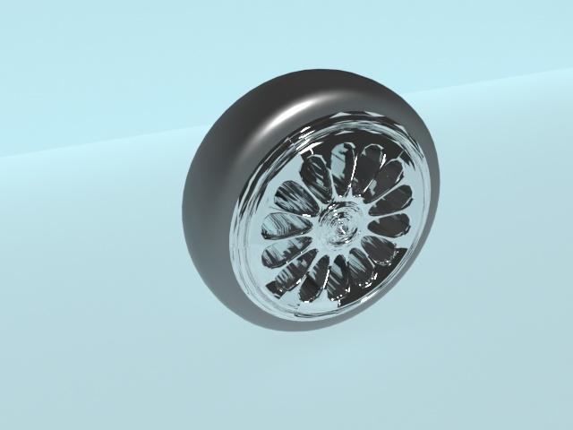
This is the final render of my 3D tyre model. I think it looks pretty cool, even though I gave the rim the wrong amount of reflectiveness. It makes the tyre look very expensive, though, with all the gloss and shine.
Research - week 2
For the second research task, we have to choose four of our favourite concept artist and analyse their work in terms of the formal elements. It was very difficult to choose four favourites, as I like all of the artists’ concept work equally. In the end, I decided to further analyse the works that I find most relevant for this project.
1. Glen Keane
For this analysis, I decided to focus on his work as a whole. Here is a moodboard of some of his work.
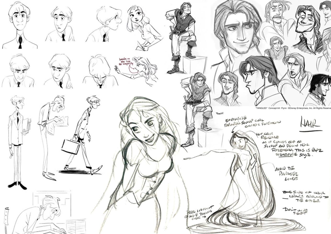
For this analysis, I decided to focus on his work as a whole. Here is a moodboard of some of his work.
Colour: As the artist only makes concept sketches without colour, it is difficult to write anything about the subject.
Texture: Again, there isn’t that much to write about texture. But even though there are no indications of texture in the artist’s work, you can still imagine the textures that would potentially have been used.
Texture: Again, there isn’t that much to write about texture. But even though there are no indications of texture in the artist’s work, you can still imagine the textures that would potentially have been used.
Shape: The artist’s products are anatomical, but in a cartoony and exaggerated way. In some of the sketches, you can clearly see that the shape of the head is based on a circle. For the rest of the bodies, though, it is hard to tell whether the artist used simple shapes put together or if they were more complex, or if the artist just went with the flow.
Line: Fortunately, there is something to so say about the use of lines. The artist’s lines are very smooth and very loose. Some lines are darker, which could indicate the importance of elements. The looseness of the lines indicates both movement and volume. Again, this style is very cartoony, and most of the lines (especially around the body of Rapunzel) are very curvy and exaggerated to create volume. The curvy lines may represent feminine, as opposed to the straighter and more precise lines that the artist has used to create the male characters.
Line: Fortunately, there is something to so say about the use of lines. The artist’s lines are very smooth and very loose. Some lines are darker, which could indicate the importance of elements. The looseness of the lines indicates both movement and volume. Again, this style is very cartoony, and most of the lines (especially around the body of Rapunzel) are very curvy and exaggerated to create volume. The curvy lines may represent feminine, as opposed to the straighter and more precise lines that the artist has used to create the male characters.
Pattern: There are no patterns used in these works. An important part of Rapunzel’s design is her hair, which is supposed to go in every direction.
Form: As most of Glen Keane’s work consists of concept sketches, there is not much to say about form. Though the artist’s work is two-dimensional, you can imagine which elements are supposed to come forward.
Tone: Again, not much to say, as most of his work are only simple pencil sketches.
Composition: The same goes for composition.
2. Hayao Miyazaki

I decided to analyse the two artworks below. Both are concept artworks for Spirited Away’s bathhouse.
Colour: The artist has used the complementary colours red and green. Purple is also used for the curtains, so that makes it a set of secondary colours. Blue and yellow, complimentary colours, are used for the signs. Basically, there is a wide variety of colours which make the building seem livelier.But there is something about the choice of colours which gives the pictures a mysterious mood. A reason as to why the bathhouse is red is because traditional Japanese temples and other buildings of great importance were painted in this colour.
Texture: As these pieces are just concepts and not finished works, the artist hasn’t really created any textures. But you can still imagine what textures the different parts of the building would have. The roof, for example, would have a smoother and shinier surface than the walls of the building would have.
Shape: The building consists of two basic shapes put together. The base of the roof could have been a triangle, while the rest of the building is based on a square or rectangle. The tree in the foreground could have been made up of several ovals protruding from a triangle. The bathhouse concept in the first picture is not a straight building, it is slightly askew. It leans slightly to the right at the top. This could be because it is just a sketch and it wasn’t made with a lot of precision.
Line: As these concept pieces are just sketches, there clearly are lines present. The artist has very smooth but strict and exact lines in the second picture. In the first picture, his lines are smooth and loose. In the second picture, the artist has used rough lines to indicate shadow.
Pattern: There is a pattern on the roof that consists of tubes (all equal sizes) that are put next to each other. The window frames all follow a rectangular pattern that looks like the rule of thirds that has been copied and pasted.
Form: As the pieces are only sketches and little shadow is used, the pictures look very flat and two-dimensional. You know which elements are supposed to come forward, but there is no real indication regarding that.
Tone: The artist makes it very clear that it is daylight. Though the clouds are covered in darkness and shadow, there is still a blue sky above. The light source is coming from somewhere above, slightly to the left. This could indicate that it is in the morning or afternoon/evening, when the sun is lower.
Composition: As the bathhouse is the most important element of the concept pieces, it is placed in the middle, though between the background and foreground. The artist has used the rule of thirds to create balance within the second picture. In terms of perspective, we can indicate where the vanishing point would be. In the first picture, the artist conveys the size of the bathhouse by placing a tiny person in front of it. As for scale in the second picture, the artist clearly wanted to show how big the bathhouse is by putting it in perspective.
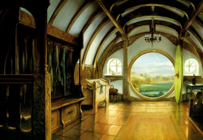
3. John Howe

I decided to analyse John Howe’s illustration of a hobbit hole. I did not get every single example that I wanted to show in the moodboard.

Colour: The artist has mostly used yellows, oranges and reds. In some places, greens and blues are used. We could say that the primary colours are used for this image, though they vary in tone and saturation. The use of primary colours gives the hobbit hole a homely feeling, though I can’t describe why. It could be the warm colours.
Texture: The artist has added glossiness to the tiles on the floor, which gives a ceramic look. The floor is also very reflective, which adds to the texture. You can clearly see that the furniture and the door are made of wood, the texture is rougher and less smooth than the floor. Though you can see that the objects hanging in the open closet are clothes, the textures seem smoother and more solid than textile.
Shape: The hobbit whole is made up of very simple shapes. The door and windows are clearly made up of circles, while the ceiling could have been made up of half a circle. The closet and other furniture all started with rectangles.
Line: This concept art piece is very realistic, so lines are not really evident. There are some individual strokes that could be perceived as lines, like the ones that separate the tiles from each other. Most of these ‘lines’ are used to indicate shadow and highlight and are not outlines of the individual elements within the picture.
Pattern: The artist has used may patterns in this piece. Firstly, there are the simple copy-paste squares that make up the tiles on the floor. Then there are the complex patterns on the furniture. The artist has also indicated some sort of pattern on the carpet, but it is not very defined.
Form: The shadows and highlights indicate which elements come forward and which don’t. This makes the piece more three-dimensional and realistic.
Tone: The light that comes in through the door and windows, which is obviously daylight, lights up the whole room so that you can clearly see each piece of furniture. The light seems almost a bit yellow, like it’s morning or evening, meaning dawn or dusk. This gives a very cosy feeling.
Composition: The artist has consciously used the rule of thirds. The foreground makes up the bottom part, which consists of the furniture and everything important in the room. The middle part consists of the entrance, which gives us a view upon the background, the outside world. The bottom and middle part are the most important elements, hence the top part only consists of the ceiling. The artist has also clearly used one vanishing point to give the piece perspective. But even though the horizontal lines in a one point perspective drawing are supposed to be straight, they are slightly curved upward in this piece, which makes it look like you’re looking through a panorama lens.
4. Robb Waters
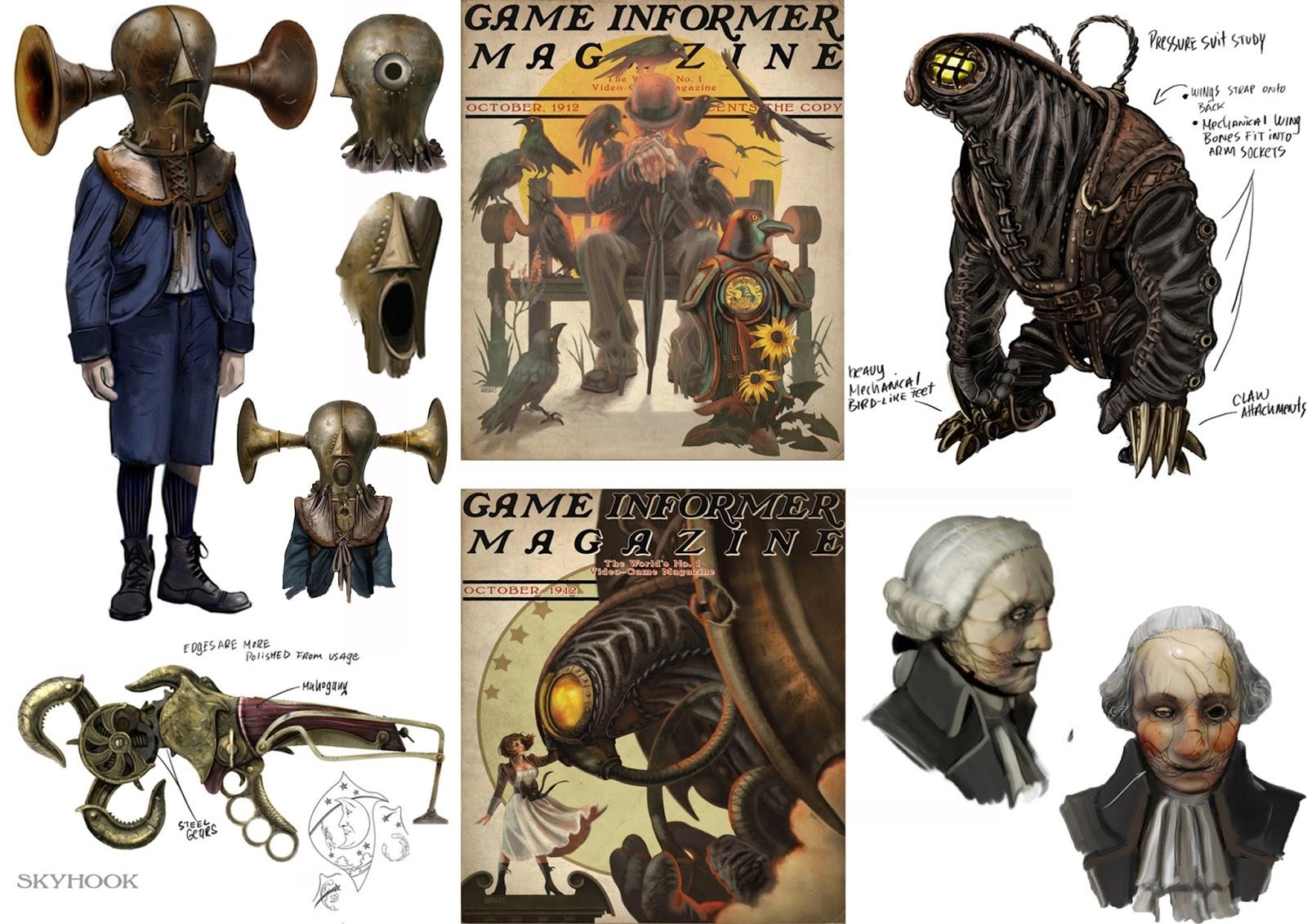
I want to focus on the artwork used for the cover of Game Informer Magazine. The concept art piece is called 'Songbird & Elizabeth'.

Colour: The artist has chosen an analogous colour palette for this piece, mostly red and yellow tones are used. The colours are differently saturated and some are darkened, which gives the less vibrant and darker colours. There is also a big contrast between light and dark. While Elizabeth is mostly in white, Songbird is completely dark. The choice of colours does make sense, as the story of Bioshock Infinite is quite sad and very dark. The desaturation of the colours gives a very gloomy mood.
Texture: It looks like the artist has given Songbird’s wings a clean and smooth texture with some shine, which makes it seem like the wings are made of metal, even though they are not. The artist has created a rougher texture and for the clothes to indicate that it is textile. Especially for Songbird, whose costume looks very leathery.
Shape: The end product could have been based on basic shapes such a s a triangle for Elizabeth. For songbird, more complex shapes could have been used, or simple shapes could have been combined to make up the base.
Line: There are no real lines present, as it is more of a realistic piece and because it is made up of individual brush strokes. You do see some lines on the tower that Elizabeth is standing on and on the wings and Songbird’s ‘eyes’, but these are just to indicate shadow and highlight.
Pattern: There are no patterns in this picture, except for maybe the stars in the background.
Form: The use of shadow and highlights gives an impression of 3D, but at the same time, the piece still looks very flat. But you can see that the elements that are supposed to be in the background are less detailed, like one of Songbird’s wings, the tube from his beak that curls away and his gloves.
Tone: Though the colours aren’t that vibrant, the artist gives an impression of daylight. The light source comes from above. The reason for the less vibrant colours could have been the fact that the weather is cloudy, but you can’t really know, as the background is only made up of a circle and stars.
Composition: The artist wants us to focus on the characters, that’s why the background is kept simple. Nothing else like the sky is shown, as it is not important. As for perspective, vanishing points are not evident. And for scale, it is very clear that Songbird is an enormous creature, compared to Elizabeth.
In relation to each other
Another reason why I chose these four artists is because their work can be connected in one way or another. For example, Rapunzel and Elizabeth Comstock are both locked up in a tower and ‘rescued’ by someone. They are both looked after by a creature, Rapunzel by Pascal and Elizabeth by Songbird.
Another reason why I chose these four artists is because their work can be connected in one way or another. For example, Rapunzel and Elizabeth Comstock are both locked up in a tower and ‘rescued’ by someone. They are both looked after by a creature, Rapunzel by Pascal and Elizabeth by Songbird.
Paperman and Bioshock Infinite both play in the early and mid-1900s, which makes the costume designs for these medias quite similar. Both medias also have a similar setting as Paperman is based in New York City and Bioshock Infinite in Columbia, a big city in the clouds (above the US). Tangled is also set in the West, though in medieval times. The Hobbit is also set in medieval times, but in an imaginative world, Tolkien’s Middle Earth (heavily based on old Norse mythology). Hayao Miyazaki’s Spirited Away is also set in an imaginative world, though in a more East-Asian world.
I also chose John Howe and Hayao Miyazaki because they both create concepts for backgrounds, meaning environmental design. But their style is very different. For instance, Hayao Miyazaki likes to keep his sketches simple and sometimes detailed, aiming for a cartoony look, while John Howe focusses on extreme detail and realism. I chose Glen Keane and Robb Waters because they focus more on character design, both very different in style as well. Glen Keane has a very cartoony style, where detail is kept to a minimum, while Robb Waters goes for a more realistic look and focusses much more on detail.
You can put these four artists on a scale that goes from cartoony to realistic in terms of style. From cartoony to realistic you have: Hayao Miyazaki and Glen Keane → Robb Waters → John Howe. Robb Waters has a very detailed and realistic style, but you can still see a subtle hint of cartoonism. John Howe(ever), focusses on extreme detail in every element of his designs.
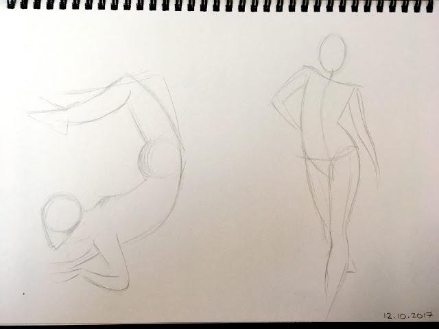
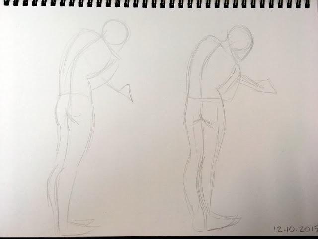
Drawing Lessons - Rhythm Drawing
We had a drawing tutorial on Thursday, focusing on rhythm-drawing. We watched a video on youtube (link in source list), where we had to copy the poses from nude models by drawing lines and contours. We had to start with a circle for the head and then work our way down by drawing a long line for the spine and then another one for the bottom. Then finish by drawing curved lines, the ‘rhythm’ of the body. Here are my studies from the skills tutorial:
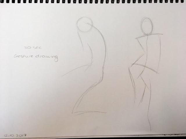
The picture above was supposed to be a 30 second drawing session. We spent more time on the poses of the pictures below.
I did something similar to this back in 2012, when I attended a drawing course in Oslo. Even though I was only 12, the teachers placed me in an adult course, because they found me much more focussed on the tasks than the rest of the kids. In the adult class, we had a life drawing session where we had to draw a female model (luckily no men). Unfortunately, I threw them away as I didn’t like the results, so these studies cannot be included.
I also study anatomy in my spare time. When I copy poses, I use a technique similar to rhythm drawing. I draw the line of the spine, but I usually begin with the legs instead of the head.
Research – Week 3
For the third research task, we are supposed to select two of our four favourite artists. From each, we have to choose one element out of their concept artwork.
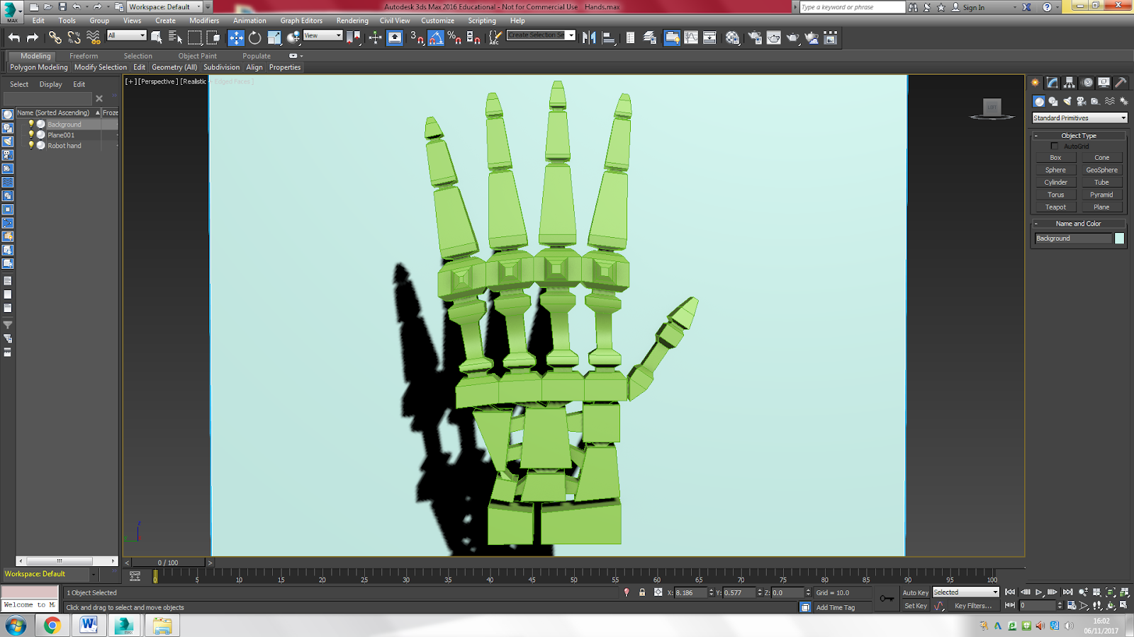
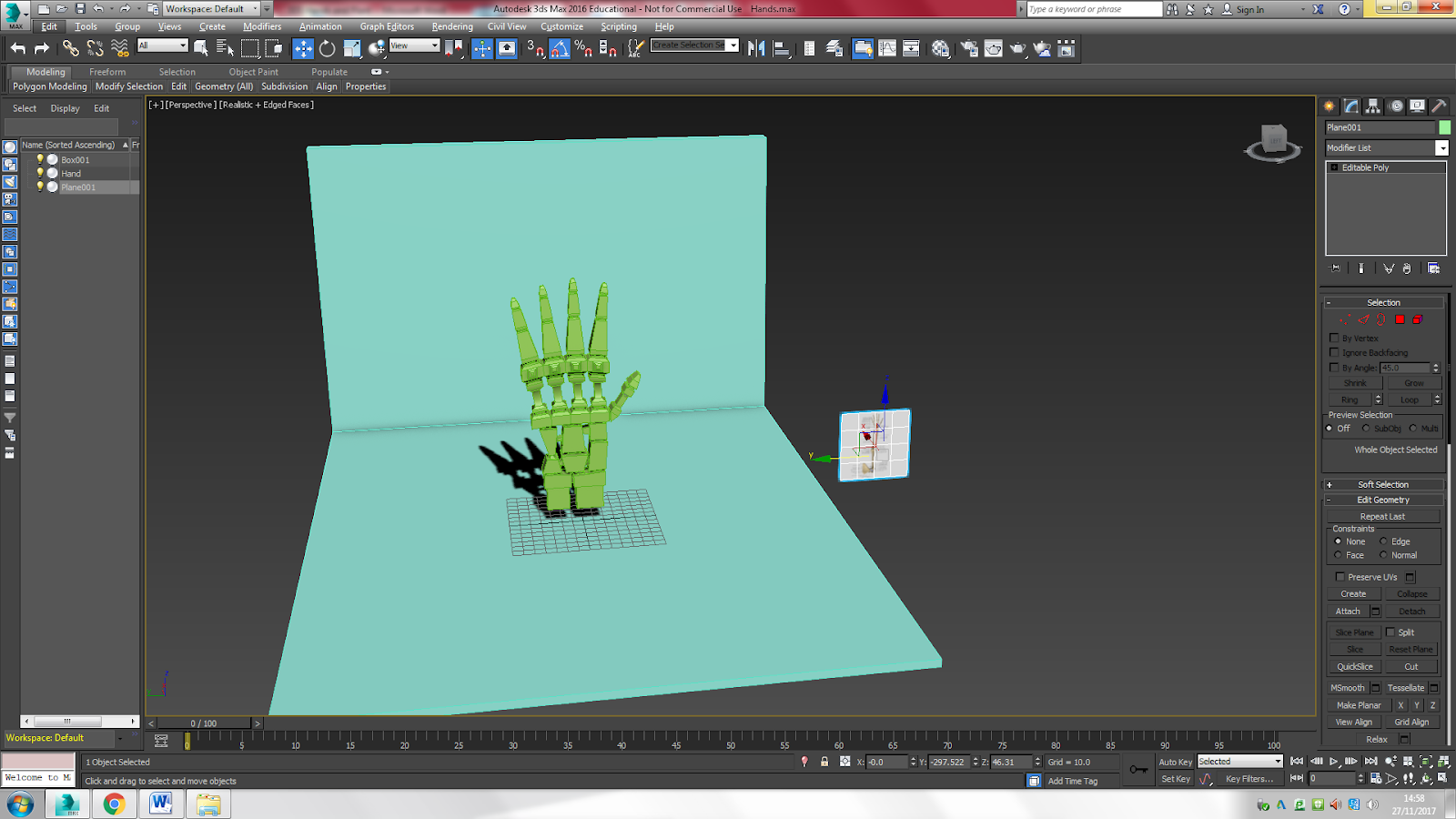
3D Tutorial - Robot Hand
The level 3 students had a tutorial on how to create a robot hand in 3DS Max on Friday. We continued the tutorial on Monday in the third week of the project. I put the tutorial in week 3 because I had finish research task 2 early, so I started research task 3 on Thursday in the second week of the project. 


We started off by creating a Plane with the length and width being 70.0. We then added the picture of the hand that we downloaded by selecting ‘bitmap’ and then selecting the picture from wherever we saved it. The plane would work as a cheat sheet.

We then created to boxes, one 80x20x10, and the other 72x18x9, both with 4 segments. We positioned the smaller box right under the larger one.


We converted the boxes to editable polys and bent the segments in ‘edge’ by selecting the edges. We bent each box into a curve.

Then we used the bevel tool to create the chocolate bar-like edges on the top and bottom of the large box and on the top of the smaller box.


Next, we attached the two boxes and created the long bones by using ‘bridge’. Then we used ‘edit’ to create lines around the long bones, which we reduced in size by using ‘scale’. All still in ‘edge’.


We then added the fingers by using the ‘insert’, ‘bevel’ and ‘extrude’ tools (poly). We first did the index finger and ring finger by selecting the edges. Then we did the middle finger and pinky separately, because they differ in size. Lastly, we created the thumb by adding another little box to the smaller box.

We changed the edge of the little box by selecting ‘edge’. We then created the thumb by going back to ‘poly’, doing the same thing as the long bones and the other fingers.

We continued the process on Monday. We added the small bones under the hand by creating three small boxes that differed in size and used edge to give them different shapes.


We then used the ‘connect’ tool in poly to create twi more segments in the first big box that we created. We selected the middle segments and used the ‘bevel’ tool to create the knuckles.


Next, we attached the three different boxes to the rest of the robot hand. We connected the two outer boxes by first using ‘insert’ and then ‘bridge polygons’.


We did the same for the little box in the middle, only we used ‘connect’ to half the inserted square, so that we could get a Y-shape when connecting the box to the rest of the hand.


We then created three more boxes and connected them, and added two more for the wrist and attached these.
Created a background and adjusted the corners of the boxes for the wrist in ‘Edge’.

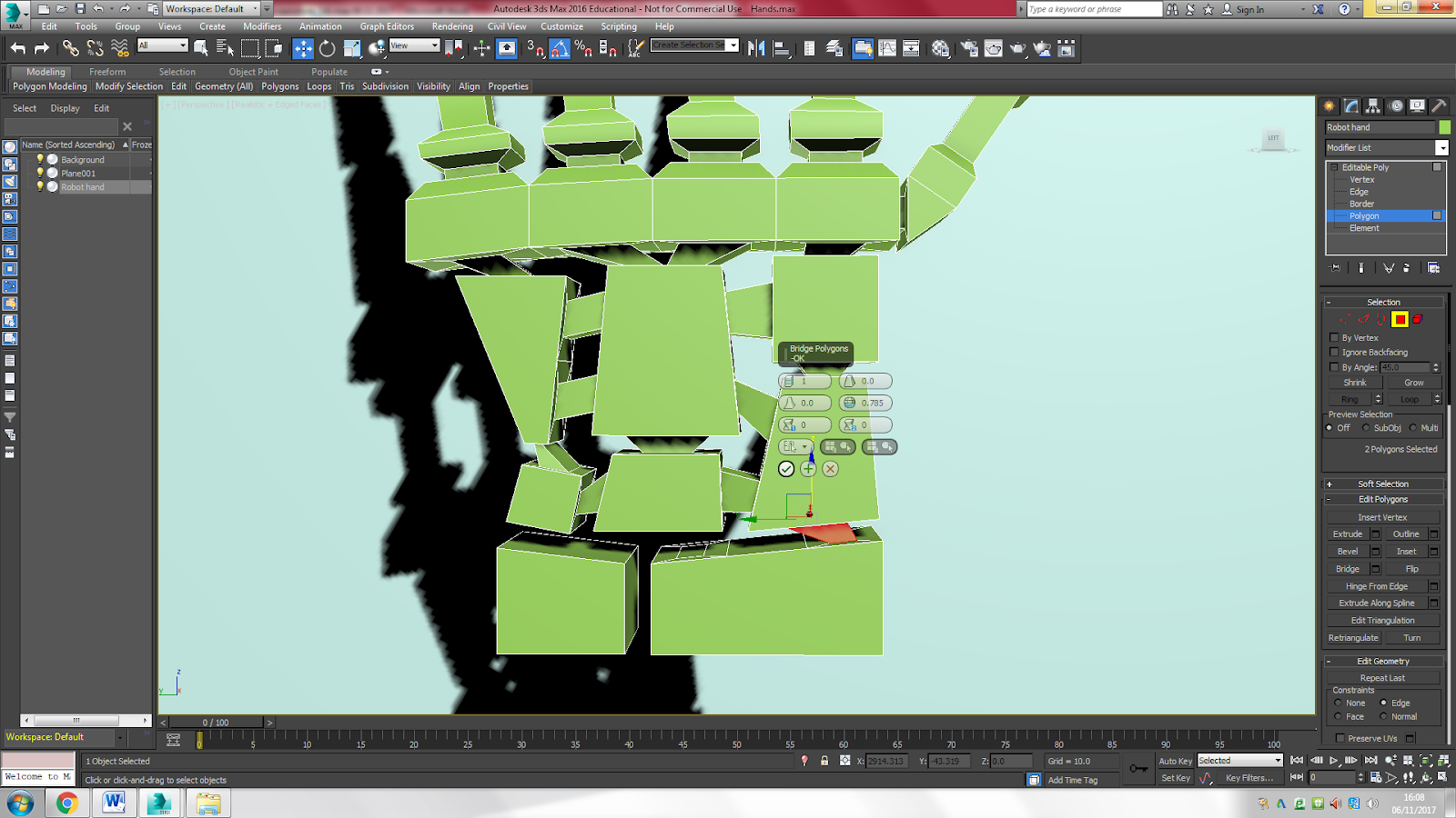

Created more segments on the boxes for the wrists to connect to the hand, again using ‘inset’ and ‘bridge’.
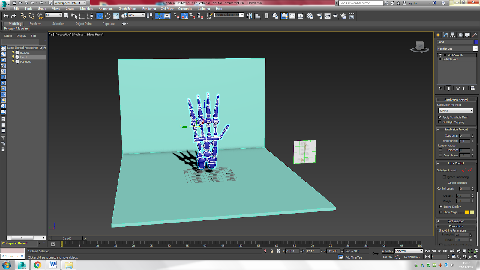
Made the background larger by using ‘scale’ and applied ‘MeshSmooth’ with 2 iterations.
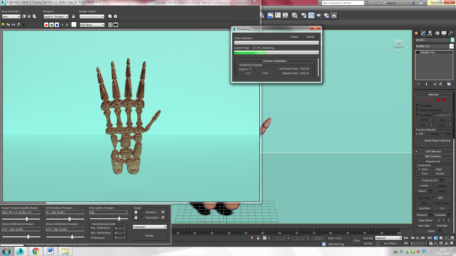

Lastly, I gave the robot hand a copper texture and rendered it. When I look at it now, I see that the thumb is too short, and the several boxes between hand and wrist are too big. But I am proud of it nevertheless. I learned a lot while making this robot hand. Not only did I learn about the anatomy and structure, but I also learned the difference between 'inset', 'bevel' and 'extrude', which I didn't know before.
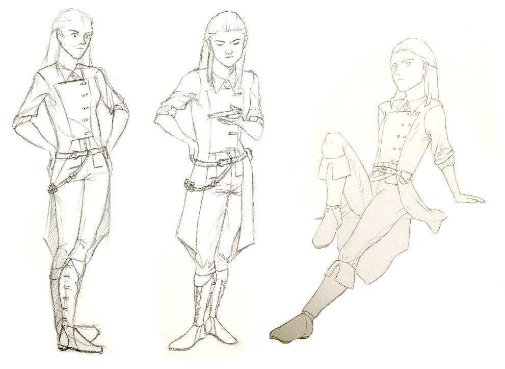
My 2 chosen elements
We have to choose two elements from two of our favourite artists’ concept artworks. We have to replicate, as accurately as possible, these two elements. I want my first chosen element to be a character and the second one to be a background or something environmental. Both are areas that I find challenging but want to improve on.
1. Character by Glen Keane
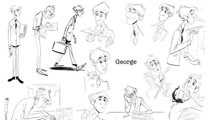
I chose the character Flynn Rider as my first element. I chose to replicate a male character because male anatomy is something that I need to work on. I found Flynn Rider from Tangled the best choice, as George from Paperman seemed too simple and flat, and too cartoonish. Flynn Rider is drawn more anatomically correct, even though he is very cartoony as well.
Human anatomy, especially male anatomy, is something that I want to improve on. I find women easier to draw because of the curves and maybe the fact that I am a woman so I know what the female body looks like). I think that being able to draw the human body will be important, because this project focuses on concept design, which includes character design.


I want to replicate this pose from my moodboard of Glenn Keane. I want to replicate the pose on the right, as it looks more realistic and less stiff than the one on the left. He is putting his weight on one of his legs, one arm rested on a leg, and there is foreshortening. All of this can be very tricky to replicate. I chose this element because it is not the costume and overall design that is challenging, but the pose and anatomy. Male anatomy is already a challenge, but I want to challenge myself further by replicating a male character doing a tricky pose.
In addition, facial expressions are something that I struggle with. Even though the character has a very neutral expression, I believe replicating it will be trickier than it looks.
In addition, facial expressions are something that I struggle with. Even though the character has a very neutral expression, I believe replicating it will be trickier than it looks.
2. Scenery by Hayao Miyazaki
Among human (especially male) anatomy, objects and scenery are things I find challenging as well.
Among human (especially male) anatomy, objects and scenery are things I find challenging as well.

I want to replicate Hayao Miyazaki’s bathhouse. Even though it looks simple and easy to draw, I bet it isn’t. In addition, as written above, I want to work on my scenery/object skills. I chose Miyazaki’s bathhouse because I think John Howe’s work will take too long to replicate, even if I had chosen a small element of some of his designs, because everything is so extremely detailed.
The picture is also created with watercolour, something that I have never used to colour my artwork. But it is something that I want to try, which is why I chose the bathhouse for my second element.
Drawing Tutorial - Boxing Method
We had a drawing tutorial on Wednesday. We first did a recap of what we learned the previous week (rhythm/gesture drawing) by drawing some more challenging poses of models from the same video.
We then moved on to another drawing technique where we had to break the torso into basic shapes. This technique focuses more on how to make your drawings more 3D, rather than studying human anatomy. We made the torso up of two boxes, one for the pelvis and one for the ribs. We didn’t draw the rest of the body.
We then moved on to another drawing technique where we had to break the torso into basic shapes. This technique focuses more on how to make your drawings more 3D, rather than studying human anatomy. We made the torso up of two boxes, one for the pelvis and one for the ribs. We didn’t draw the rest of the body.


I find this method very useful. Breaking down the body into basic shapes makes it easier, but drawing these boxes also makes it easier to see the angles and perspective. I will try to use both the rhythm technique and the box technique to replicate my character element.
Feedback task 3
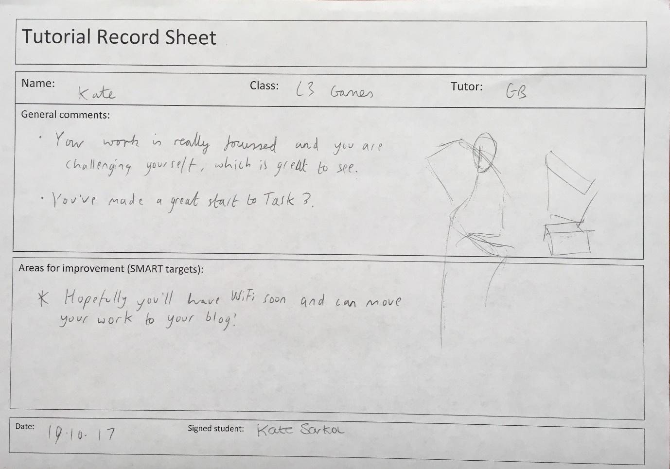
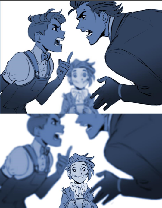
Here is feedback that I got during my pastiche process. It says that I am challenging myself and that I made a good start to the task. On the picture above, you can also see GB trying out Flynn’s pose in different ways, helping me to understand how best to start with sketching the character.
I hope that my ‘final pieces’ turned out alright. I did get wifi the same day as I got this feedback, which was a blessing.
I hope that my ‘final pieces’ turned out alright. I did get wifi the same day as I got this feedback, which was a blessing.
Pastiche
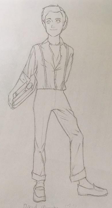
Flynn Rider
Process
As written above, it is the pose and anatomy of this particular piece of concept art that will be a challenge. Different body parts bend different ways, and the upper body rests and puts its weight on just one leg. I wanted to practice the pose first, so that I could get used to it and master it a bit before creating my ‘final’ piece.

This first sketch is basically trying to get the pose right. I drew the first sketch (the right one, I draw from right to left because I’m left-handed) starting from the lower body, which is my usual way of drawing bodies. I think it turned out alright. It really looks like the character is resting on one leg and putting his weight for- and downward. It’s just the head that is placed awkwardly. That’s why I tried to start with the head on the second sketch. The second ketch is also alright, but there is less indication of the weight-putting and foreshortening. In my annotations I wrote that both studies look too stiff, which I still agree with.


I focussed more on the head in the next sketch pages. The body in the first sketch looks alright, but the head is still in a weird position which makes the whole study look off. I wrote in my annotations that the head is too high on the head. This makes it look like the character is lifting his head up, which he doesn’t do in Glen Keane’s original work. In Keane’s work, Flynn’s face is faced downwards, but he looks up. This is what I tried to replicate in the other sketch, which worked a little bit better than the first one.
What I didn’t expect was that replicating the face would be so difficult. Flynn’s design is fairly simple, given that he is a cartoon character and much detail would take forever for the animators to animate. But, in my opinion, even the simplest elements in an art piece can be extremely challenging to pastiche. I just did not think that that would be the case with this art work. One reason as to why it was so difficult to replicate the face is that the style is different from the one that I usually draw in. Also, this was my first time trying to pastiche it, so I should not have expected the result to be good.
What I didn’t expect was that replicating the face would be so difficult. Flynn’s design is fairly simple, given that he is a cartoon character and much detail would take forever for the animators to animate. But, in my opinion, even the simplest elements in an art piece can be extremely challenging to pastiche. I just did not think that that would be the case with this art work. One reason as to why it was so difficult to replicate the face is that the style is different from the one that I usually draw in. Also, this was my first time trying to pastiche it, so I should not have expected the result to be good.


I also practiced the pose in PS using the box method, which I found quite helpful in terms of perspective. I tried to draw the character whole instead of just its anatomy. The waist should be much much slimmer and go more outward. The right arm is too long and the head is too big. Overall the result looks horrendous, but that’s just the way it is. In my annotations, I wrote the opacity that I used to colour the piece. I also wrote Sketch size 7, but I don’t remember what that was for.


I tried to focus on the head in PS, this time with a pencil brush instead of those basic brushes. The character still looks too angry, though.

Some brush pre-sets experiments.


Here I tried to use the box technique and rhythm drawing technique to get the pose right. I found the box technique very useful. It helped showing the way the body twists and bends forward. It makes the pose look more natural and less stiff, especially on the second page. On the first page, I wrote what is challenging: the pose and anatomy, not the details (except the face) + hair in Dutch.
On the second page, I experimented with tone and shading. I also practiced drawing the head. The studies look better than the previous ones because they are facing more downwards, but they are still not accurate to the original piece. The eyebrows, I think, are the most important element of the face, as it conveys the mood of the character. The eyebrows were a challenge. In the original, they look very straight, like the character is frowning, but not angry. My studies look too angry or annoyed. (I later found out that it is because he doesn’t really frown, it is more like he lowers one of his eyebrows and lifts the other one slightly in a mocking way).
It was also while creating these head studies that I realised that Flynn Rider has a tiny beard, which I hadn’t noticed before and therefore left out in my previous studies.

On this page, I tried to use the rhythm method more to keep the body curvy. In the first sketch (again, starting from the right) the upper body looks too big and too long. The chest is very big which makes the arms seem very small. On the second sketch, the whole upper body is too big. My first annotation says hip should come forward more in Dutch. What I meant to say was that the hip should go more outward. That would make it look like the upper body is leaning on one of the legs more. The other annotations say too stiff shoulders and this arm is too low, meaning that the arm is resting too much and goes too much downward.
Even though the proportions are at its worst in these studies, it was on this page that I discovered an easy way to keep the proportions right. You can see the line between the two body studies, where the middle is marked. I found out that the upper body all the way to the groin is about the same length as the lower body, and that the leg that rests on the cube ends halfway down the lower part of the guideline.
The head study looks too much like he is doing the ‘Jaden Smith’ because the eyebrows are making an inverted frown. But the head studies are becoming better at this point, as I started getting used to drawing in Disney style.

This is just a failed sketch. I tried to recreate “Back Door Bag End” by John Howe because I wanted to pastiche that one instead of the bathhouse.

On one of my final sketch pages for Flynn Rider, I used the trick that I discovered on the previous page. I also tried the pose with the costume as well. My first sketch, which is on the right, was done without the trick, though, because I forgot to use it. But the study turned out better that I thought it would. The proportions are all very accurate to the original piece. But some things are not right. I noted that the head is too big and the pose still seems very stiff.
For the second body sketch, I lowered the left shoulder and raised the right one. This made the pose look more correct. The head is also smaller and it doesn’t look like the character is lifting his head. The result of the facial expression is also quite good and accurate. Though the eyebrows make a sort of frown, it isn’t an angry frown, it is more mocking. The reason for that is because I discovered, while sketching the head in the middle, that the eyebrows aren’t horizontally straight. The eyebrows sort of lie on a straight line, but the line is more diagonal than horizontal.
I didn’t annotate the last body sketch because I found that nothing could be improved on it (At the time). So I gave it a thumbs up.

This is my last sketchbook page of Flynn Rider. I used my trick to make the proportions right, though it didn’t work on the first study. The right leg was too long, but otherwise it seemed fine. The second one looked too stiff, and the face still looks too angry. The waist also looks too broad, as it is supposed to be very exaggeratedly slim.
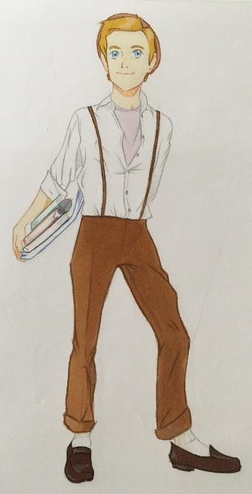
Final piece
I wanted to make my ‘final piece’ digitally, so that I could improve on my PS skills. I got lazy so I decided to use one of my previous sketches (the one that I gave a thumbs up, because it was ‘perfect’) an trace it in PS so that I only had to do the shading.
I wanted to make my ‘final piece’ digitally, so that I could improve on my PS skills. I got lazy so I decided to use one of my previous sketches (the one that I gave a thumbs up, because it was ‘perfect’) an trace it in PS so that I only had to do the shading.


I put the sketch in PS and started tracing it. I thought this process would be easy, but it proved to be quite difficult. I am used to the graphics pads that we use at the college, and I still have to get used to my personal one. My personal pad has some disadvantages, including not being able to erase when you flip the pencil tool. It also doesn’t move along the ‘paper’ when I click the button near the tip of the pencil, which is quite annoying.


I used a pencil brush. It was also while tracing my sketch that I realised that I can just select a certain element in a layer to edit it by using ‘transform’, instead of having to undo or erase all the time.
But after struggling with my graphics pad for a while I gave up on the digital part. Drawing traditionally is easier, in my opinion. I wanted to use the same previous sketch, but I found it very small. So, I wanted to edit it on an A4 paper in PS and then trace it in my sketchbook using my laptop screen as a lightbox.
That didn’t work because I couldn’t see through the paper, even though my laptop was on full brightness. So I had to give up on the tracing and just use the sketch and finish it. I used an HB pencil, I think, to finish the whole piece. Next to the final piece, you can see my tonal experiments.
Even though it sounds very easy to trace a sketch and put in some colour/tone, it till took me hours to finish the piece. I wanted every line to be precise, especially in the face. I also built up the tones to get it exactly right.
Though the final piece has many imperfections, I think it looks pretty professional

Bath House
Process
As written above, I want to improve my environmental assets/background/architecture skills, which is why I chose to pastiche Miyazaki’s bathhouse. I also chose the bathhouse because it is painted with watercolour. I have never used watercolour before, so that is something that I wanted to try out.


I started by making a very rough and quick sketch of the house only. I found out that drawing the bathhouse is actually pretty easy, mainly because it is made up of basic shapes. But because I sketched really quickly, the shapes weren’t accurate. I wrote that the sketch of the house as a whole should be wider. I also wrote that the colouring would probably be more difficult, which later seemed to be true.
The trickiest part about drawing the house was the top roof, because it has so many details. So I focussed more on that in my other studies.

The trickiest part about drawing the house was the top roof, because it has so many details. So I focussed more on that in my other studies.
Originally, I wanted to do the whole piece traditionally. But I wanted to create digital studies as well.


I played around with the brush presets. It proved difficult to create watercolour brushes, so I downloaded some online. But I felt that it didn’t really work out, so I went back to traditional sketching.

This time, instead of creating a quick study, I tried to build up the sketch by starting with the basic shapes. I also looked more closely at the original piece, and found that the building isn’t symmetrical, though that could be because it was one of Miyazaki’s rough concept sketches. The building is askew, so it tilts to the right, and the roof goes upward to the right. I tried to replicate that in my sketchbook. Later I tried out some of my fine liner pencils on this sketch.


During half term, I decided to draw the bathhouse traditionally and then colour it digitally. I don’t have watercolour, as it isn’t a medium that I use, so I decided that it would be easier to do it in PS. I watched videos on how to create watercolour brushes (links in source list).
First, I had to swap the default brushes with Natural Brushes 2. This brush set has watercolour brushes available, which I customized. Again, I played around and experimented with scattering, wet brush and other features. Above you can see my experiments. I intended to use many of these brushes to create a watercolour effect, but later forgot to save them as presets. So later, when I was making the final piece (and was running out of time), I couldn’t bother to recreate them all over again.
First, I had to swap the default brushes with Natural Brushes 2. This brush set has watercolour brushes available, which I customized. Again, I played around and experimented with scattering, wet brush and other features. Above you can see my experiments. I intended to use many of these brushes to create a watercolour effect, but later forgot to save them as presets. So later, when I was making the final piece (and was running out of time), I couldn’t bother to recreate them all over again.


I then copied the original picture into PS and turned it into a colouring page. This way, I could test the brushes on the drawing to see what it looked like. I also experimented with the tones. I also found out that by swapping the default brushes with the natural brushes, I got different tools like the sponge and burn tool. These proved to be extremely helpful in creating a watercolour effect.
Final piece
Final piece

I measured the original bathhouse picture on my laptop screen with my ruler and copied it in my sketchbook.


Added the details as closely as I could while rushing. (I had to start the bathhouse pastiche on Sunday during half term because I am a procrastinator).


Used my fine liner (0.2 cm) and put it in PS. I realised that I could have kept the colouring page I made from the original bathhouse and save time, but that would be very lazy and cheating.


Created a base for the red parts of the bathhouse by using both smooth and scattered watercolour brushes.

I then used the burn tool and sponge to saturate and desaturate some parts to make it look more like the original picture.

I then used the blur tool to smoothen it out a bit. The base looked a bit too scattered, so it didn’t really have the watercolour effect.


Added a new layer and filled it with white. I then lowered to opacity to desaturate the red watercolour. The colours in the original picture are pretty light and pastel, so I wanted to get my pastiche piece as accurate as possible.

Adjusted some small details.

I then experimented with the effects. I discovered a cool gradient style that I can use for future art pieces. I wanted to keep the style here to remember it.

I regretted blurring my piece because it looked too smooth. So, I used a noisy and scattered pattern overlay.

I then started on the green parts of the house. I selected custom colours that I saved in my swatches from when I experimented on the colour page of the original picture.


I made a smooth green base, which I built up with a more scattered watercolour brush. The watercolour brush had colour dynamics on. This made it faster and easier to switch between colours. If you look closely at the original picture, you can see some light green/yellowish splotches. I tried to recreate that by using a colour dynamic watercolour brush.


I then used the sponge again to desaturate some parts. I also used the burn tool for that, and used the same method from the red part to desaturate the whole green and brown parts to match the original picture.
At one point, Photoshop stopped working for a while. This delayed the little time I had left until Monday to finish the piece, which made me really upset. Luckily, I saved the file just a few minutes before the programme stopped functioning, so I didn’t have to redo that much.
At one point, Photoshop stopped working for a while. This delayed the little time I had left until Monday to finish the piece, which made me really upset. Luckily, I saved the file just a few minutes before the programme stopped functioning, so I didn’t have to redo that much.

I quickly finished the purple curtains and the big yellow sign before going to bed.

On Monday, I started on the last details, like the flag, the grass in front of the house and the windows. I also used the burn tool and sponge tool to saturate and desaturate parts.


Here, I show the tonal and brush experiments that I did within the document. I realise now that the colour swatches slightly look like the background on the original picture. Which is funny, considering the fact that I was only supposed to draw the bathhouse.


With my almost finished piece, I compared it to the original piece. My colours were pretty vibrant, so I had to lower the opacity to match the original piece.

Evaluation
Flynn Rider


My first pastiche work is based on Glen Keane's concept sketch from Tangled. Because the pose is very tricky, I planned on making some pose/anatomy studies before starting on my rough sketches. I didn't have a specific media in mind at first, if I should create the final piece traditionally or in PS. I did use both medias for my studies, but in the end I decided to do it traditionally, as I struggled a bit with my graphics pad.
I think the piece is pretty accurate. The pose looks right, and it looks like he is bending forward and putting his weight on one leg. The facial expression also turned out well, in my opinion, he doesn’t look angry but looks mockingly to the left (of the viewer). The shadows give more depth to the piece, and the colour/tones for the outfit and the hair look pretty accurate. The waist is very slim, which is something that I struggled with throughout the process.
There are still some things that didn’t go well, though. In many places where the lines in the original piece are very thin and light, I made them too thick. But it was necessary so that nothing would stand out or be unnoticeable. I also think the piece looks too much like a final product than a concept sketch. That could be because the lack of helplines makes it look very clean and finished. The right arm is too crooked, which makes him look less relaxed. The right arm is also too long, it is supposed to be shorter than the left. The left hand is also too small. I don’t know what went wrong while creating the final piece, but it shrinked. Also the head, now that I look at it, is also too high. The line of the hair should meet the line of the chest (right shoulder). The hip could have gone more outward, that would help the right arms becoming shorter. The feet are also too small.
The more I look at my final piece and compare it to the original picture, the more imperfections and ‘errors’ I find. The list of mistakes goes on, but I will stop mentioning everything, as I feel that I have mentioned the most important ones.
Though there are many things about the final piece that are not accurate, I did learn some things. Firstly, I learned to use the box technique efficiently. I also learnt that the position of the eyebrows is vital to facial expressions. The pose also heavily depends on where the head is placed. If it is lowered (like in this one) it will look like the character is bending forward.
My areas for improvement are line work and male anatomy. I should also have finished the piece in PS, as I need to work on my digital skills. It is a shame that I gave up on creating it digitally, because I could have improved. But I got lazy and stepped back in my comfort zone. This has heavily affected the outcome, as I, in PS, could have adjusted some of the imperfections that I made. When I have to create my own work, I will push myself to do it digitally.
Bath House


My second pastiche work is based on Hayao Miyazaki's bath house sketch for Spirited Away. Initially, I had planned on doing the whole thing traditionally, but as I don't have any watercolour, I had to resort to PS in terms of colouring. I had planned to do some sketches of the house first, then start with tonal and brush experiments in PS. I used the Natural Brushes 2 presets and the tools that came with it, such as the sponge and burn tool. These were very useful, as it helped getting some watercolour effect.
I feel that my final piece of the bathhouse is pretty accurate in relation to Miyazaki's original work, though there are some aspects that differ, of course. The original piece is quite asymmetrical, the whole building is leaning to the right. I tried to copy that, but found out too late that mine still looks too symmetrical. I realise now that I could have used transform to make it more accurate. I also see now that my outline is too thin. You can't really see the lines in most places, so I definitely should have picked a thicker fine liner. The colours are still too vibrant when compared to the original piece. The original piece has more pastel colours, which I wasn't that successful at recreating. I also think the piece looks too smooth in some places, which doesn't give the watercolour effect. But I think that the sponge tool and burn tool were really helpful. Overall, I think my piece is pretty accurate.
Though I didn't get the watercolour effect, and my work doesn't look that professional, I did learn a lot. I have certainly improved my PS skills, especially when it comes to creating brushes (with help from youtube videos). Even though I did some experimentation before starting on the final piece, I still learnt a lot and discovered new tools and features whilst recreating the bathhouse. Though next time, I will try not to procrastinate so that I have more time to finish my works and with more finesse. I will also experiment more with brushes in PS, and actually use the features that I tried in my experiments.
Task 4 – Concept Phase
In task 4 we start developing our own concept art. During the fourth, fifth and sixth week we will have to create three “concepts” and then choose one to focus on for our final piece.
Planning

I planned to do step 1 and 2 during the first week. Coming up with appealing ideas can take some time, so I wanted to dedicate the first week to brainstorming. But I want these steps to be done as quickly as possible so that I can start on step 3. Step 3 is sketching and experimenting with tones and colour swatches, which I believe will take the longest for this task. I want to dedicate week 5 to step 3 and week 6 to step 4.
Drawing Tutorial - Mannequinization
We had a drawing tutorial on Wednesday where we continued practising the boxing and rhythm methods. But this time we had to draw the whole body and ‘mannequinise’ it. We started by watching an introduction video to making mannequins, then copying examples in our sketchbooks.
On the first example (the study on the right), we first deconstructed the pose into basic shapes. We started with the head, which essentially was a circle with a small triangle for the chin. We then drew the neck and torso, for which we used the boxing method. For the arms and legs, we used the rhythm technique.
On the second example (on the left), we first used the rhythm technique for the torso and legs, then added details with boxing. For the arms and head, we used the rhythm technique again.

I had issues with the right leg of the pose on the right. The angle was slightly off, but the length was fine. Many students struggled with this particular leg during the tutorial. For the rest, I think my studies went very well.
I have learned how to combine the boxing and rhythm technique in one study in different ways. For example, you can start with the boxing method and then use rhythm, or vice versa. Both are very useful, in my opinion. I had never used the boxing method before, but combining it with rhythm drawing helps to show perspective and movement in a pose.
I have learned how to combine the boxing and rhythm technique in one study in different ways. For example, you can start with the boxing method and then use rhythm, or vice versa. Both are very useful, in my opinion. I had never used the boxing method before, but combining it with rhythm drawing helps to show perspective and movement in a pose.
Step 1
During the first step, we have to decide what types of concepts we want to create. We can choose between assets, characters and environments. We can choose ourselves in what quantity, for example I can choose to create two characters and an asset. It doesn’t really matter, but some variety would be good. But we should have three ideas. I don’t know yet what I want to do, so getting started with the mind maps will probably help me. I know that I want to create at least one character, but the rest I’m still contemplating.
This task is very open, no specifications are given whatsoever. This means that I can create whatever I want.
First thoughts

I decided to create mind maps focusing on the settings of my concepts first. This way, I will have some sort of idea of what style I want to create in, whether it be character, environment or asset. Above is everything that I could come up with that seem interesting to me. I especially like the idea of a historical setting that maybe could be combined with fantasy/superstition. But I want my three concepts to be set in different eras, to give more variety.
(On “renaissance” I wrote ‘telescope guy’ because I forgot the name of Galileo Galilei.)
By making this mindmap, I found it easier to come up with ideas that I would like to do for the three different topics. Though I don’t yet know whether I want to do one character, an asset and an environment or something different. Because I don’t know yet, I decided to make mindmaps for all three. On the mindmaps below I elaborated further on the eras that appeal to me for specifically that topic.

Notice that I used the same colours for the same setting/eras from the previous mindmap. Above you can see some of my ideas that I could potentially elaborate on for a character. I think that the detective in Grand Budapest Hotel style would be quite fun. But I also like the idea of creating something Viking-related, as I grew up in Scandinavia and was taught a lot about it. Creating my own version of 1800s Sherlock Holmes or Jack the Ripper also seems interesting.

I then created a mindmap where I elaborated on interesting concepts for assets. I wrote down things that were and are active and popular in the eras that I find interesting for the topic. Today, for example, everyone is obsessed with their phones and looking appealing. I forgot to write it down, but an idea for an asset to represent today’s society could be bottles containing beauty products, maybe makeup, anything else to conceal a natural look.
Again, I like the idea of a Viking setting. The shield sounds particularly interesting to me, but I also like the idea of creating a vintage propaganda poster or magazine cover from the World Wars.
Again, I like the idea of a Viking setting. The shield sounds particularly interesting to me, but I also like the idea of creating a vintage propaganda poster or magazine cover from the World Wars.

For my environment mindmap, I also wrote down things that were active or popular within the eras that I find interesting for the topic. The Viking hall sounds particularly interesting, but my ideas for a renaissance setting are also very intriguing. On “present” I wrote in Norwegian ‘skolegård’, which I don’t know the word for in English. It is an outside school area where the students can play during recess. But I think that that will not be interesting enough.
I like the idea of the front façade of small or independent shops, especially those with an Asian aesthetic. It could be because I am from Indonesia and grew up with Asian culture, but who knows. I wrote it down in the mindmap because I remembered an article that I read about these types of artworks. Talking about Asian aesthetic, I forgot to write down Buddhistic temple. I myself am not a Buddhist, but I am fond of the temples and statues, which have a serene and peaceful charisma.
I like the idea of the front façade of small or independent shops, especially those with an Asian aesthetic. It could be because I am from Indonesia and grew up with Asian culture, but who knows. I wrote it down in the mindmap because I remembered an article that I read about these types of artworks. Talking about Asian aesthetic, I forgot to write down Buddhistic temple. I myself am not a Buddhist, but I am fond of the temples and statues, which have a serene and peaceful charisma.
Further thought process
I have decided to create one character, one asset and one environmental piece/background. I have also come up with the idea of creating each topic in a different era and location. I want these locations to relate to my ethnic and cultural backgrounds. For example, I want one topic to have an Asian aesthetic, as I come from Asia. Another topic will be set in renaissance Holland, because I was born in Amsterdam. The remaining topic will be set in the Viking era, as I grew up in Scandinavia. Here are some ideas that I want to choose from, this time not focussed entirely on setting/era. Some are from my mindmaps and some I made up while writing my thought process:
I have decided to create one character, one asset and one environmental piece/background. I have also come up with the idea of creating each topic in a different era and location. I want these locations to relate to my ethnic and cultural backgrounds. For example, I want one topic to have an Asian aesthetic, as I come from Asia. Another topic will be set in renaissance Holland, because I was born in Amsterdam. The remaining topic will be set in the Viking era, as I grew up in Scandinavia. Here are some ideas that I want to choose from, this time not focussed entirely on setting/era. Some are from my mindmaps and some I made up while writing my thought process:

As you can see, I elaborated on some of my ideas. Here is a mindmap for my Dutch-ish concepts. I find the Golden Era/Renaissance painter a very interesting concept. The Golden Era (Gouden Euuw) was, as is self-explanatory, when the Dutch trade, art, economy and science was at its peak. For my renaissance/Golden Era painter I added a dark characteristic, being that he is a murderer and paints with the blood of his victims. The tulip that works as a lantern is also intriguing. It is partially inspired by the flower from Tangled that lights up when someone sings a song.
I also added the telescope to my asset ideas because it is a Dutch invention. But I don’t think that the telescope will be intriguing enough to create, even if I try to make it look interesting. I also like the idea of the typical Amsterdam block façade. The old architecture in Amsterdam really adds to the place, traditionally and historic wise.
I also added the telescope to my asset ideas because it is a Dutch invention. But I don’t think that the telescope will be intriguing enough to create, even if I try to make it look interesting. I also like the idea of the typical Amsterdam block façade. The old architecture in Amsterdam really adds to the place, traditionally and historic wise.

This is a mindmap for Norwegian/Scandinavian ideas that I have. I like the idea of realising Huldra, which is an old Scandinavian legend/myth. Huldra is a creature that lives in the forest. She supposedly is very beautiful and seductive. In Norwegian folklore, Huldra has a cow tale and wears normal or more dazzling clothes. The cow tale is a curse, which she can lift by marrying a young man. Huldra tries to seduce and lure young men to the forest. But tale tells that if the young men treat her badly, Huldra will behead them. That’s what I learned in primary school, there could be different versions of the tale. Huldra is basically an above-water mermaid.
The shield idea is also one of my favourite ideas, though it is very basic and simple.
The shield idea is also one of my favourite ideas, though it is very basic and simple.

As for a character that could represent my Asian side, I of course thought of creating a character design for a halfie teenager whose Asian background overshadows his/her European background. A halfie is an Asian term for people who are half Asian, my case being half Indonesian and half Dutch. But as that idea sounds pretty boring, I tried to come up with more interesting ideas, such as an evil emperor. This idea is inspired by an Indonesian political leader who died a few years ago, but also because my grandmother is a distant relative of a former emperor from Java.
The stereotypical Japanese busy business man seems too flat and ordinary to further create, though the title for the character is pretty funny. I can for example create a Buddhist character with superpowers, like Aang from Avatar. But maybe that will be too unoriginal.
As for assets, I find the market stands very interesting. Asian markets mostly sell food, as (stereotypically) Asians are obsessed with food and eat a lots and lots. Creating my own version of a food stand sounds pretty fun, as Asian cuisine is very diverse and has lots of flavour and colour.
I also wrote down beauty products. Asians, especially Koreans, Japanese people and people from other East-Asian countries have very different beauty standards from the West. In Asia, the ideal look is being stick skinny and pale-skinned, as pale skin symbolises wealth. Many Asians also want to look more like Western people. This includes having double eyelids, bigger and less slinted eyes, wavy hair and a longer, more defined nose bridge. Cosmetics, bleaching, teeth and skin whitening products, makeup and coloured eye lenses are very popular ways to conceal their natural look. South Korea’s plastic and cosmetic surgery industry is rapidly increasing in popularity, not only because it’s cheap but because the surgeons are very good and precise in their work. Many people, not only from Asian countries, travel to Korea just to get plastic surgery. But the beauty pressure is very high, and many feel that they have to change the way they look in order to be pretty. That’s why I wrote down beauty products, because it is such a big part of Asian society. If I choose to create an asset surrounding this topic, I could for example make a small collection of cosmetics, makeup, eye lenses and hair products.
Final ideas
As written above, I want my three concepts to represent the places that I come from/grew up in, meaning my Indonesian, Dutch and Norwegian sides. I came up with many ideas that I really like and find it very difficult to choose only three.
To make a final decision, I narrowed my ideas down and listed them on the picture below. My absolute favourite ideas got a star. I then had to choose from these, which proved to be a challenge.

I was left with the choice of the Huldra or painter for my character and the shield or tulip lantern for my asset, as I had already chosen my environmental piece to be the Asian shop façade. I already knew that I wanted to create the shop façade when I came up with the idea. I don’t know why, but it strikes me as the most aesthetic choice. The colours and tiny space give a claustrophobic and busy, yet quiet and serene feeling, in my opinion.
In the end, I chose the Dutch Renaissance painter for my character concept. Though I liked the idea of realising an old Norse mythical creature (Huldra), I found the renaissance painter more intriguing, as it is more open to interpretation. The Huldra has a very specific look, whereas I can make the painter look however I want, as long as I stick to renaissance fashion.As stated before, I wanted to add a dark twist to this potential character to make him more interesting. I think I came up with this idea because of Layers of Fear, a very eery, dark and disturbing horror game about a painter that killed his wife (or fiancé, I don’t remember).
Having chosen an Asian environmental piece and a Dutch renaissance painter for my character, I was left with the Viking shield for my asset. Even though Viking shields look very simplistic and generic, this idea is also very open. I can give it basically any colour(s) and symbols that I like, as long as I stick to the Viking style. I was thinking about adding runes and a symbol that is typically Norwegian, like a Norse dragon, a tree, a wolf or moose. The colours will probably be inspired by the Northern Lights.
Even though I have made my final decisions, I find it a pity that I can’t create all of my favourite ideas. The evil emperor and tulip lantern could have made for good concept pieces as well. But maybe I can use those for future projects.
Step 2 – Moodboards

For step 2, we have to create at least three moodboards about our three chosen ideas. I have decided to make at least two moodboards for each concept.
Asset – Viking Shield
I found a really good article on Viking shields and what materials were used. You can find it and the sources from of the pictures used in the source list under ‘Viking shield’. I made my own brushes and colour swatches on the moodboard below. I had to make them digitally, as I left all my art tools back in Norway and don’t have anything here. I should buy some, but haven’t had the time yet.
As for patterns, Viking shields usually only had geometric shapes. But I want to add something that is typically Norwegian, like a bear icon or symbol. Other animals can be used, maybe a moose, wolf or Norse dragon. Yggdrasil also sounds like an interesting detail to add.

As for patterns, Viking shields usually only had geometric shapes. But I want to add something that is typically Norwegian, like a bear icon or symbol. Other animals can be used, maybe a moose, wolf or Norse dragon. Yggdrasil also sounds like an interesting detail to add.
I see Norse patterns as many pretzels that are connected together in infinite, looped tangles and braids. It can be very confusing to look at sometimes. There really is no other way of describing it.
Each colour had a different meaning in Norse mythology. White, for example, signifies purity and peace, while gold symbolises wisdom. Green symbolises joy and love, red signifies strength and purple resembles royalty. Black, like gold, signifies wisdom, but also strength and grief. I like the idea of combining black, white and gold, but I tried some other swatches as well. Red goes well with black and gold as well. But because I want the colour scheme to be based on the Northern Lights, I will probably choose greens and blues.
As for texture, a Norse shield is made up of light, flexible wooden planks and metal, often iron. The shield is concave, and the centre, called shield boss, is made out of metal. The shield boss is sharper and sticks out to stop attacks. In some cases, Viking shields were reinforced with leather. The handle is in the centre of the shield, just like the shield boss is.
Character – Renaissance Painter

I like to define renaissance fashion as very voluminous. The trousers were particularly big. I think that the wealthier you were, the bigger and more detailed your clothing would be. The trousers were very short, either knee-length or even shorter. Big collars were also very popular during this era. Boots were either knee-length or shorter. Hats were enormous, often decorated with a feather, and long hair was also popular. For facial hair, goatees and moustaches were very common.
Suede or velvet were popular textiles used for clothing if you were rich.
Suede or velvet were popular textiles used for clothing if you were rich.


Patterns were very detailed and repetitive; a lot is going on. They are very much based on natural things like flowers.
Above I used brushes from the ‘special effect brushes’, ‘faux finish brushes’ and ‘natural brushes’ to create potential patterns that I can use for the painter’s clothing.
Above I used brushes from the ‘special effect brushes’, ‘faux finish brushes’ and ‘natural brushes’ to create potential patterns that I can use for the painter’s clothing.

Colours like red and purple represented wealth, power, prestige and royalty. Only people with high social status wore red clothing. Peasants tried to imitate the wealthy by dying their clothes orange (I may give my character an orange costume, as it is the national colour of the Netherlands). Green was a very popular colour during spring. It represents love and joy. Blue, however, was worn by servants, as it resembled servitude. Beige and grey were worn by peasants, as they were colours of poverty. Black signified mourning and seriousness, but also wealth and distinction, meaning only upper-class people could wear the colour.
I like a combination with reds, browns and whites. I could use these colours for the costume and make some golden details.
Environment – Storefront
I like a combination with reds, browns and whites. I could use these colours for the costume and make some golden details.
Environment – Storefront

Here is a moodboard of some example artwork. As you can see, the pieces are very colourful and vibrant and are very packed because of little space. But, considering the fact that these stores were allocated in big busy cities like Tokyo and Seoul, it still gives a peaceful and chill vibe nonetheless. I think that Asian aesthetic is so peaceful and relaxing because that is what the continent’s cultures are about. Hinduism and Buddhism are predominant religions in many East-Asian ans Southeast-Asian countries, and these religions heavily focus on peace. (Even though there is a lot going on in the pieces).
I was also thinking about making an isometric art piece of a store. But perhaps that will disturb the peacefulness that these storefront pieces give.
I was also thinking about making an isometric art piece of a store. But perhaps that will disturb the peacefulness that these storefront pieces give.

Here are some pictures that me and my sister took when in Tokyo and Kyoto, Japan, last summer. They’re not exactly of storefronts, but it is the closest thing that I found on my drive. The signs attract your attention (which they are supposed to), as they have very vibrant colours and big text that stands out. The quality is bad because I took the photos with my old phone. I recently got a new one.

Patterns aren’t really used, as storefronts are not really a form of art, as opposed to fashion and maybe interior design. Storefronts are supposed to show what is available inside, so art really isn’t relative to this type of building (except if it is an art store).
I do not yet know what my storefront is going to look like and what type of store it will be, but I made some colour swatches for paper walls just in case. I also created colour swatches for cement walls. Japanese houses normally have pastel coloured walls, usually in white or light-yellow tones. Nothing out of the ordinary, that is.
As for texture, it really depends on what building the store is attached to. I think that brick, wooden or cement can be used for the walls, and wood for the windowsills. Though a brick wall texture doesn’t seem quite Asian. If I create a storefront that is more traditional, only wood and paper textures could be used. If the store has automatic doors, the edges of those will most likely also we made of wood, or plastic. In Japan, traditional houses and such are made up of dark wood. The windows and doors are, of course, made of glass.
I am planning on dedicating one whole day for one idea. This means that I have Monday for character, for example, Tuesday for environment and Wednesday for asset. I can then use Thursday and Friday for tonal experiments and further design, so that I can start with my final concept next week.

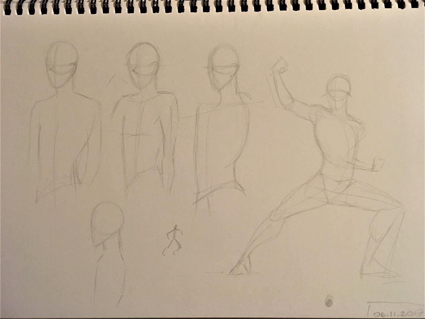

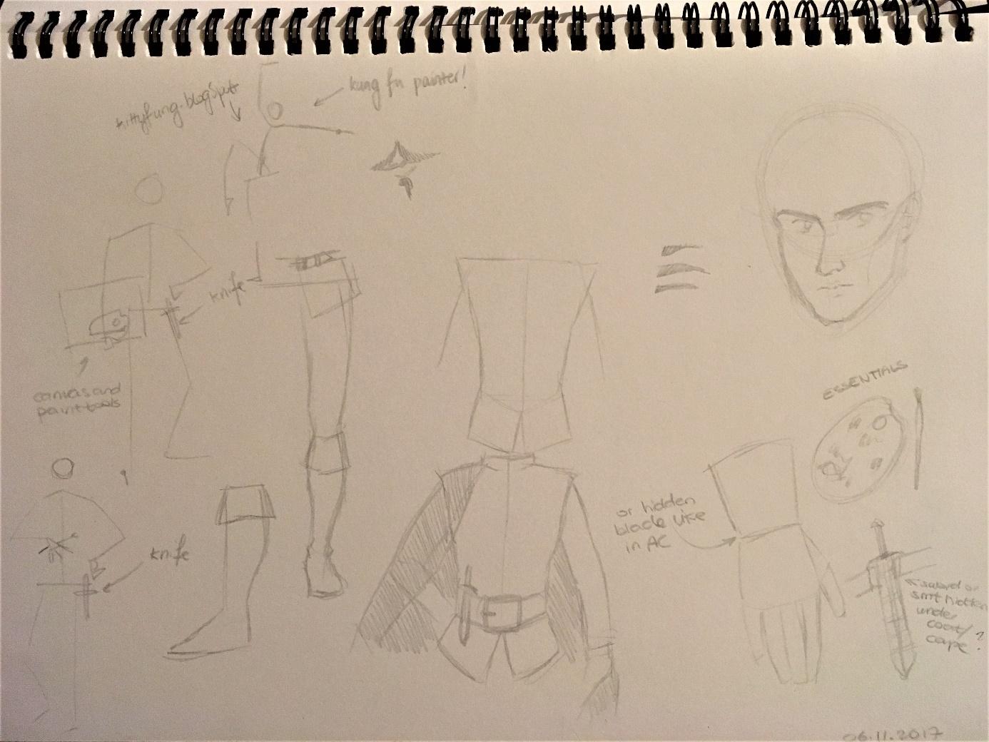
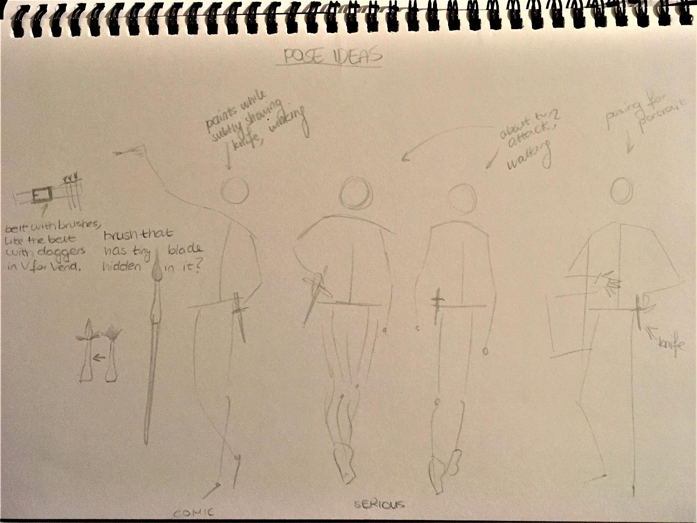
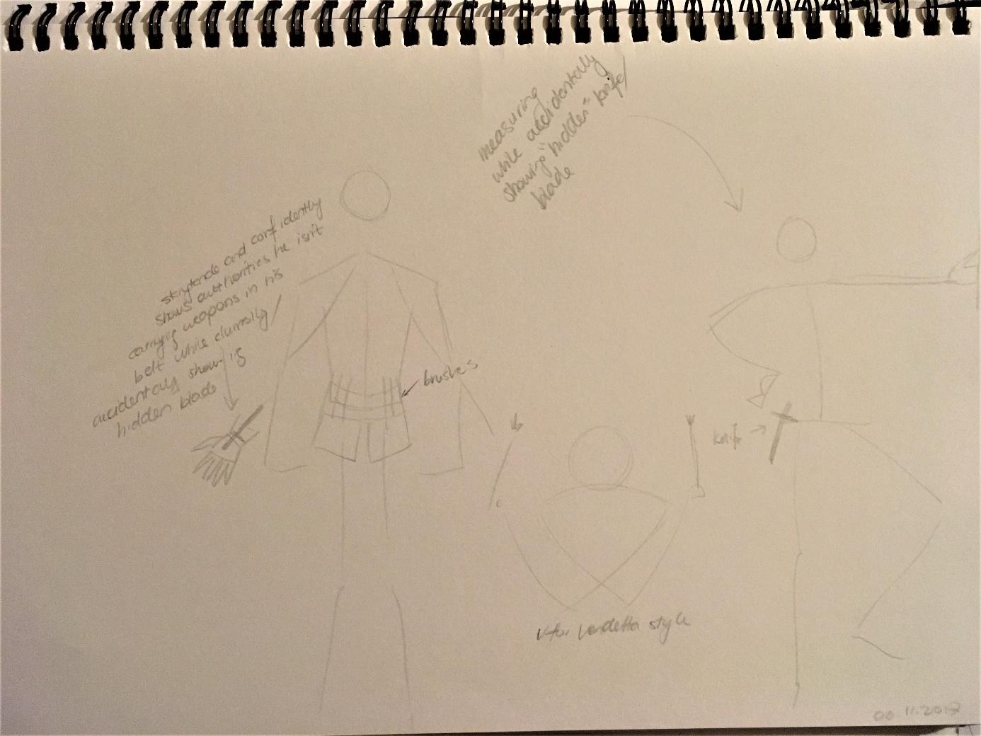
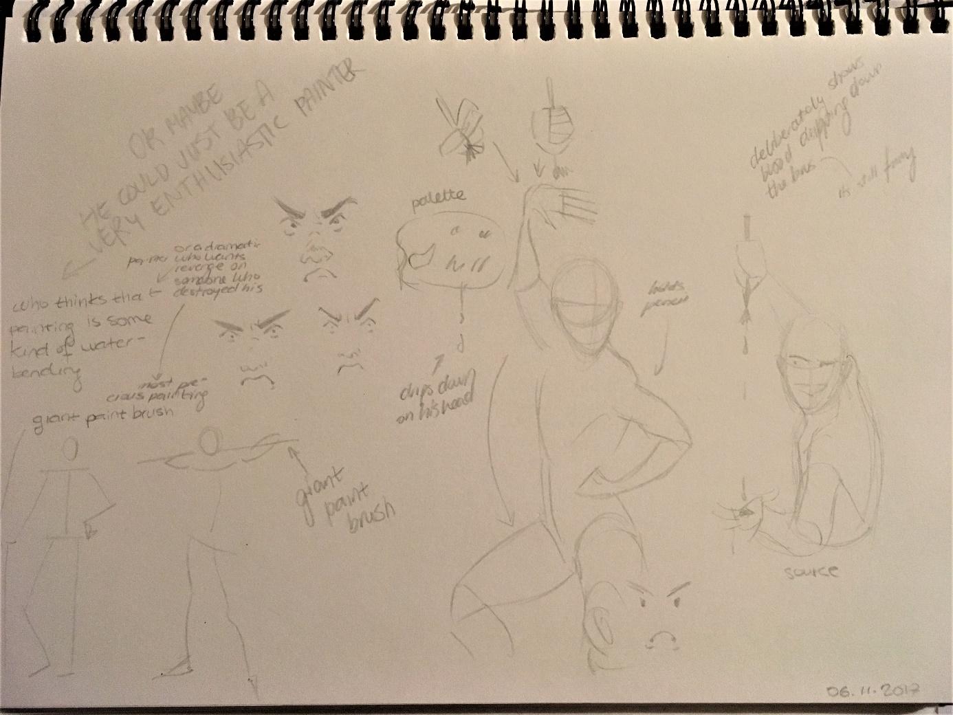
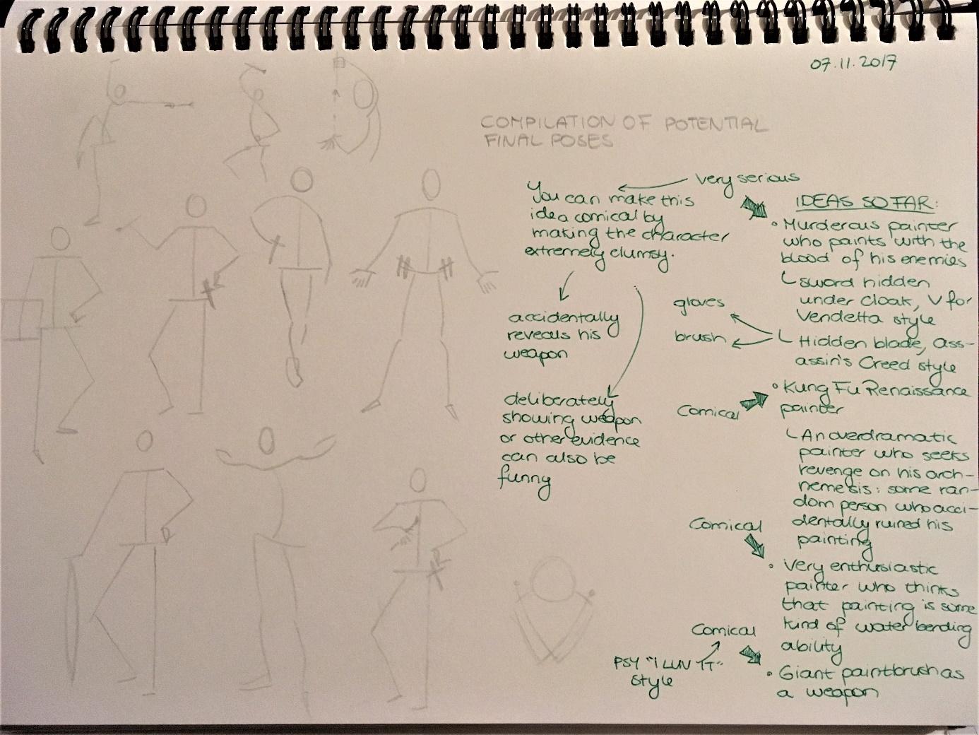
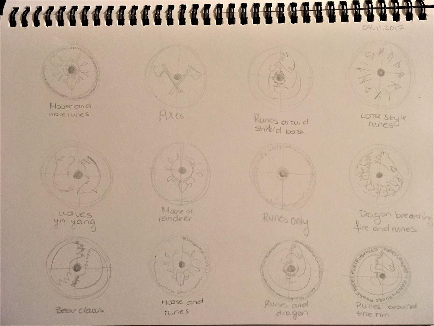
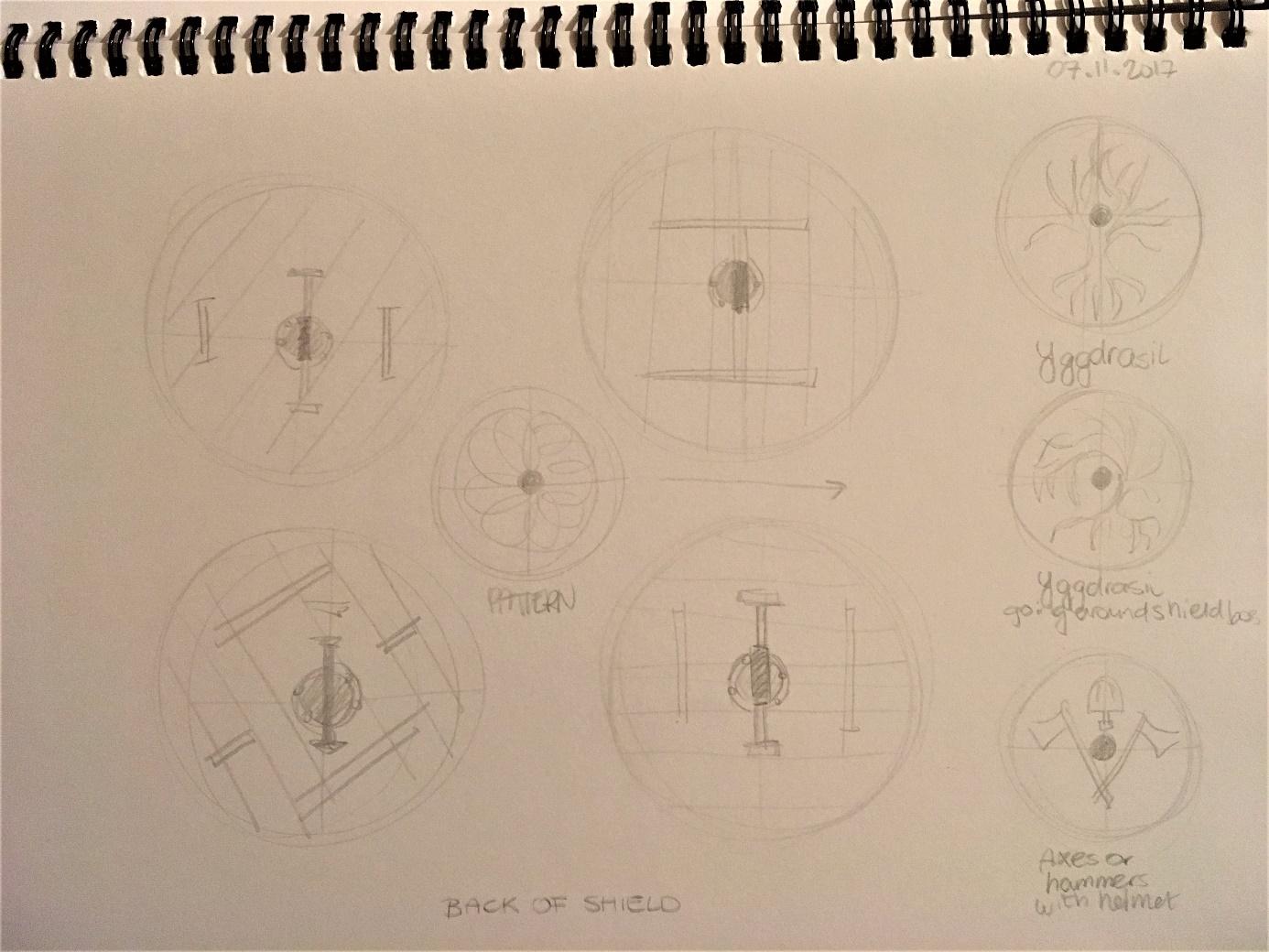
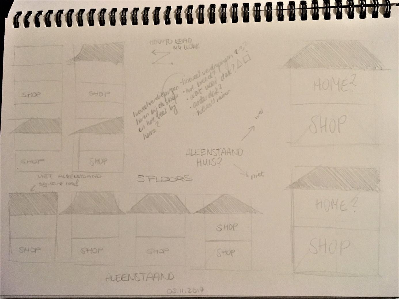
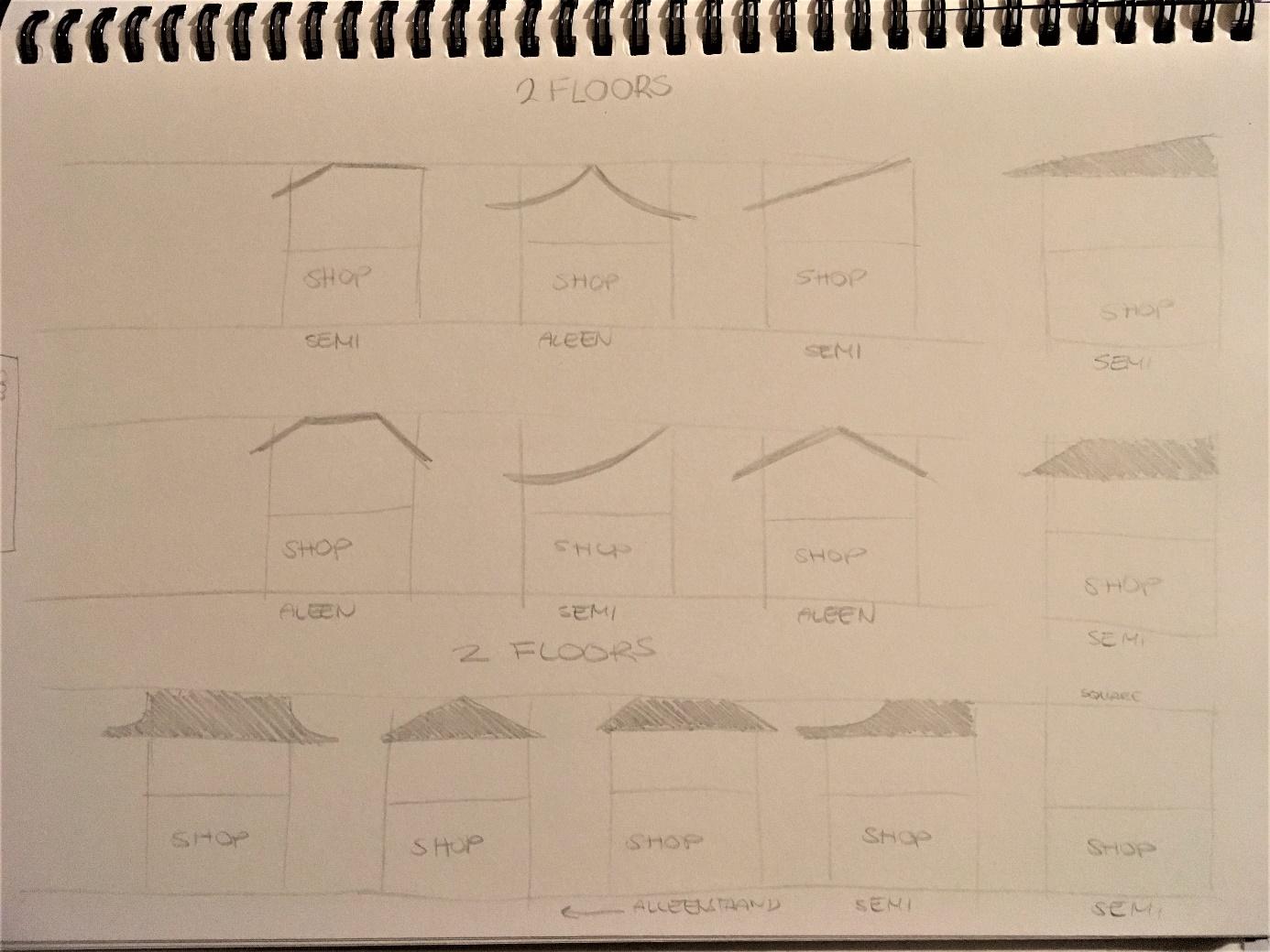

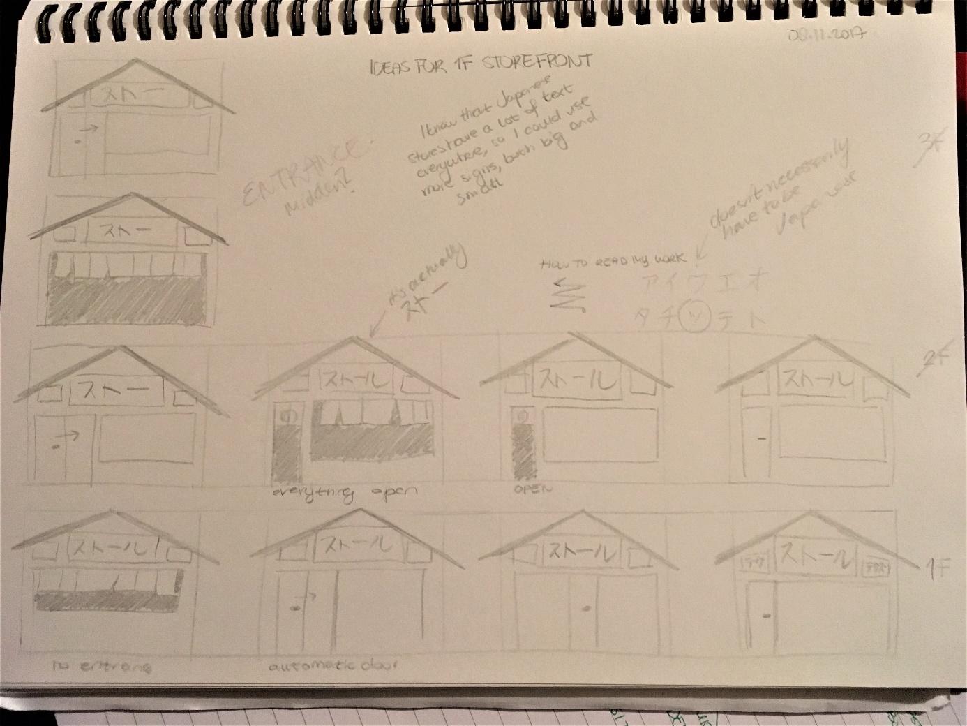

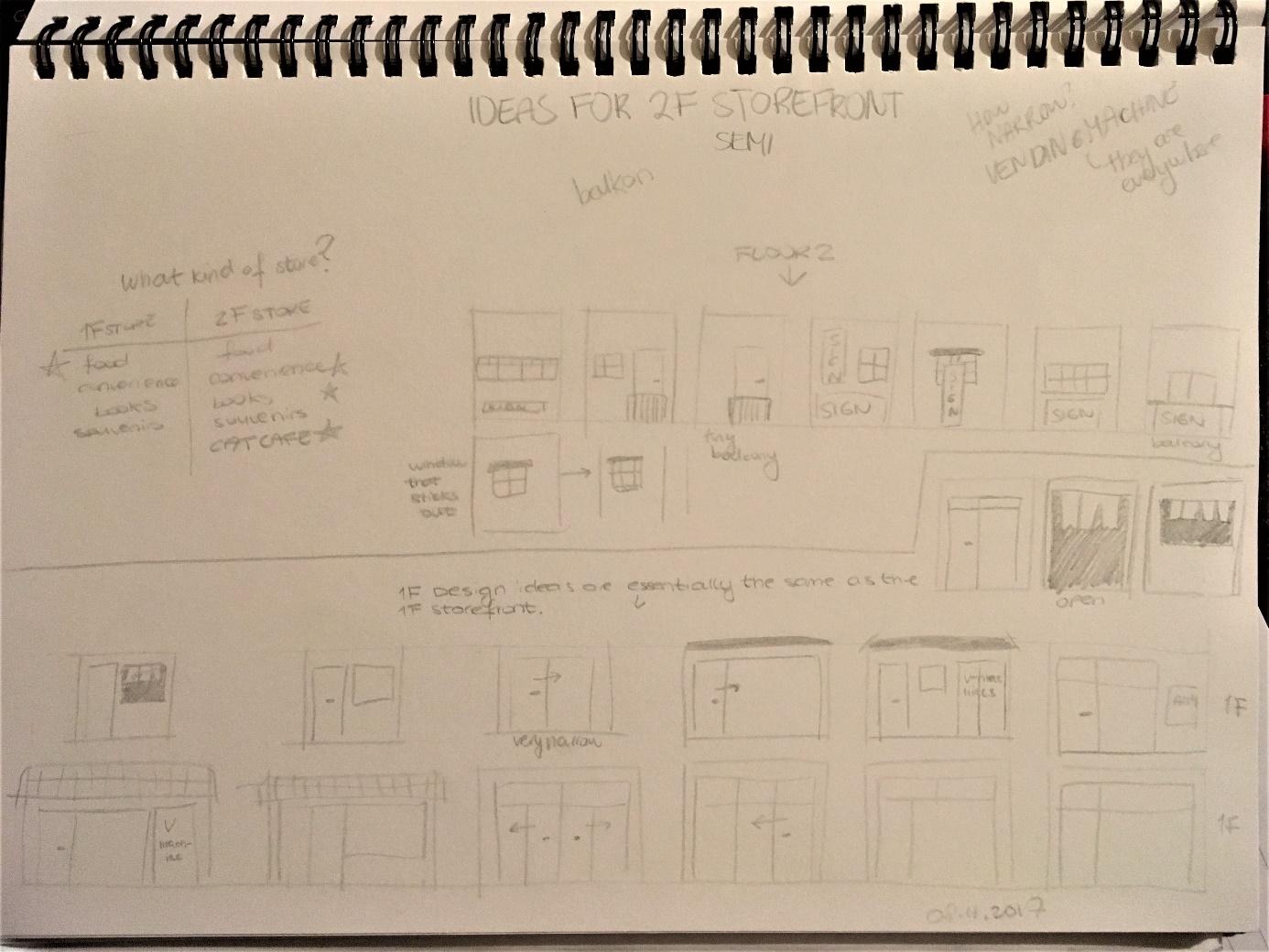
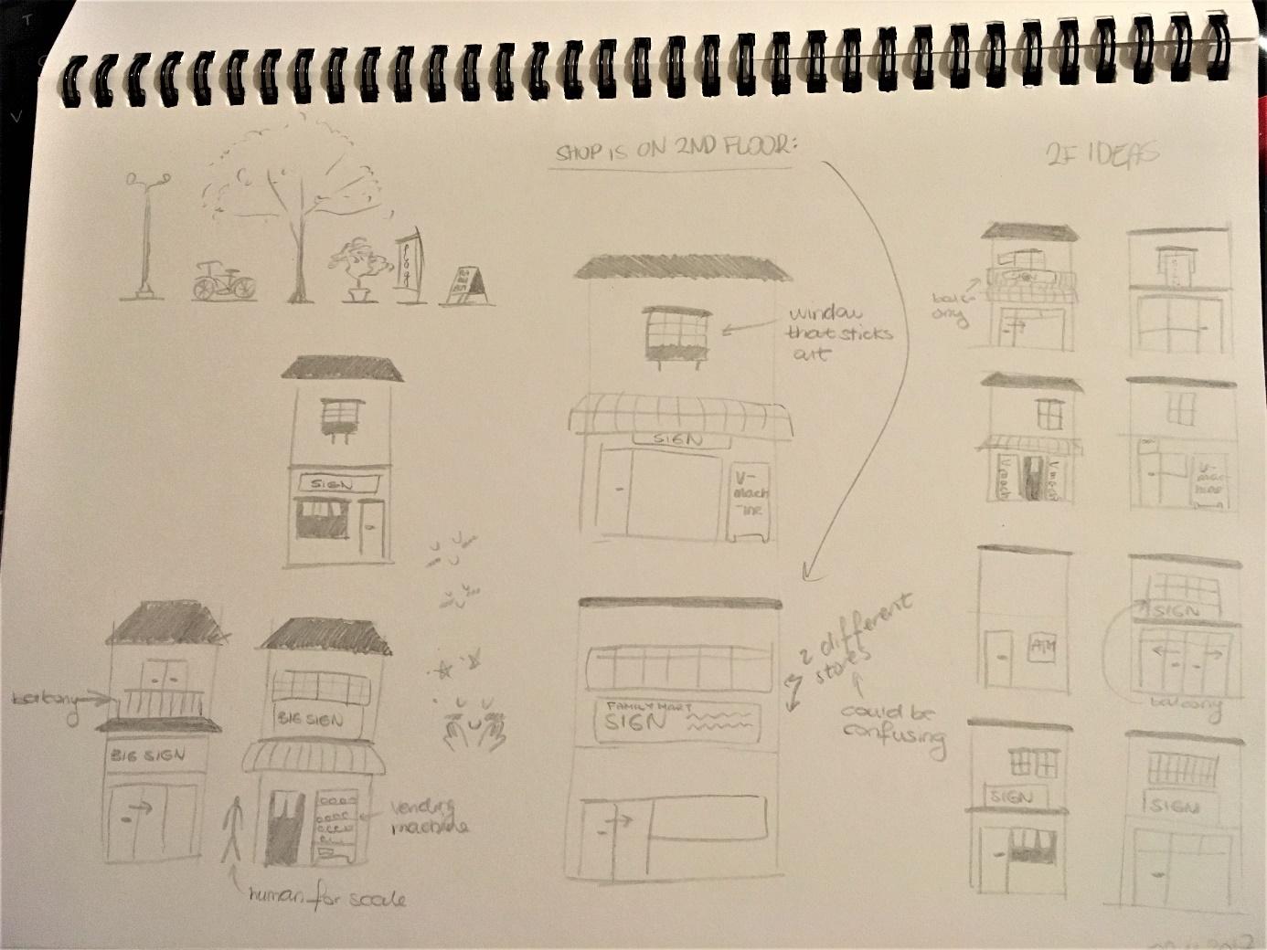
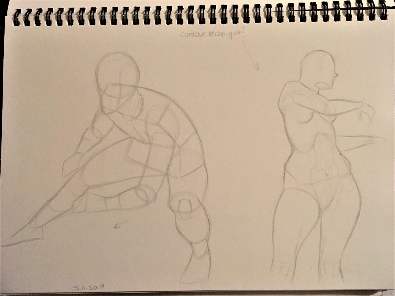
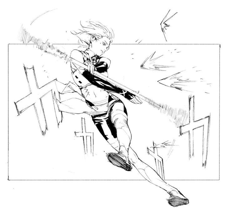


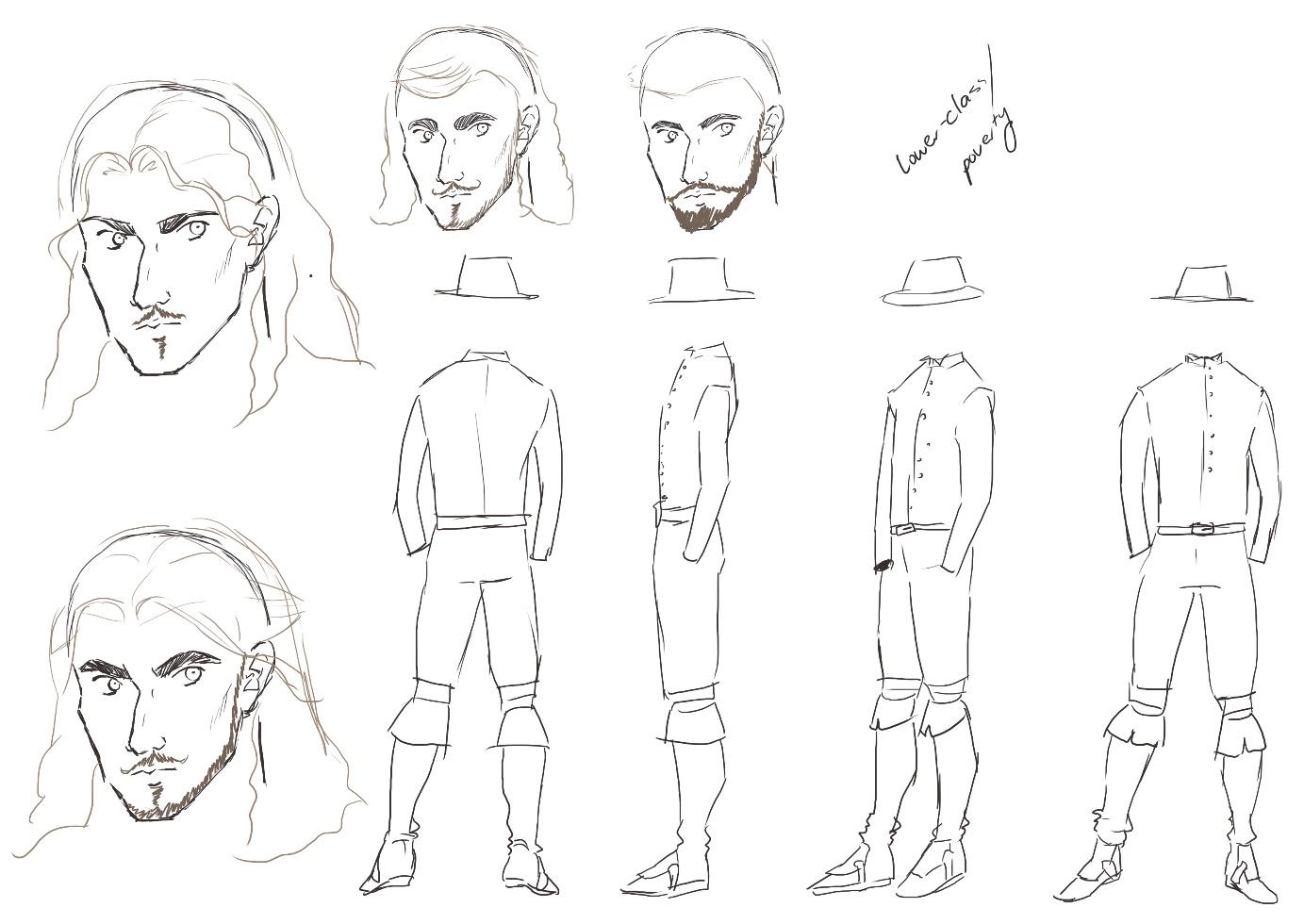
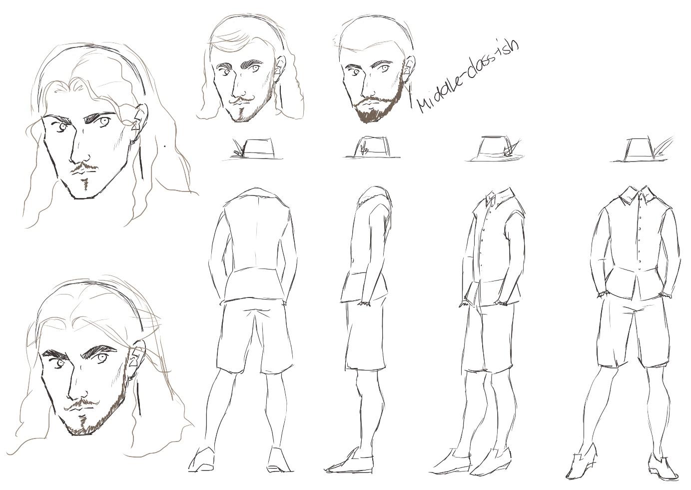
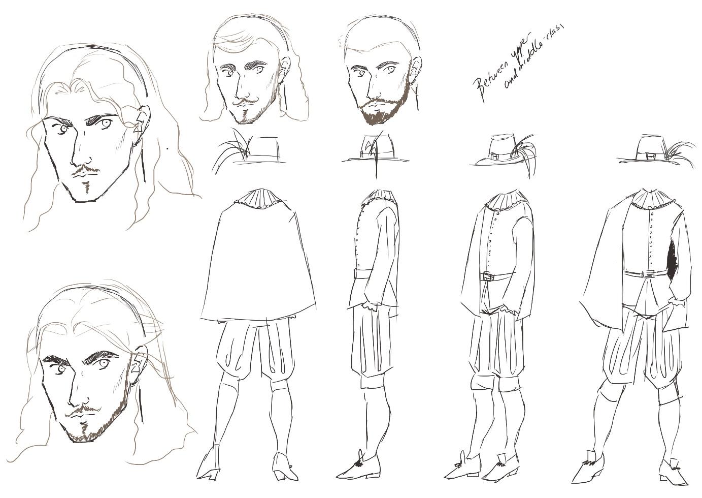
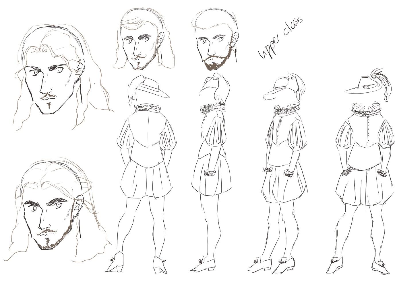

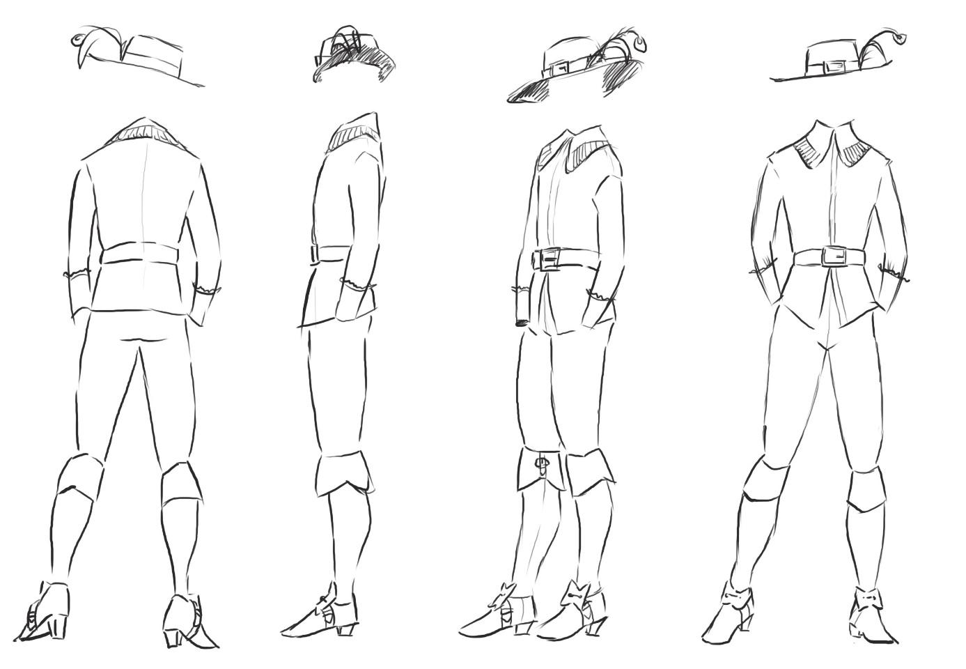
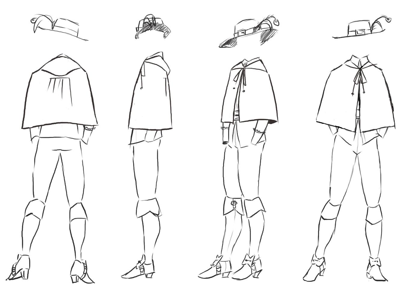
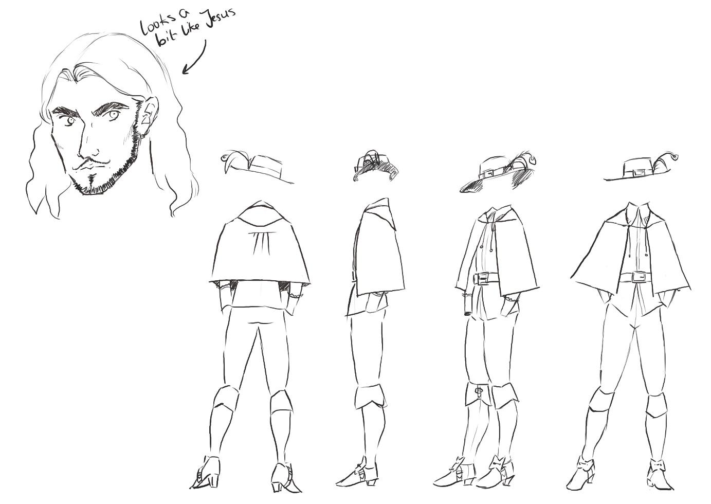
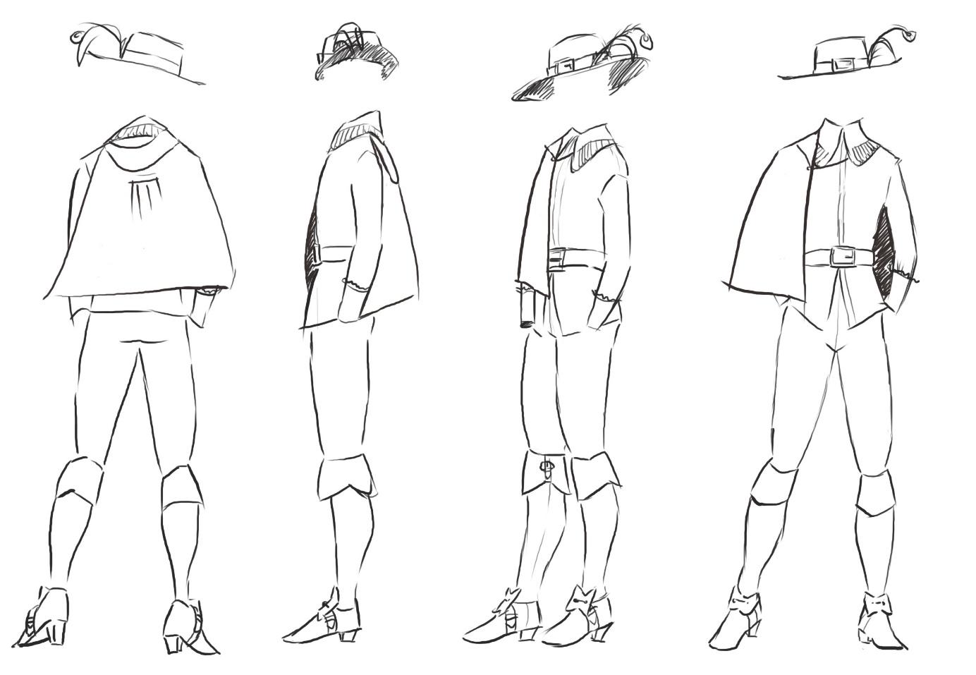
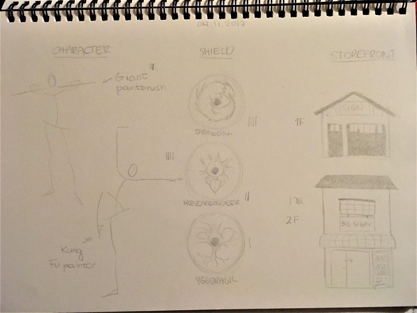
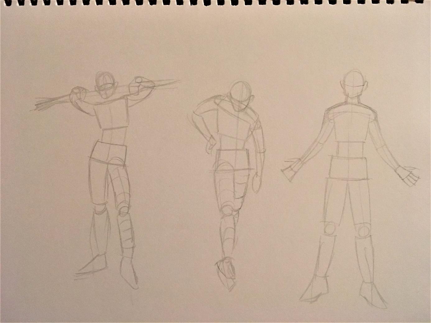
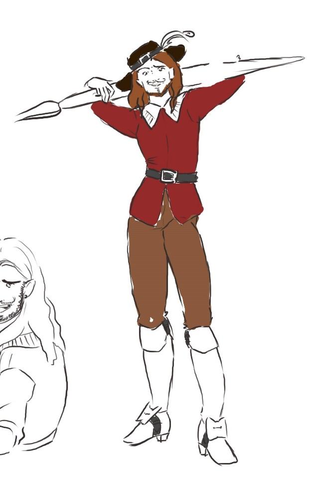
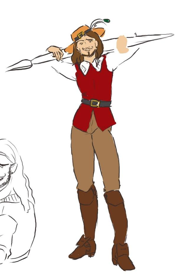
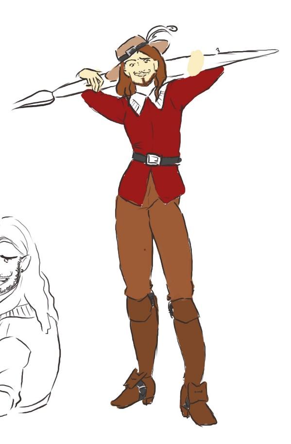
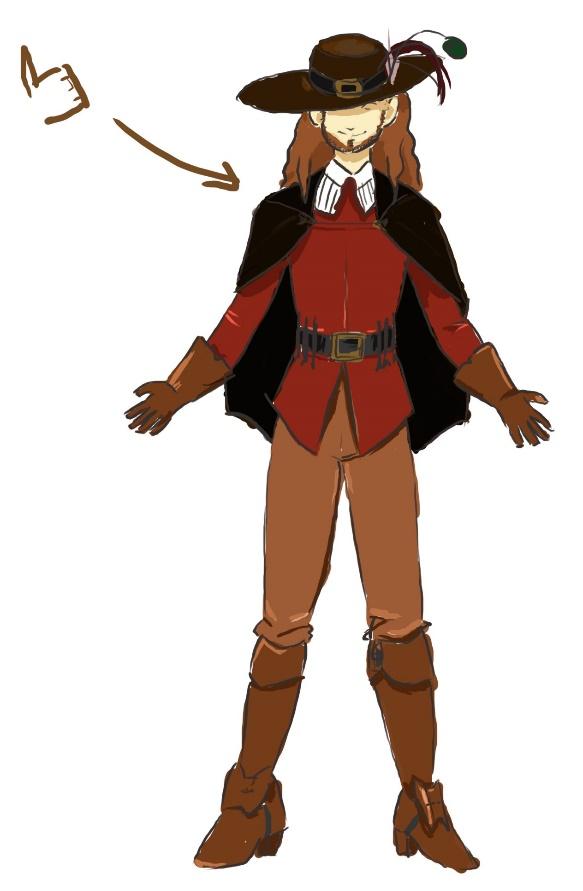
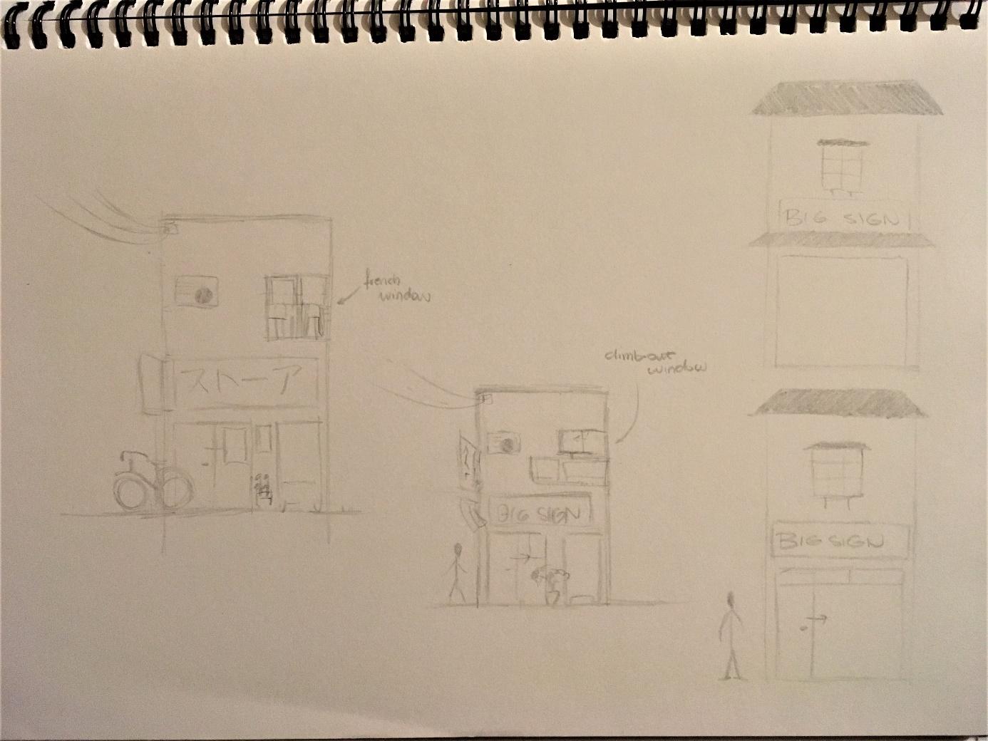
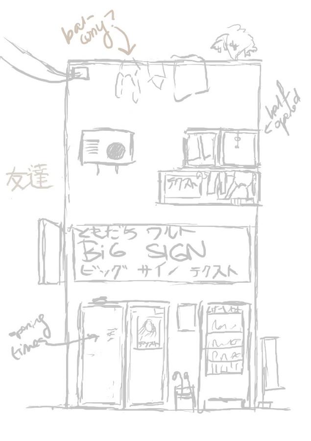


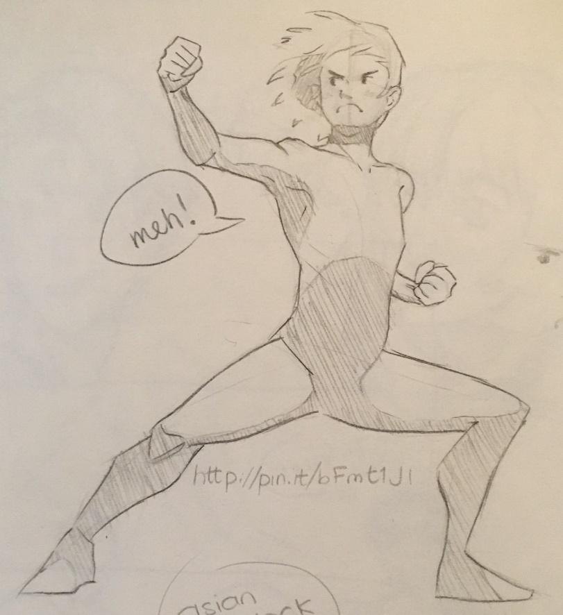
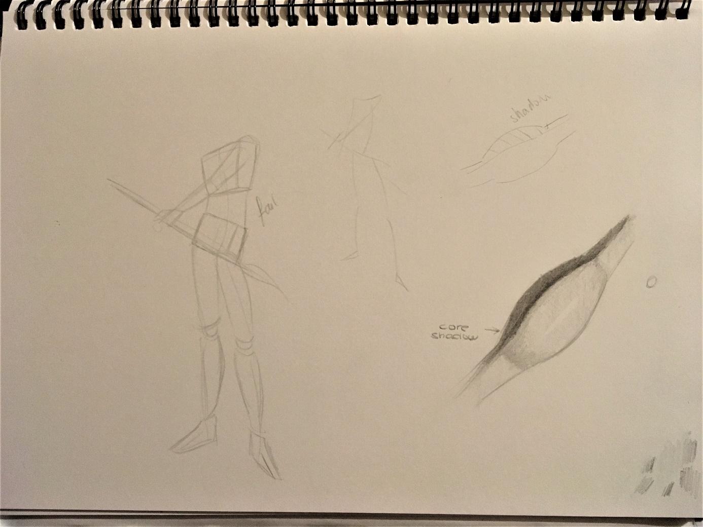


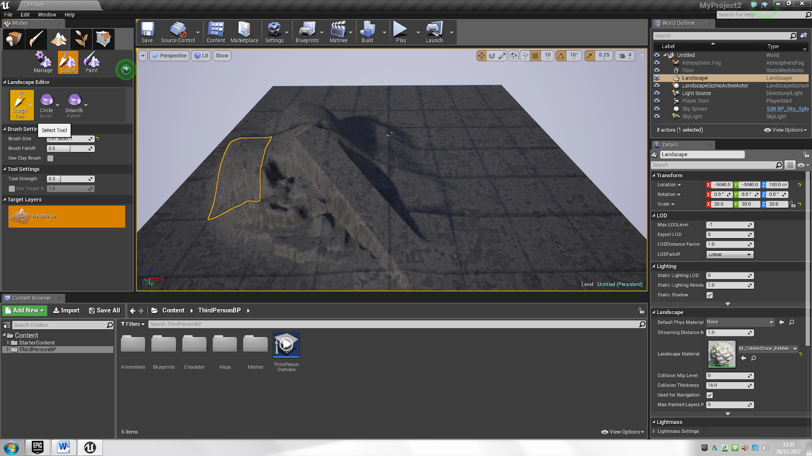
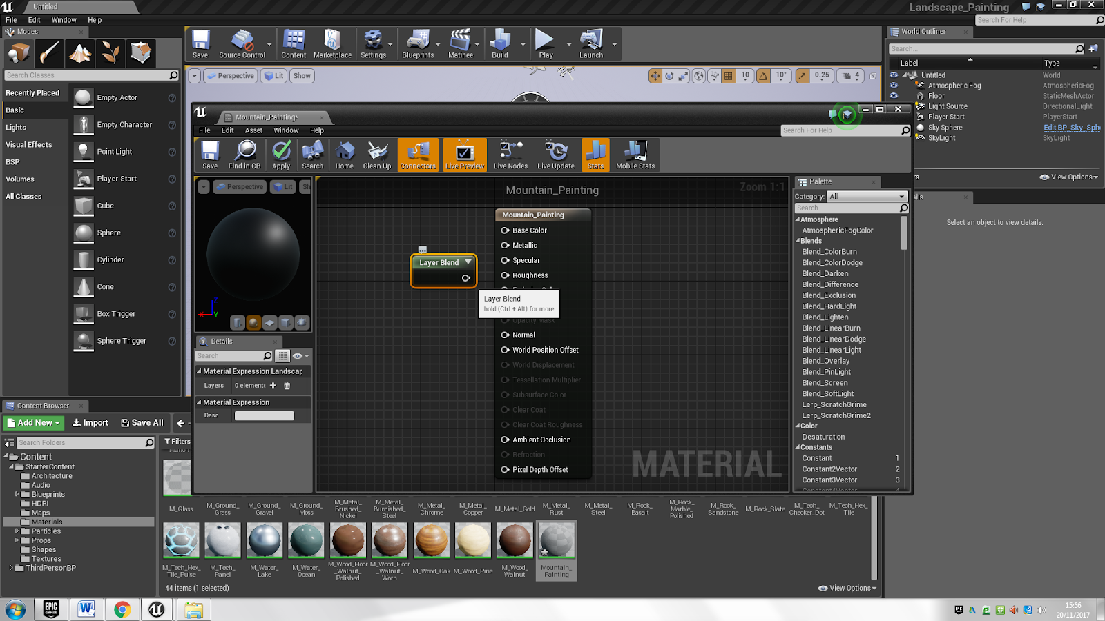


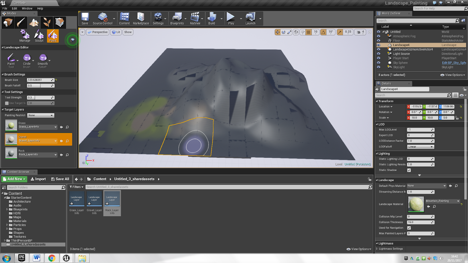
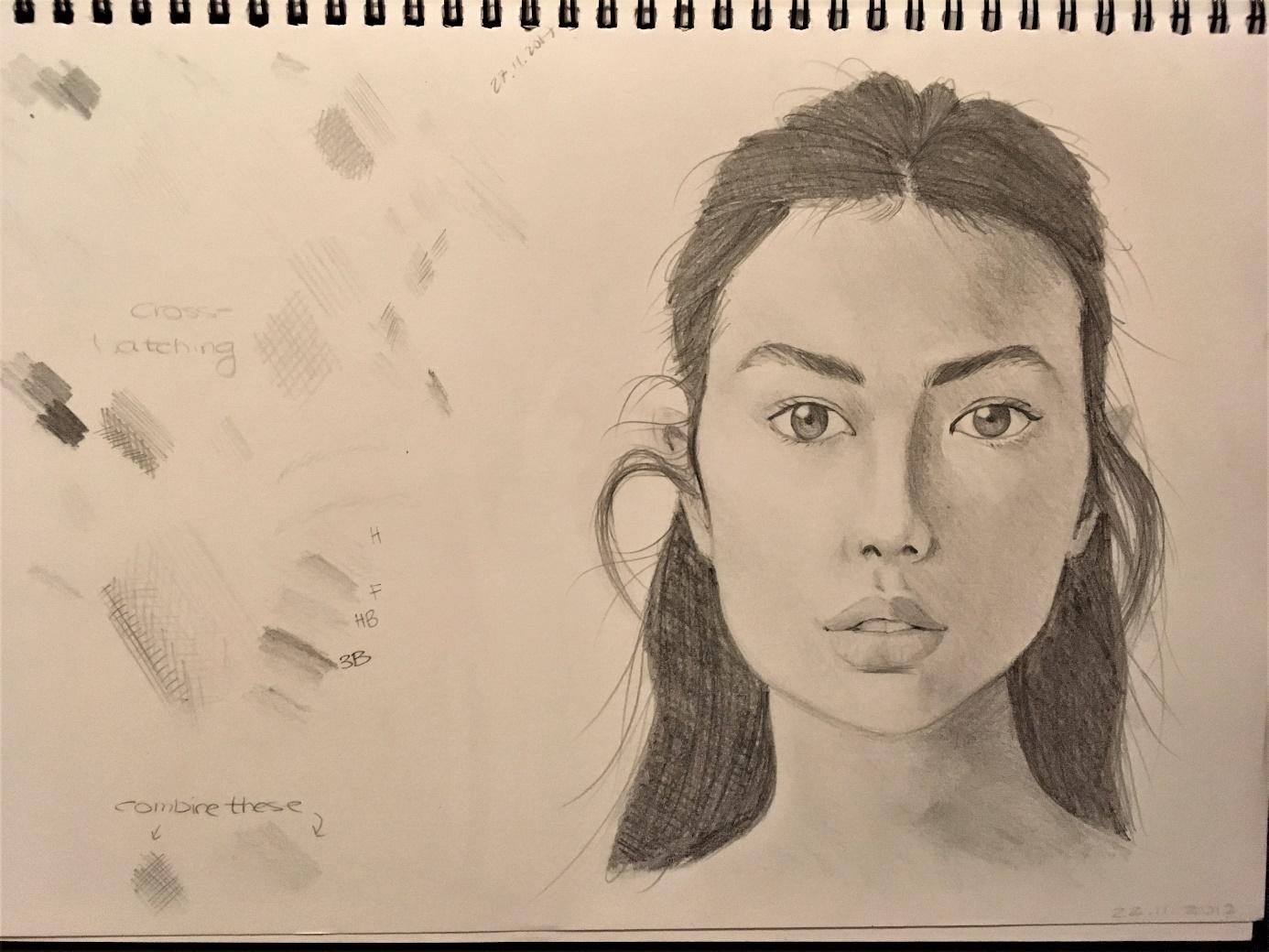

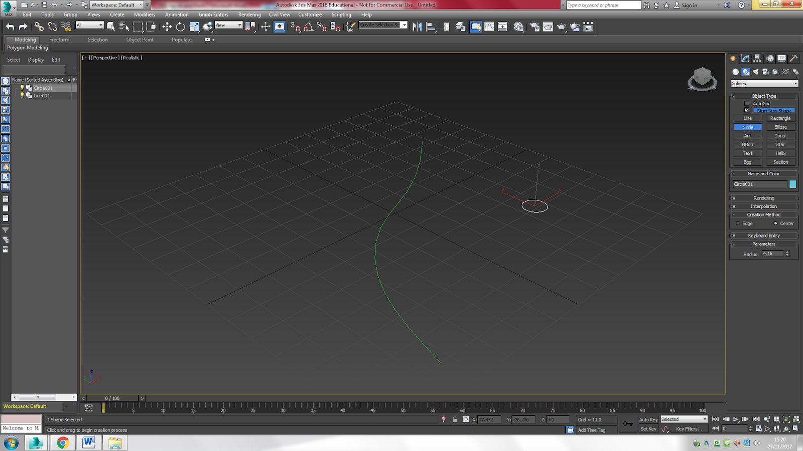


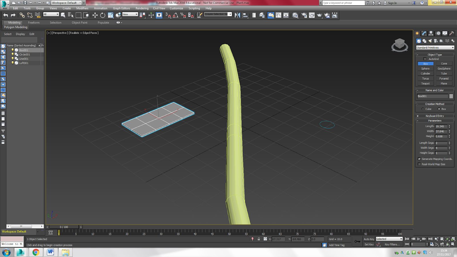


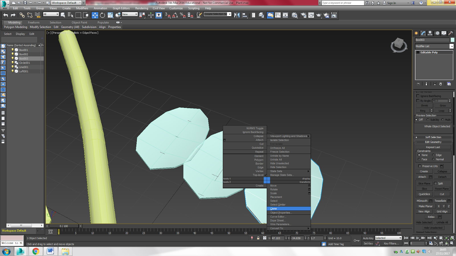

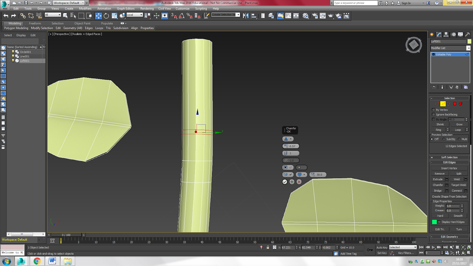
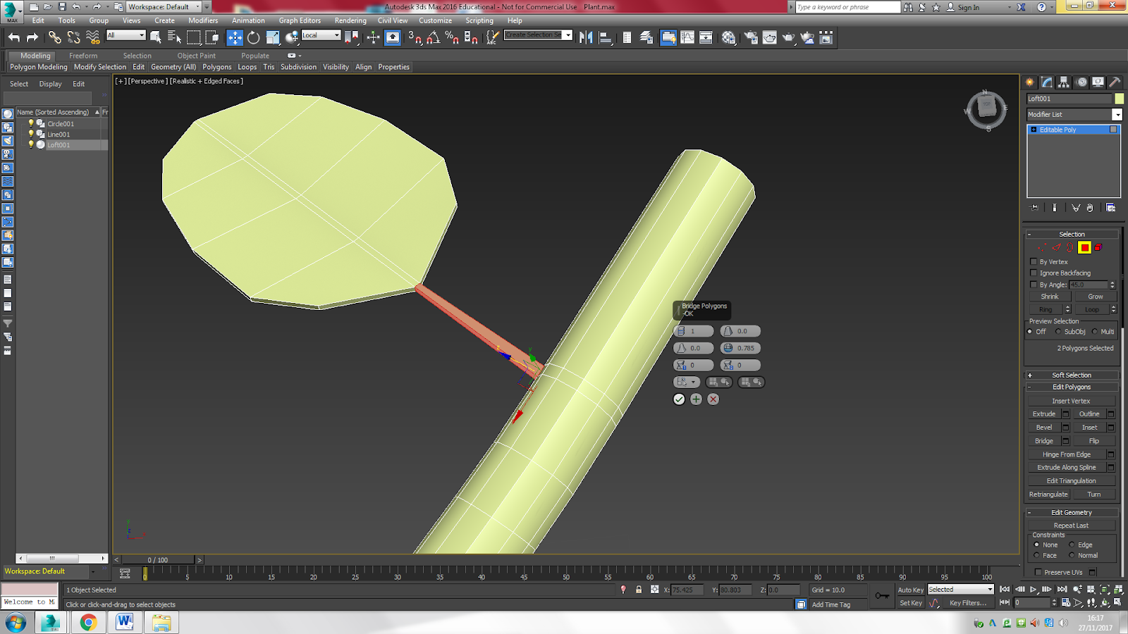
 This was the result. I like how the plant/vine turned out. After completing this tutorial, it seems pretty easy to create something like this.
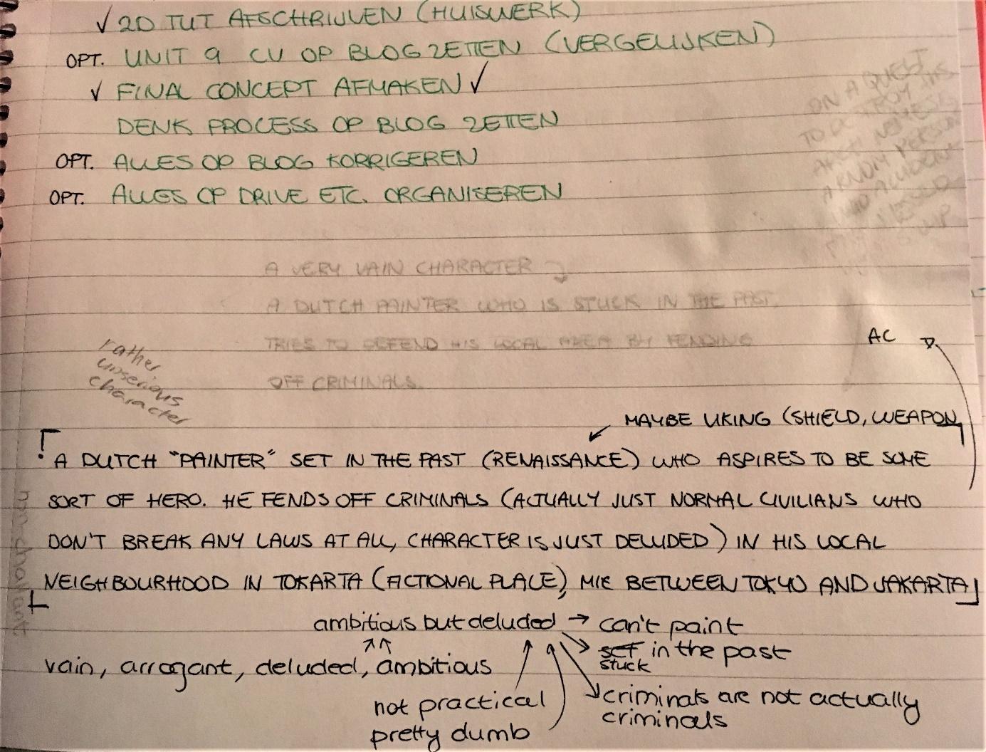
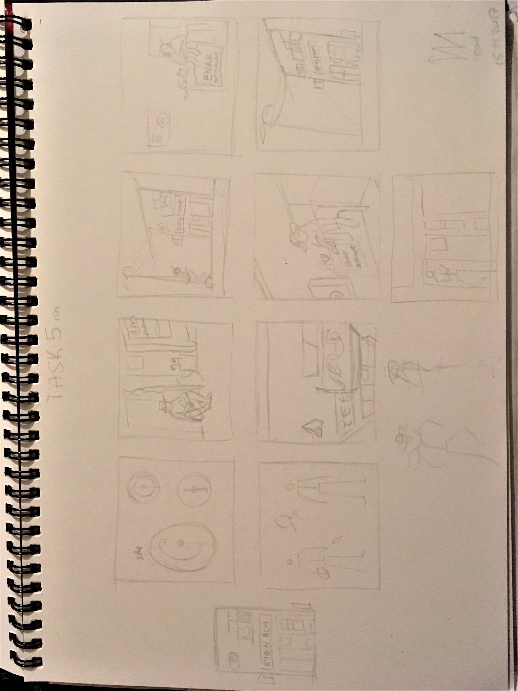
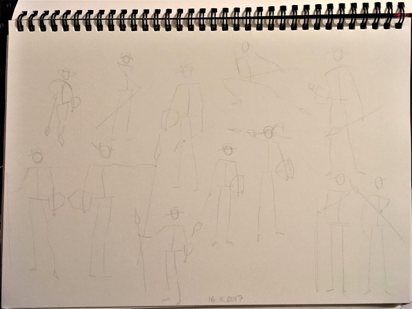
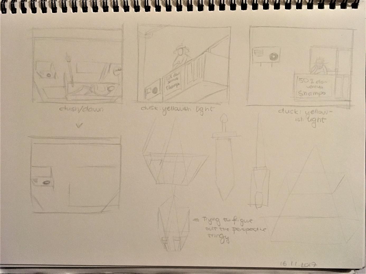

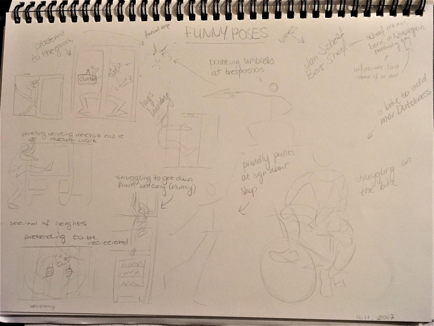

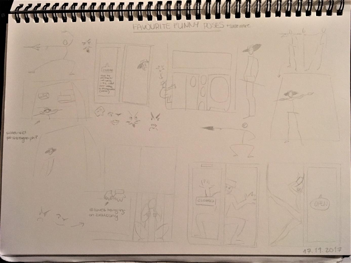
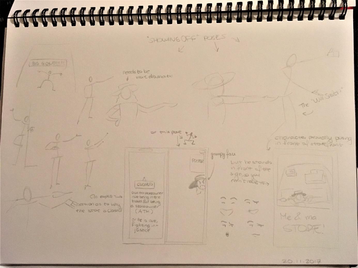
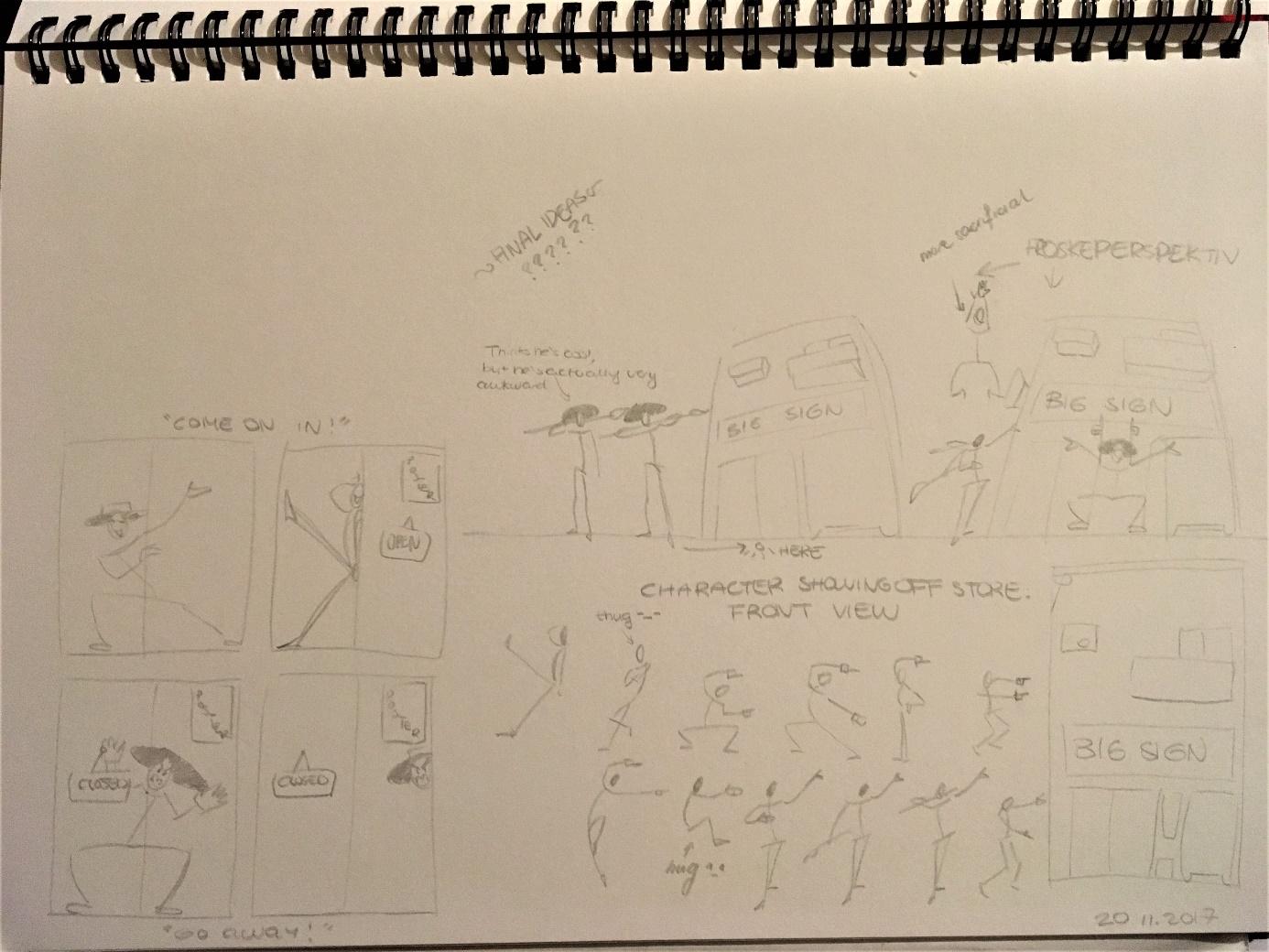

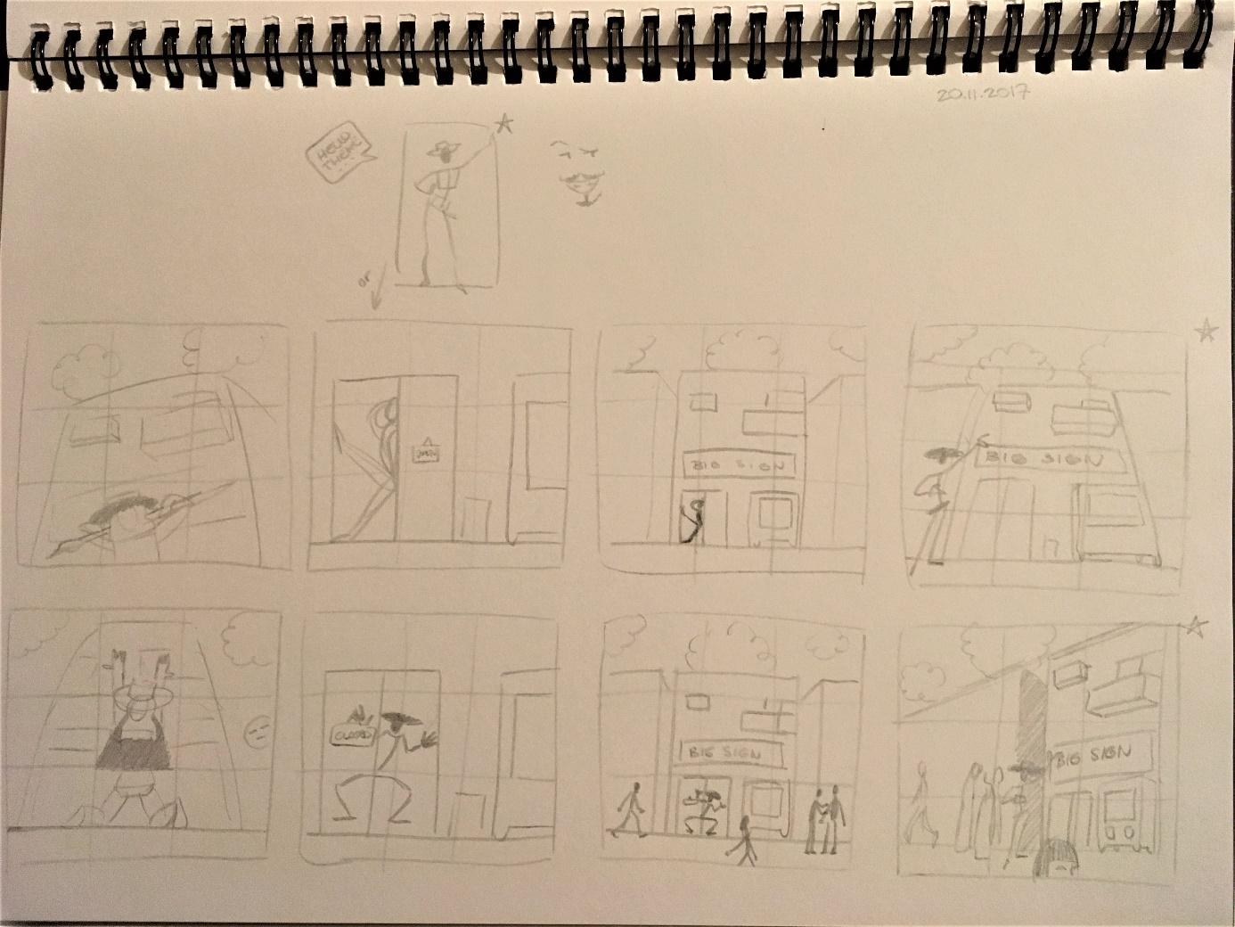

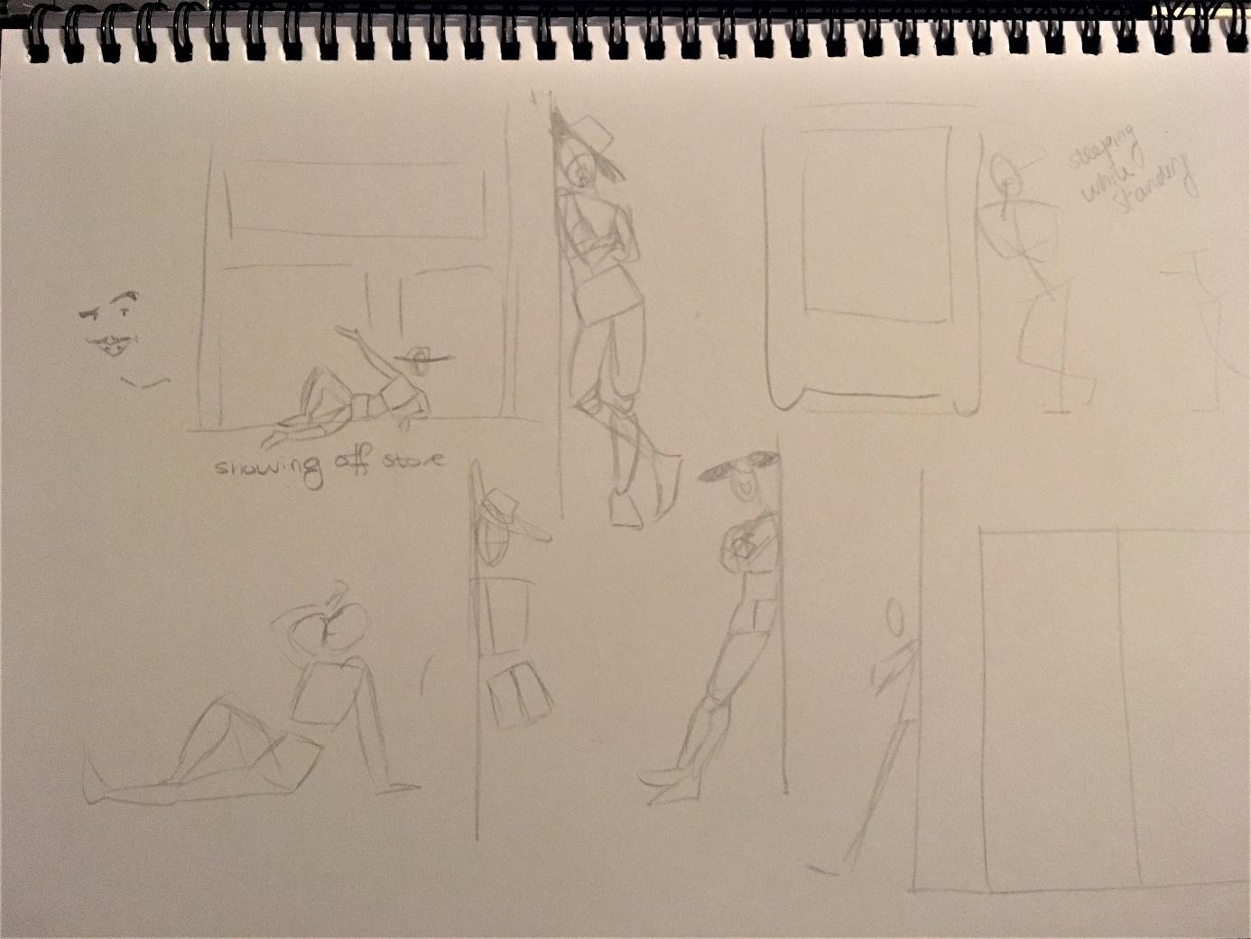
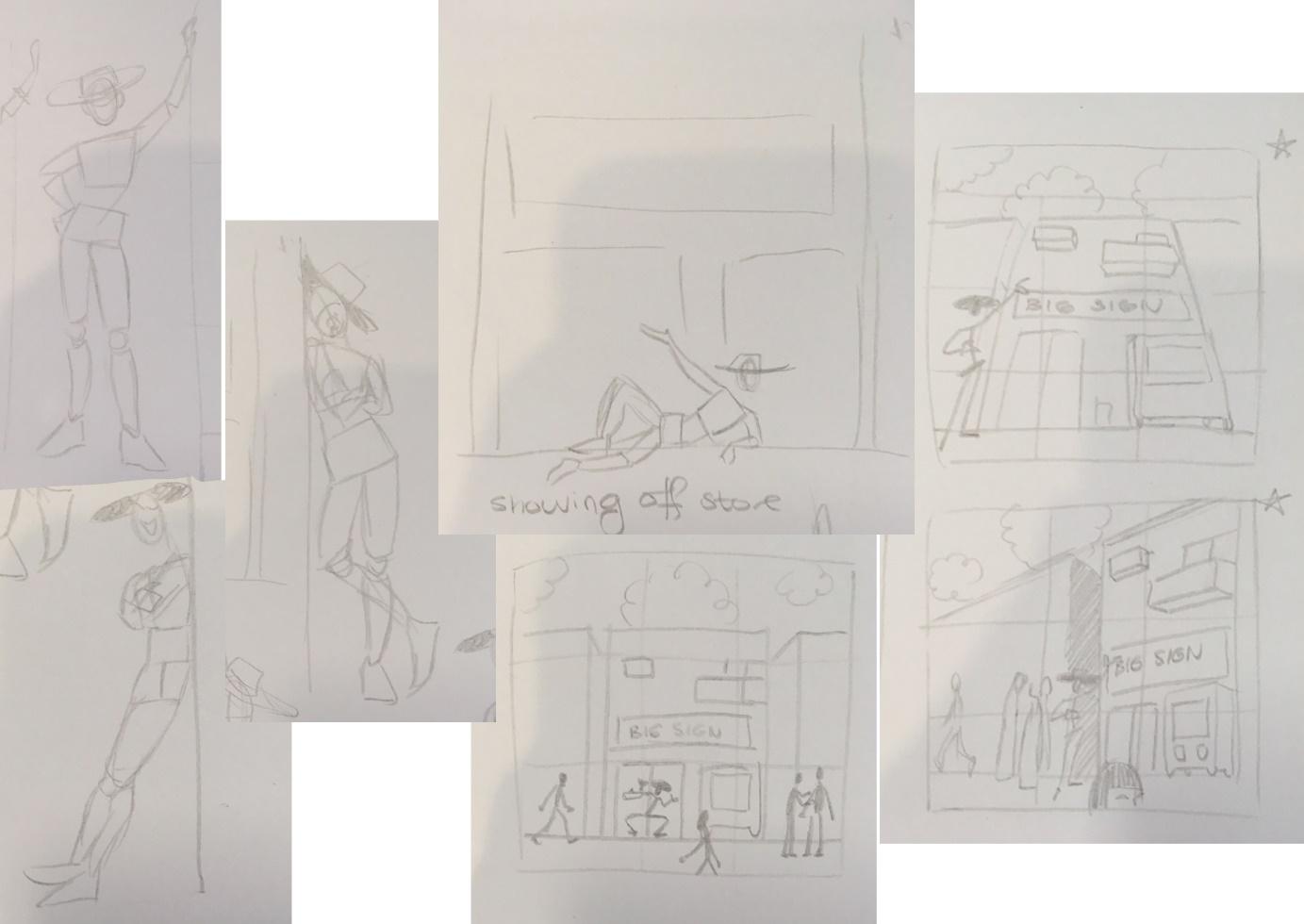
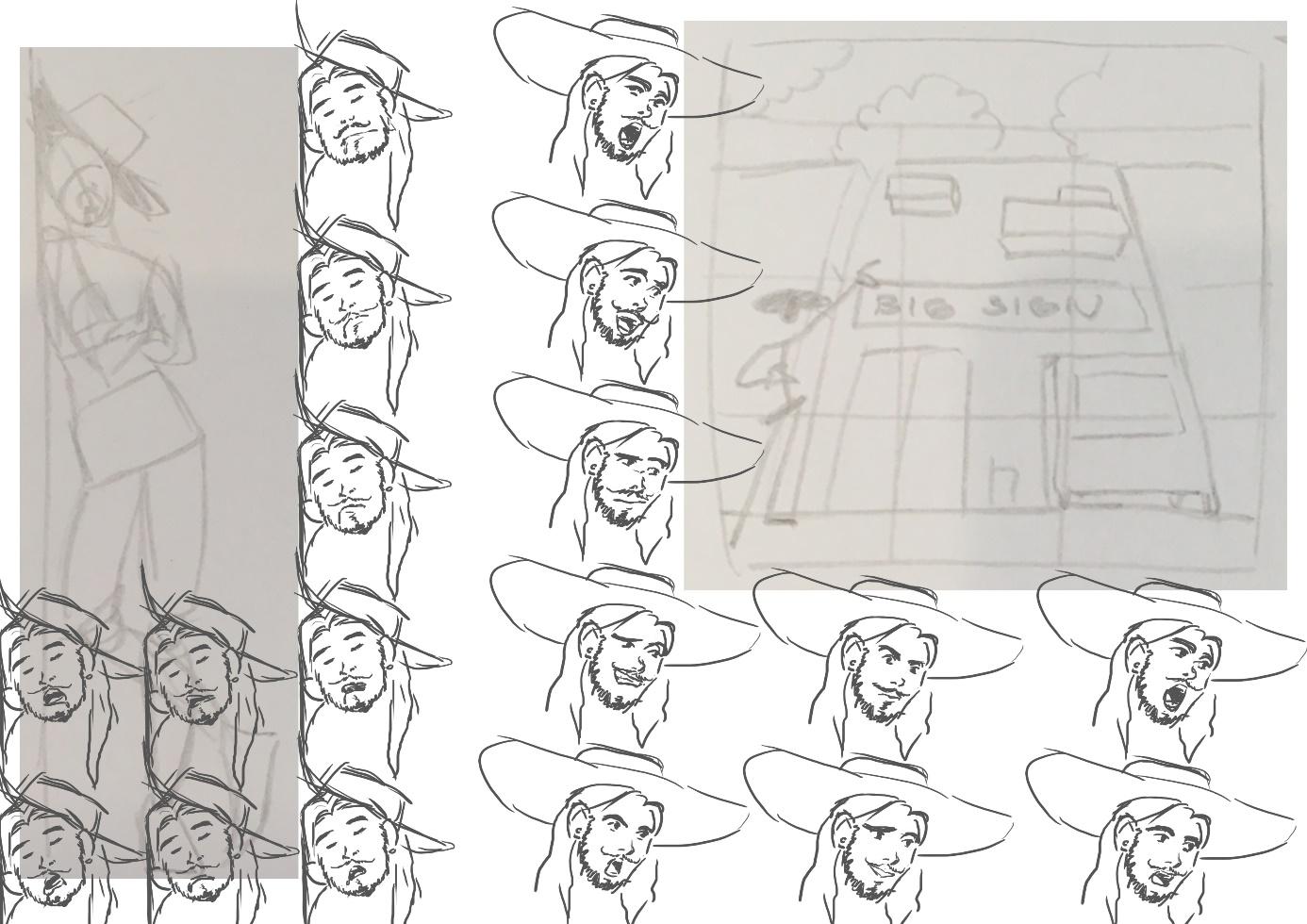

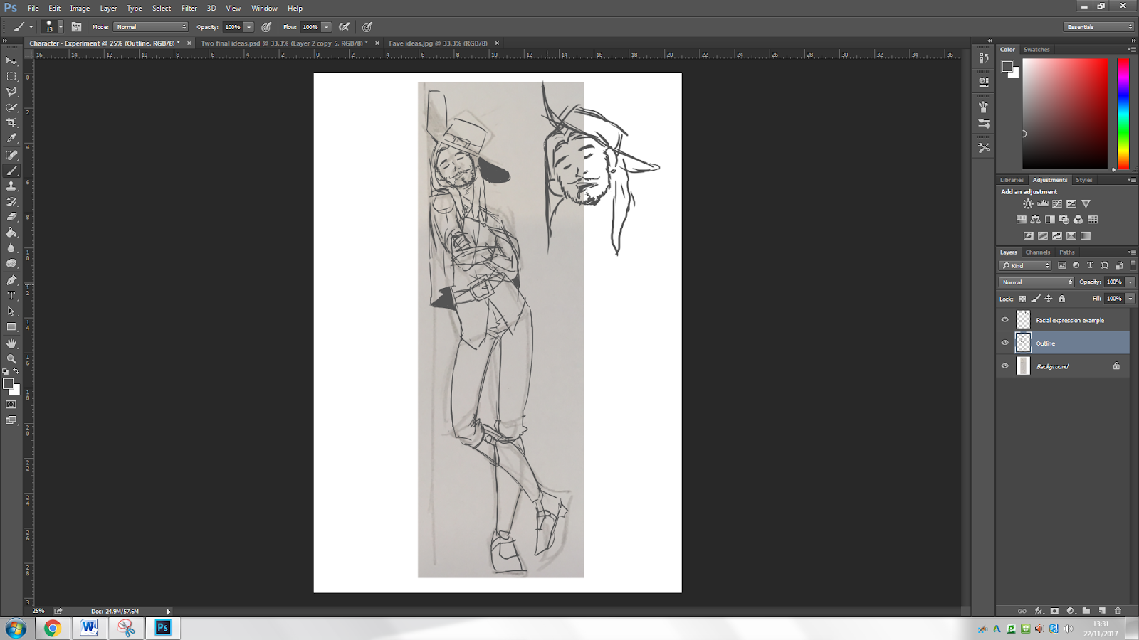
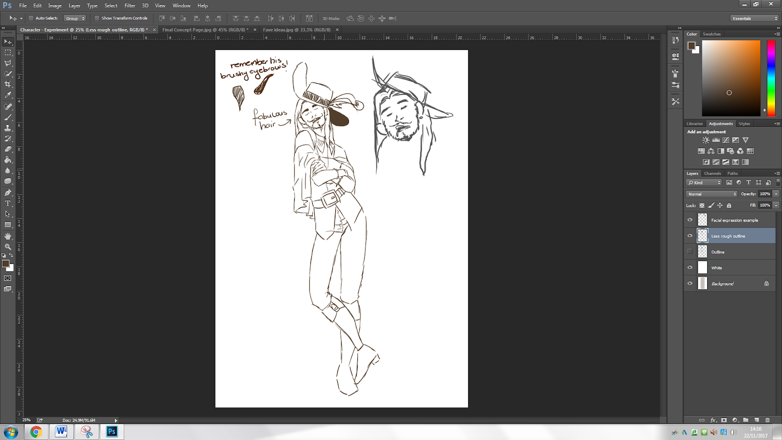


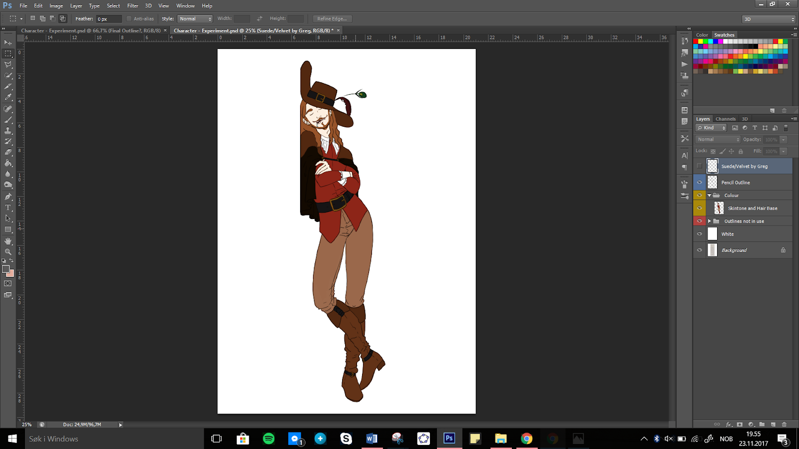

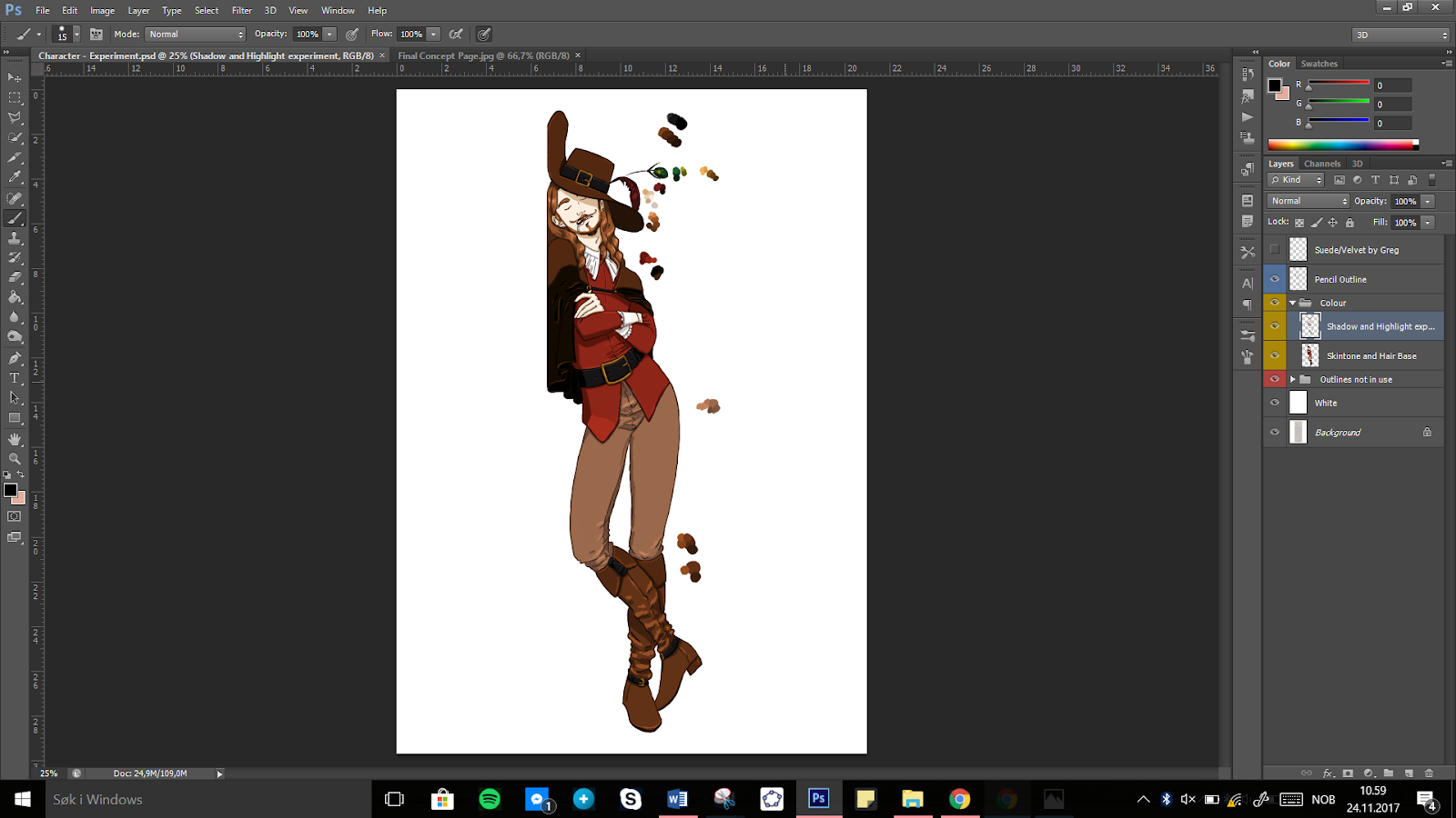
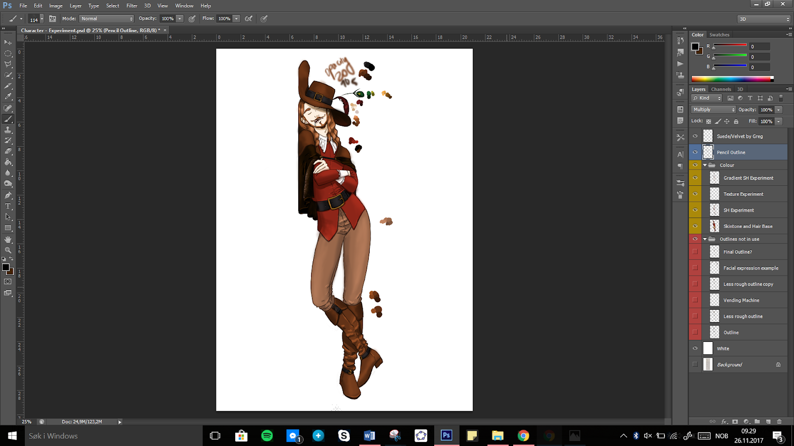
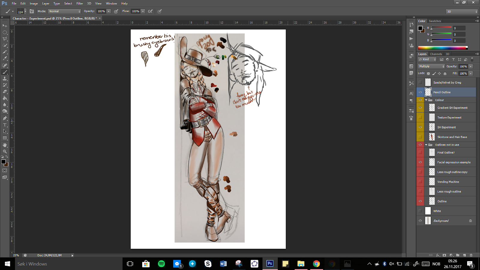
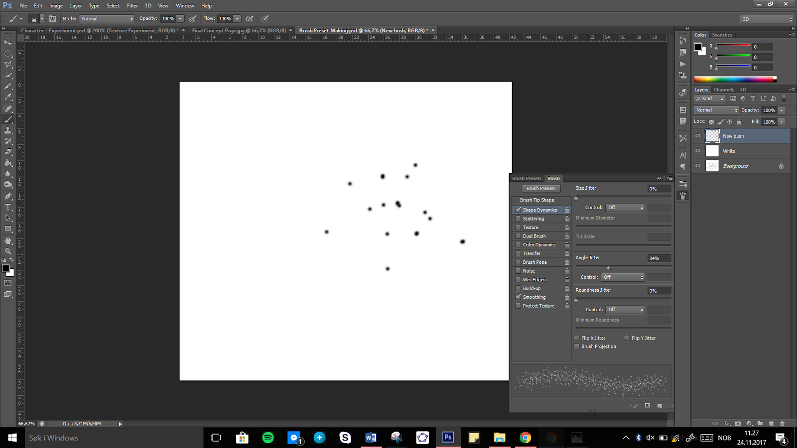
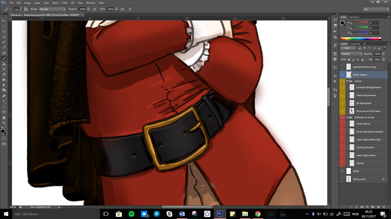
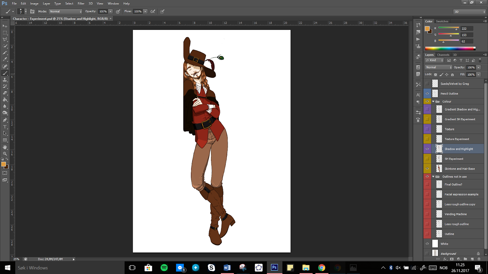
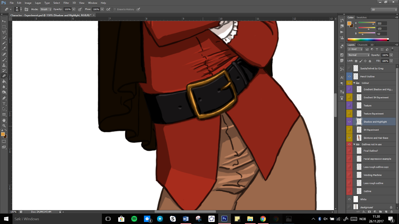
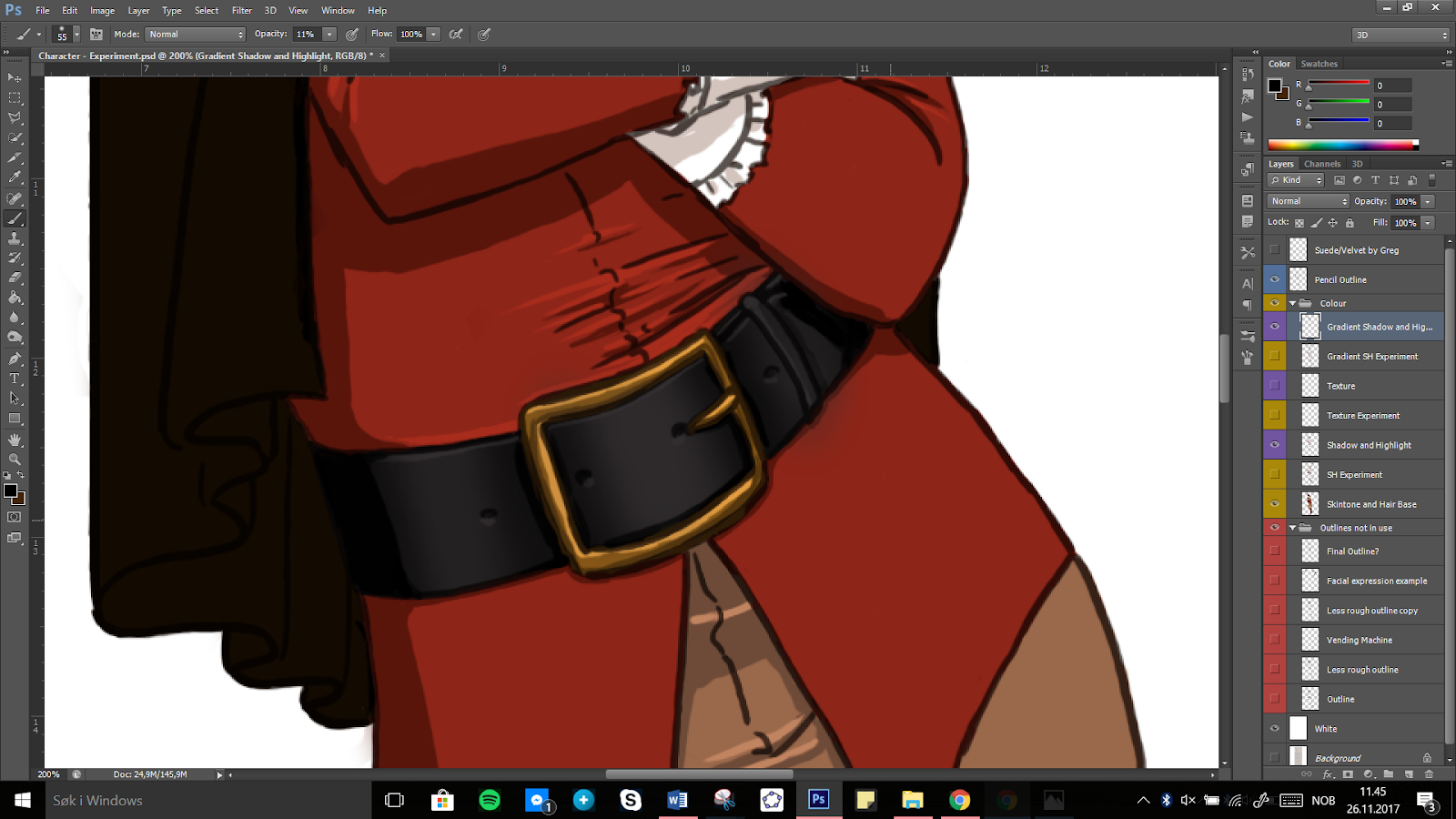
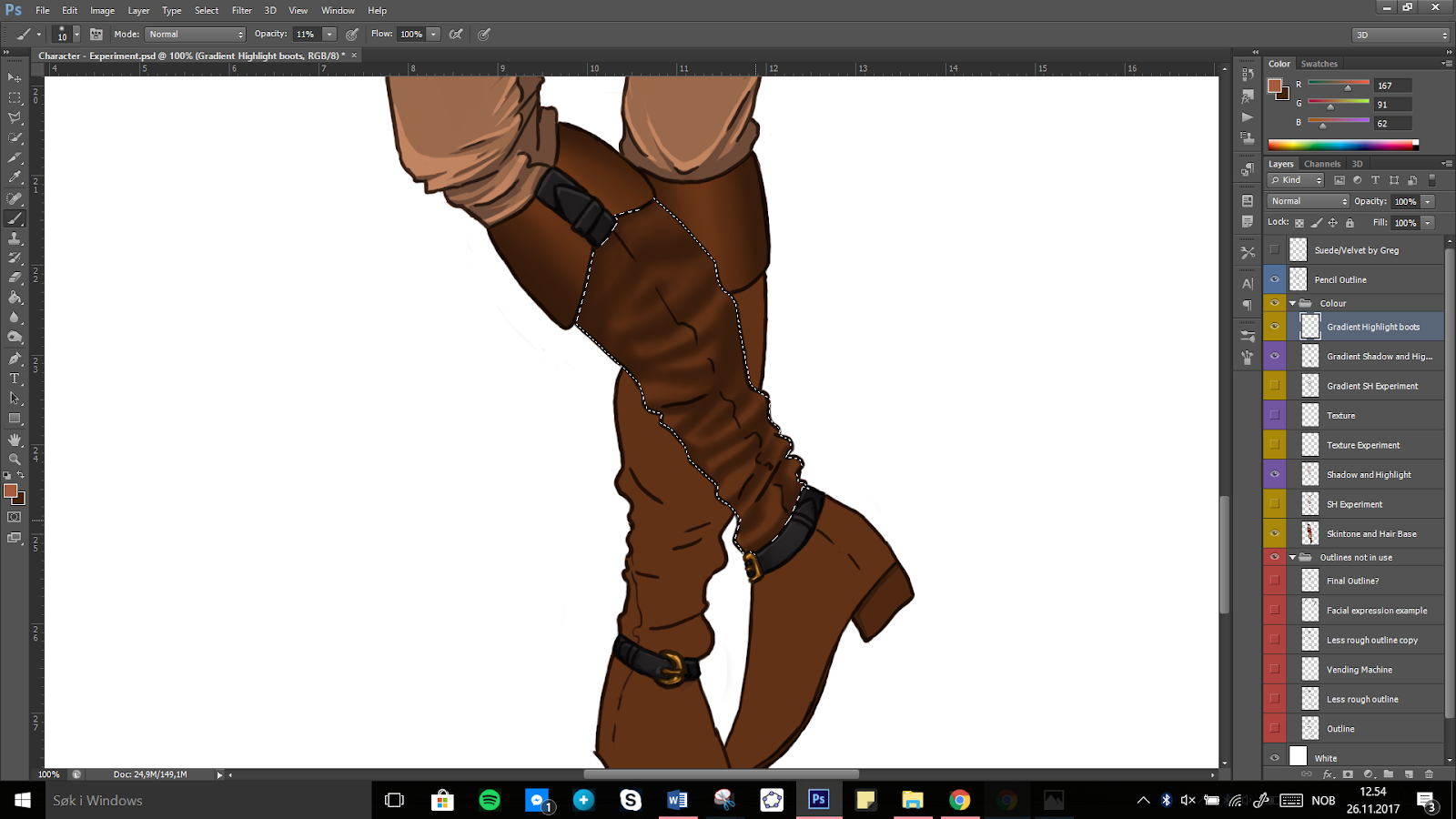


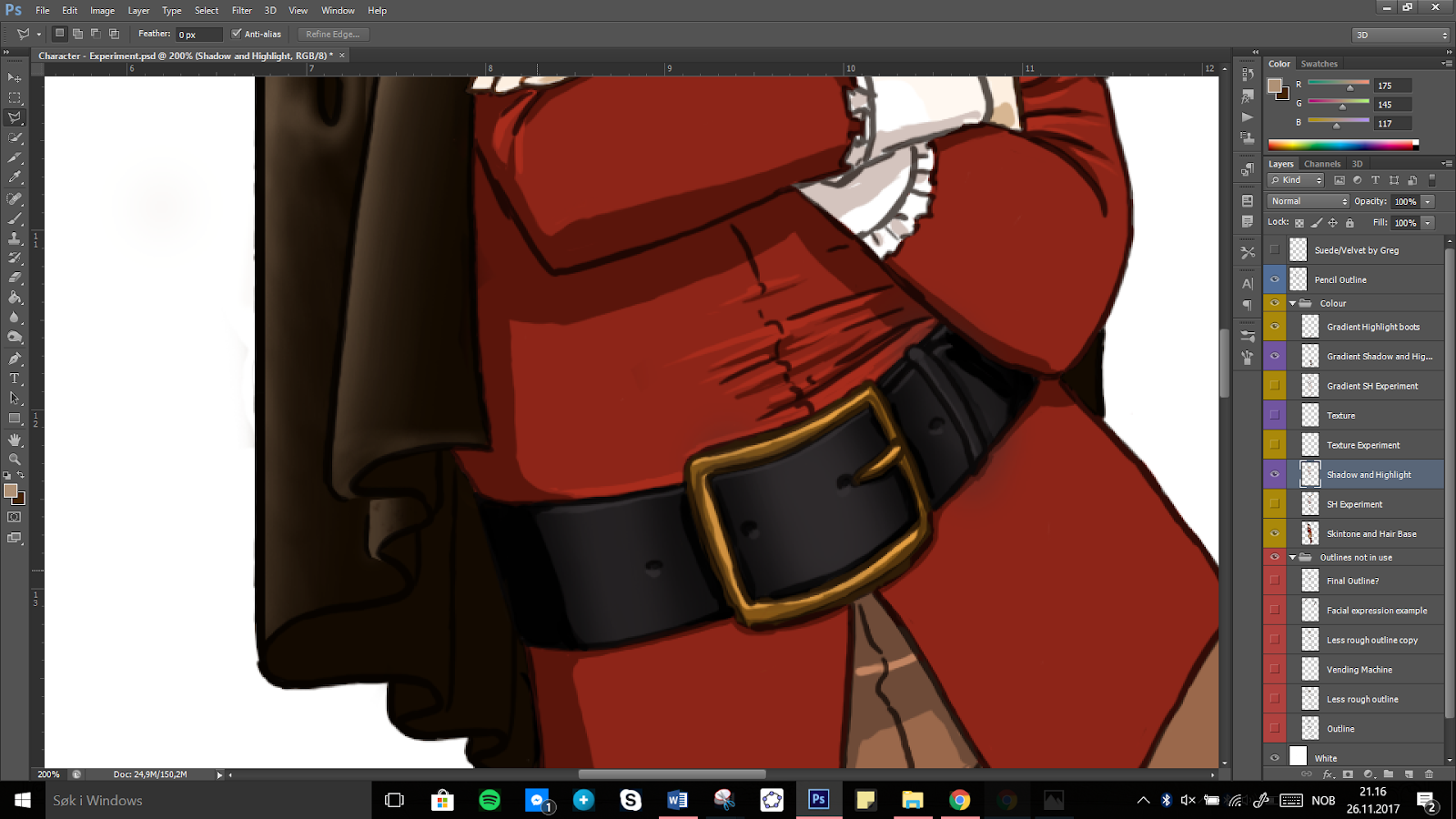
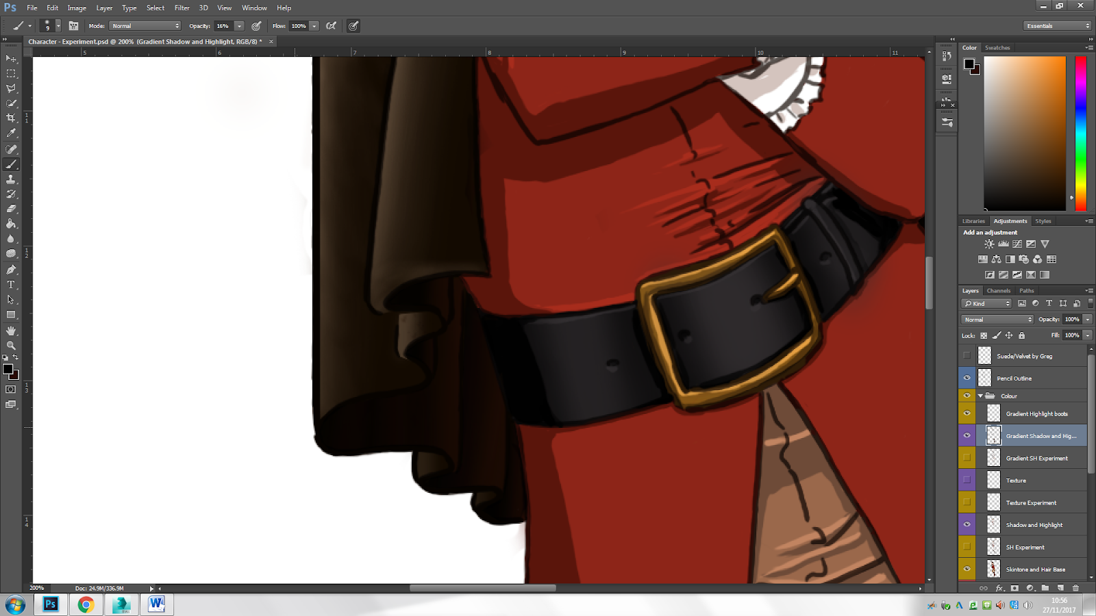
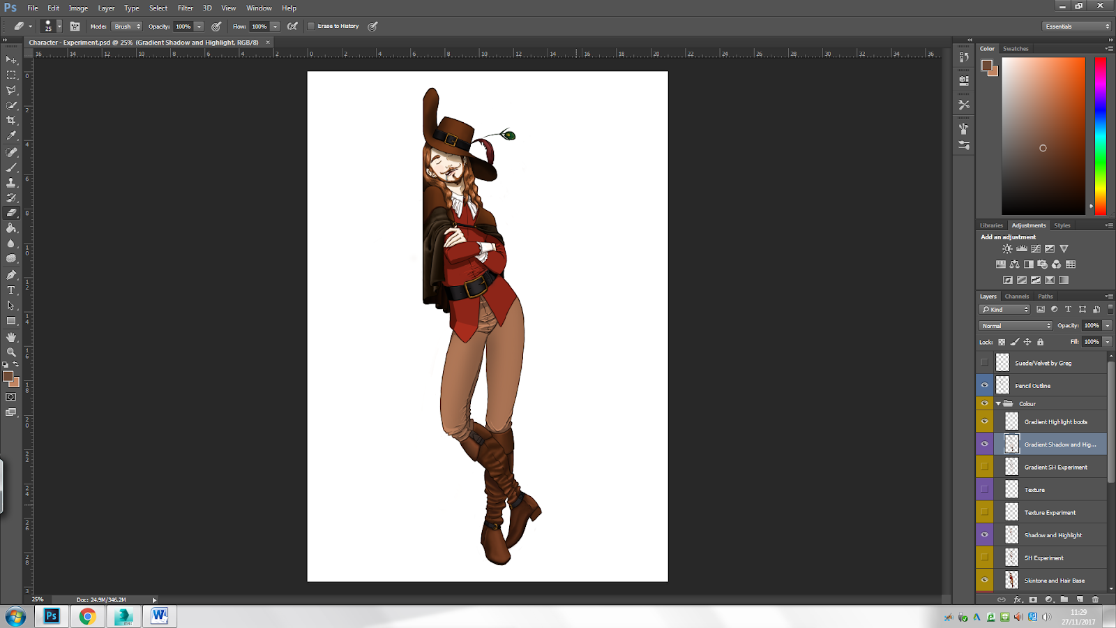
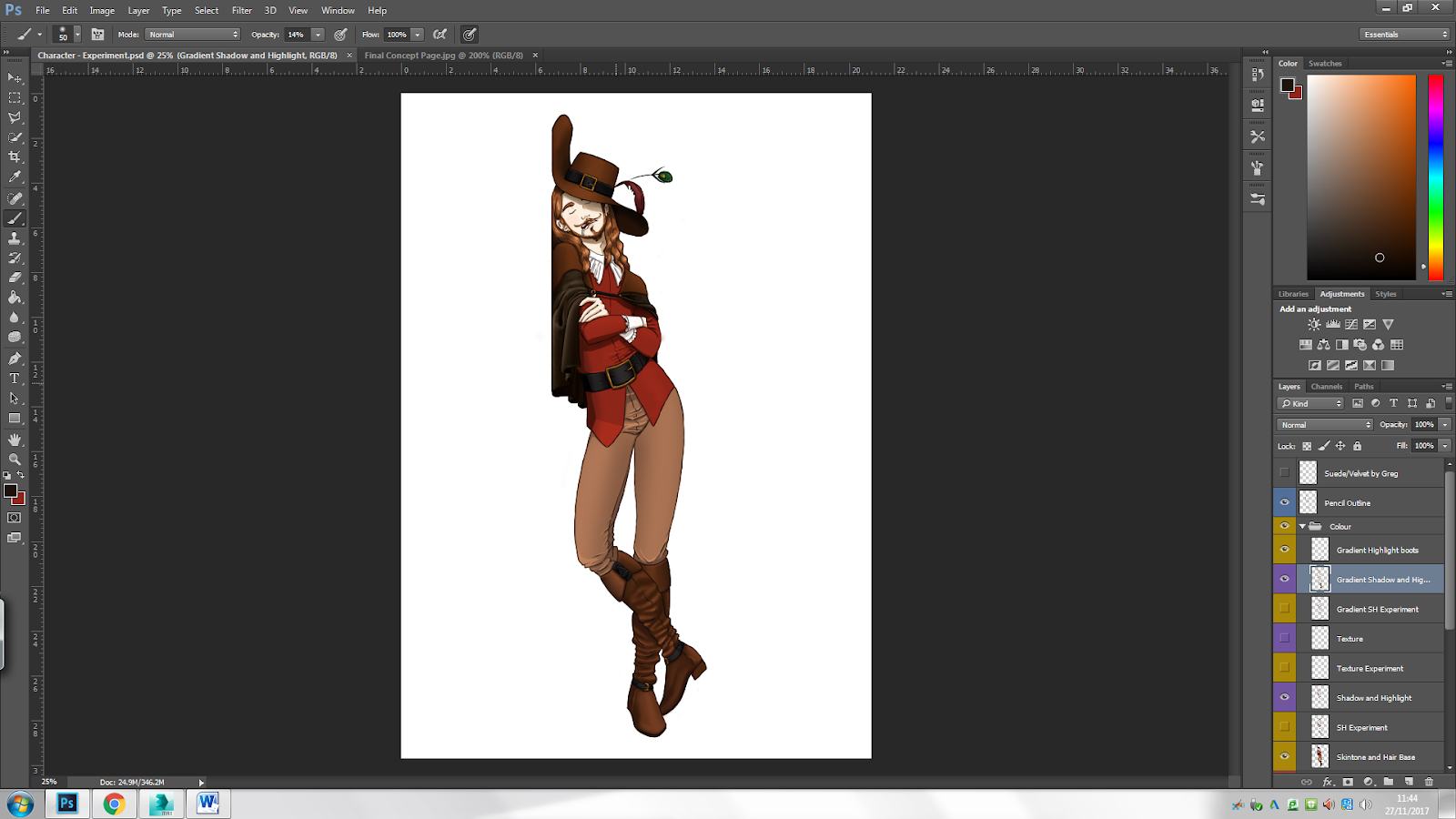

I do not yet know what my storefront is going to look like and what type of store it will be, but I made some colour swatches for paper walls just in case. I also created colour swatches for cement walls. Japanese houses normally have pastel coloured walls, usually in white or light-yellow tones. Nothing out of the ordinary, that is.
As for texture, it really depends on what building the store is attached to. I think that brick, wooden or cement can be used for the walls, and wood for the windowsills. Though a brick wall texture doesn’t seem quite Asian. If I create a storefront that is more traditional, only wood and paper textures could be used. If the store has automatic doors, the edges of those will most likely also we made of wood, or plastic. In Japan, traditional houses and such are made up of dark wood. The windows and doors are, of course, made of glass.
Step 3 – Creating concepts
Step three is creating concept pieces for the three ideas. This task will take longer than the last two, so I want to spend a lot of time creating designs this week (week 5). I am planning on dedicating one whole day for one idea. This means that I have Monday for character, for example, Tuesday for environment and Wednesday for asset. I can then use Thursday and Friday for tonal experiments and further design, so that I can start with my final concept next week.
Monday - Character
I dedicated Monday to creating my Dutch Renaissance Painter. I started off by studying the male anatomy. I got a new sketchbook, as I had already filled my first one.
My studies didn’t turn out so well, as male anatomy is something that I still struggle with. I partly chose to create a ale character so that I could improve on this skills. I tried to make a dynamic pose on the far left, but it doesn’t quite fit the character because he is a painter.
I also thought of what body type my character will be. Chubby or fat didn’t quite fit, neither did skinny. I want something in-between the two, so very average-looking. I also don’t know how old my character will be, but I figure that maybe 20s or 30s will fit.
On the second sketchbook page, I tried a more intense pose (remember that I draw from right to left). I had already tried this pose a few months ago, but I wanted to try it again, this time making the character hold a pencil (even though I forgot to draw the pencil).
The other sketches are just me trying to draw the male upper body.
I drew a very basic pose in three different angles on the third page. It was here that I came up with the idea of making a template, just like I did in the Induction Project. I decided that I would just make a few poses in my sketchbook and then do the costume design digitally. But I sketched a concept on the same page, nevertheless.
On the fourth page, I first drew a face that I could use in the template. Under the head I drew some essential things that my character needs to have on him. Here, I came up with the idea of creating an Assassin’s Creed style character that wears a hidden blade.
You can also see some more pose experiments on the left. I want to show that my character is a painter, which is why he is holding art tools.
Some more pose ideas. Again, read (or look) from right to left. The first pose is just the character posing for a portrait. I made him reveal his weapon, which looks more like a cross. The next two poses are of the character walking towards his target, about to attack. The last pose is more comical than the others. Even though all poses on this page deliberately show their ‘crosses’, the character on the last post is doing it in a funny way instead of threatening.
On the fifth page, I made some other poses. These were also meant to be more funny than serious. The first pose shows the character accidentally showing his 'cross’ while measuring something that he wants to paint. In the second pose, he deliberately shows them off.
Another page with pose ideas. You can find the sources for these poses under ‘Renaissance Painter’ in the source list. The two first poses (on the right) are supposed to be comical. The first one, on the far right, is the character deliberately and showing the viewer his grotesque work. The second one is a Kung Fu pose again, where he holds a used painting tool that makes paint drip down on his head. He doesn’t seem to notice, because he has a very angry (but still funny looking) face. The facial expressions studies you can see beside the pose.
I found out that my blog has to be more ‘family-friendly’, so I came up with other ideas than ‘crosses’. These ideas are less dark, serious and violent than the original one, but they work. One idea is that the painter is just very enthusiastic about his career asapainter and dramatically executes his work by striking some intense poses. Another idea was that the painter thinks that painting is an art of waterbending (or something in that direction), hence the dramatic Kung Fu poses.
A third idea, which could be combined with some of the others, is that this painter seeks revenge on someone who accidentally messed up his most precious painting. The last idea was that instead of having a ‘cross’, the character has a giant paint brush. I find that this idea works best, as it is comical and ‘family-friendly’.
This last page sums up the ideas that I have for this character. It also shows a compilation of poses that I could use for a final concept piece. But as I am not allowed to develop a 'cross' or something in that direction, many of these ideas have to be excluded or changed. Later, I will make some designs and tonal experiments digitally.
Tuesday – Asset
I dedicated Tuesday to designing the Viking Shield. Here are some of my ideas.
On the first page, I tried some colour patterns and some ideas for the shield boss and the bolt-thingies. As you can see, there are many ways to create the shield boss and the bolts around it. I don’t want my design to look too busy, though, so there will probably be few bolts or none. But I found it best to try everything before making a final decision.
I experimented more with colour patterns on the second page, with and without a rim. I don’t know yet whether my shield will have a metal rim, a leather rim, a wooden rim or no rim at all.
I was thinking that if I decorate the shield with a dragon or some other symbol, it is probably best to stick to one colour. Otherwise, too much is going on. I also made some dragon designs, as you can see. I particularly like the idea of a dragon breathing fire that makes up or covers the body.
Some more decoration ideas on the third sketchbook page. I made some designs with rune text and tried to make them look a bit like the One Ring from The lord of The Rings. I also made a design of a dragon head breathing fire, but at the same time saying something in old Norse.
I also like the idea of the moose’s antlers going around the shield boss. It looks even more intriguing with runes around the rim and shield boss. The wolves’ heads are also very cool. I like this idea because wolves are some of my favourite animals.
I also really like the idea of creating Yggdrasil, a Norse sacred tree from Midgard, around the shield boss. If I decide to stick with this design, the roots of the tree will probably have those Norse patterns. Above the tree could be some rune text, though I don’t yet know what that could be saying.
I also made some designs for the back of the shield. I want the wooden planks to be more visible at the back than on the front. Later, I will select a few of these designs and give them colour, digitally.
Wednesday - Environment
On Wednesday, I focused on the Asian storefront.
Again, I draw from right to left. I wrote my annotations in Dutch. I basically wrote down some things that need to be thought out, like how many floors the building will have, how wide it should be, what kind of roof it should have, how many and what kind of windows etc. I also thought about how many of the floors will belong to the store and how many will be for other things like homes.
On the bottom, you can see the word ‘alleenstaand’, which means single. My storefront could be part of a detached building, like a block of flats, or be a single building.
Some ideas for roofs and quantity of floors.
Here are some ideas for a single floor storefront. I wrote in Japanese on the signs, it just says store and text. My storefront doesn’t necessarily have to be Japanese. But Indonesians use the Roman alphabet instead of those fancy symbols that East-Asians use or other Southeast Asians use.
I like the idea of the open storefront, where there is no door and there are no glass windows. If I choose to create a one floor storefront, then I want to keep it traditional.
Here are some ideas for a two-floor storefront. Because there are two floors, this leaves me with even more choices than I had on the first one. If I choose a two-floor storefront, I will have to focus on more things. I don’t want the store to be on two separate floors, just on the ground floor. So, perhaps the first floor can be someone’s home, maybe it is where the owner of the shop lives. I like that idea, as that way of living is quite common for many shop owners, not only in Asia.
I like the idea of the second floor having a balcony or a window that sticks out from the walls. It gives more depth and makes the building look slightly more interesting. On the left of the second page you can see some props that can be placed in front of the store to make it even more interesting.
I don’t know yet if I want to do a one-floor or two-floor building, but I will decide on Thursday. On Thursday, I will make tonal experiments for my three ideas and make final designs for them.
Drawing Tutorial - Mannequinization
This drawing lesson was a recap of what we learned last week (combining rhythm and boxing methods), but we also learned how to use the contour technique. With the contour technique, you basically follow the lines of the spine or other body parts.
We first did a recap on what we did last week. We drew the same pose, which went much easier this time because we had already practised it. Then, we moved on to the contour technique. Below is a picture of the studies that I made during the tutorial.
The sketch of the female model looks basically the same as the one from the last tutorial, though creating this one was much quicker. On the left, you can see an action (or at least intense) pose by a male model. This pose was much more difficult to recreate than the one on the right. It could be because drawing the female body is much easier for me.
I find combining the rhythm, contour and boxing techniques very helpful, especially when it comes to foreshortening. Combining the methods not only give more form to the bodies, but it also helps show perspective. I will try to use these techniques when creating future pieces.
Homework
For week 6, we have to recreate or come up with a pose, preferably action. At first, I wanted to recreate the Kung Fu-like pose that I used for one of my potential final poses for my character concept, but I found that one too easy. I looked for some good example poses on the internet and found so many good ones. It was difficult to choose only one, but in the end I decided to recreate this one.
This pose seemed like a challenge because of the foreshortening. I combined the three methods that we learnt during the lesson with my own, which is creating helplines for the torso and limbs. You can see this on the page below.
I started practicing the pose on the second page (again, from right to left). This pose actually turned out to be pretty easy when combining all these methods. Because these first studies were done pretty quickly, I decided to make a last study.
I finished the piece during lunch break.
(All the pictures of the pages that I have covered in this task 3 section have already filled half of my new sketchbook. This means that I have filled half of my sketchbook in 3 days! but with very quick sketch ideas, though)
I think that from Thursday on, I will have to do the designing digitally. Not only because I don’t want to buy another sketchbook that will cost me money and because PS is free (and limitless in the quantity of ‘paper’), but also because I don’t have colouring tools at home. I left everything in Norway because it didn’t fit in my suitcase. Also, I want to push myself to draw more digitally so that I can improve my PS skills.
Thursday – Character Costume Design
I wanted to focus on my character’s costume design on Thursday. I put some of the poses from my sketchbook into PS and made a template.
My idea was to do the costume designing before experimenting with colours and textures. I still haven’t figured out whether I want my character to be lower or upper class. The class, or status, of people in the 1600s did determine the choice of colour. As explained in my ‘step 2’ section, the poor wore very dull colours, while the wealthy wore more vibrant colours such as red or green.
I started with creating some ideas for the head. I had an idea that the eyebrows could look like the tips of paint brushes, that would really add to the character.
I knew from the beginning that my character would have long, brown hair. I feel that that fits best not only with the character, but with Renaissance fashion as well. But I made a design with short hair nonetheless.
I particularly like the French-like moustache on two of the designs, and the short beard. I will probably use these for my ‘final’ design.
Above is the first idea that I made. It is middle-class, so it looks fairly simple. I don’t think my character will have this design, but I found it important to try everything before making a decision.
The image above is of my second design, this time being middle-class-ish. It still looks very simple, so I will probably not use this design. I want something that looks a bit more flamboyant or fancy, because that looks more interesting.
Here is a detailed and more interesting design. The hat, trousers, shoes and collar look more upper-class. The cape that covers half of the body adds to that wealthy look as well.
Another upper-class costume design. This design looks even more flamboyant and fancy, with the big and voluminous clothing. I especially like the hat, which has a huge feather pin. I also like the collar, which is very over the top, but as my character is a painter, I will probably not include it in my final design. It seems a bit impractical for a painter to wear such fancy clothing anyway, as he spends most of his day in his working space.
Here are some more costume designs that I made. I decided that my character will look pretty wealthy, as that always looks more intriguing. I found that capes add to that wealthy look, so I will probably include a cape in my final design. But the cape will probably not be that long, as it is very impractical in terms of martial arts (if my character will be a Kung Fu painter).
With different costumes created, I found it time to choose one that I liked best and further develop that, or create a completely new look by combining pieces that I really like.
I want my character to have a combination of feathers attached to the hat, so I came up with different ideas. I especially like the peacock-like feather, as I don’t think that choice of hat decoration was popular.
I like the collar design on the two outer costumes. They are fairly simple, but still complicated enough to come off as wealthy pieces of accessories. As for footwear, I really want my character to have boots, but not too simplistic in looks.
In the end, I decided to further develop the design on the right (see image above) and make it more interesting.
I created a final sort of design for the head. My character’s hair will be really long, wavy, voluminous and parted in the middle. Not that the last piece of information will be helpful, as his head will be covered by a hat. I found that by adding the facial hair and removing the hat, he looks like the Western depiction of Jesus Christ, which gave me some ideas for his personality. Instead of being this serious person, he is very vain and sees himself as a kind of saint that was sent to the people to help fight crime and injustice. Something in that direction, at least.
I first made some concept pages where I explored with the different ways my character could wear a cape. And frankly, I like all ways that I have created. But as the one where the cape is closed hides the upper part of the design, I will probably have to choose another design. I decided to make the cape shorter because my character does fight, and having a long cape would just get in his way.
I decided that the hat will not be pinned to the top at one side. Even though that will look more interesting, it will look too similar to the example art piece that I included in my renaissance moodboard. It does have the peacock feather, however.
As for the boots, I added more detail by giving them belts and heels. I think the heels, especially, add to a flamboyant look, it makes everything look classier and the character wealthier. I was also thinking about adding gloves, but as I refrained from the dark characteristic (the ‘cross’) to make the character less serious and more ‘family-friendly’, I don’t know whether that will be necessary. Though it certainly will add to the classy and fancy look.
How my design currently looks, it is more of a middle-class leaning towards upper class (I don’t think that there were upper, middle and lower classes during the 1600s, but rather a big divide between the rich and the poor. But you understands what I mean here). By having the status of my character clearer, I can now choose colours and texture.
I am now finished with the first part of the costume design, what’s next is to choose colours, textures and patterns. The design will probably not have patterns, as the character is more of a middle-class person and therefore can’t really afford pieces of clothing with extravagant patterns or nice silky fabrics.
Another thing about the character that I still need to decide is whether he will be:
- A very enthusiastic painter that thinks that painting is some sort of water-bending
- A very dramatic painter who hunts down enemies (possibly other painters, so my character will be competitive). He will try to sabotage other painters’ work, but accidentally improving their pieces and making a fool of himself
- A painter that tries to save society by fending off criminals. The criminals aren’t actually criminals, the painter is just very deluded and thinks that every time someone slightly misbehaves, it is worth punishment
- A Kung Fu painter
All these ideas can include either the giant paint brush or the smaller paint brushes. I have yet to decide which one is better.
I picked out my favourite ideas for all three concepts and decided to ask relatives and friends which designs they preferred. All of them said that the two-storey building was better than the one-storey storefront, but opinions on the shield were more divided. As you can see, the majority chose the dragon shield. I find this a good choice for a ‘final’ concept, as I had many more ideas for this one than the other two.
The biggest divide, though, was on the ideas for my character. Three preferred the painter with a giant paintbrush, and three preferred the martial arts painter. One came up with the idea of combining the two ideas, which I really like. That will certainly make the character even less serious, which is my aim.
Weekend – Tonal Experiments
Tonal and texture experiments are something that I have yet to do for all three concepts. I started with tonal experiments for the character.
Renaissance Painter
Some ideas that I had for his tools. He could either have small brushes attached to his belt, or one big brush. I find the giant brush much funnier and more intriguing, but I could combine both. This has nothing to do with the colours and texture, but I made this in the same document as where I did tonal experiments, so I thought I might as well include it.
I don’t yet know whether I want my character to wear gloves, but I decided to make some designs nonetheless. I personally find the long gloves more interesting and fancy-looking. They don’t have to be that detailed to look fancy, though, as you can see. If the character will wear gloves, they will probably be made of brown leather. But some of the designs have white details. With this, I wanted to indicate that part of the gloves could be made of the same textile as the collar.
Some pose ideas that I made for the digital tonal experiments for the costume.
Some colour experiments that I made. For some reason, as you will see, I only stuck to warm and red-ish colours. It could be because my painter will be a bit violent, and red best represents that trait. Also, even with one colour scheme, you can go many ways. You can for example have darker shades of red or brown. These will give different effects.
Above, the biggest difference between the designs is the hat and belt. I find that the darker hat looks better. Another difference is the colour of the sleeves. On the right, the sleeves are red and part of the top, while the sleeves on the other design are part of a white shirt that is covered with a red top. I find that the latter looks strange, though.
The last big difference is the colour of the belt. On the left, it is silver and on the right, it is golden. I like the look of the golden belt details better, as that gives a fancier and wealthier look. Gold also fits with more colours, in my opinion.
Some more but not so different swatches. The shirt on the left design stands more out from the rest of the clothing pieces as it is more saturated, and the brown tones are very much the same. On the right, the red shirt is less saturated and fits more with the rest of the costume.
I want the red shirt to have a thick and heavy fabric. My character is not rich, so he can’t afford nice silky tops with fancy patterns. But he isn’t poor either, so he does have decent clothing. I gave the cape a dark colour. I want the cape to also be made of a thick textile, maybe this one will be silkier than the shirt. The boots and gloves will have the same colour and be made of thick leather.
I found that the last colour scheme fit best. It is very simple and has many of the same colours, but the different shades make for a more interesting design. I also find that sticking to these colours is best because combining more than three different colours in an outfit can be too much.
Storefront
As for the storefront, I already had a colour scheme in mind. Because the actual store will be on the ground floor and an apartment of the storeowner will be on the top floor, I had the idea of making the building look homelier. The way of doing that is giving the building warmer colours like reds, oranges and yellows.
This concept will be based on what I’ve seen in Japan. Most buildings (in Tokyo) were either white or pastel coloured, most often yellow. I like the look of pastel colours, as it gives a more serene feeling. That’s why I already before the tonal experiments had decided that my building will be pastel coloured, preferably yellow.
You can go many ways within a yellow colour scheme. The colour of the building can be pastel yellow leaning towards grey, orange or brown. For my first swatch, I chose a very light-yellow colour for the building. The big sign and the entrance to the shop are inspired by Family Mart, a popular convenience store that can be found on every corner in Tokyo. Only here, I named the store Friend Mart and changed the colours from green and blue to red and yellow.
Most of the colours in the image above are from a warmer colour scheme. There are reds, oranges, yellows, browns and pinks. But the windows have colder and darker shades.
Here is a last colour experiment that I did. It is basically the same as the first one, but the colour of the building is brighter. I like this better than the first one, as the contrast between the colours was too big in the first one. I still think that this scheme misses something, but I am not quite sure what it is.
Viking Shield
As for the Viking Shield, I had many options, design and colour wise. I narrowed my design ideas down to 12 and made some colour swatches on them. Grey is supposed to be iron or some other metal, while brown on the rim can be leather or wood. Brown on the base of the shield is wood, and the darker yellow colour is gold. The rest is paint.
Colour wise, I especially like the designs on the bottom. Though I coloured the dragons entirely, they will actually be made up of many tiny threads, braids ad patterns, so the entire symbol won’t be of metal or of gold. They seem very simple yet look very pretty (in my opinion). I also like the design of the golden dragon breathing fire on a red background.
I narrowed my 12 favourite shield designs down to 7. These final designs I chose because of the design and colours. I think that if I decide to further develop the Viking Shield, I will choose one of the designs on the bottom row. Even though they are more simplistic and neutral in colour, I find that there is less going on, which lowers the risk of confusing the viewer. They are also more traditional in design, as the Viking Shields actually looked very simplistic. But then again, the designs on the top row look more aggressive and ‘battle-ready’ because of the fire and red colour.
Monday – Choosing a Final Concept
On Monday of weeks 6, I had to choose a concept that I want to further develop. I do have some options. I could choose one of the concepts, or combine two of them or put them all together to make a scene.
I don’t know how I can combine all three concepts without it being too random, but I will find a way. Below is a compilation of what I could further develop.
I was suggested to combine all three elements, as I have gone into so much detail on all three of them. I was also suggested to turn the Viking Shield into a palette shield and that the shop could be a fancy dress shop/costume shop, so that it would fit more with the character. I think that is a good idea, so I will let the Viking Shield go and replace it with a huge palette.
I think it is a shame that my three concepts are so different, because that makes it difficult to combine them. But I think I had to let that go, anyway. I still feel that the theme for the shop isn’t right, though, so I will have to change that.
I decided that the environmental piece will be a beauty store. This fits in more with where it is located (read my thought process in the mindmap section), but not as much with the character. So, I will probably have to change that idea as well. Above are ideas for the palette shield.
Unreal Engine Tutorial - Basics
On Monday, we started with some basic techniques in Unreal Engine. Here is what we did.
We started off with a plane, which we rotated 90 degrees by selecting the plane and using the rotate tool.
We then added materials to the plane, in my case a cobblestone texture.
Next, we created a cube by dragging a default cube shape from BSP to the document. Selected a vertex and then split it in Geometry editing, which is essentially the same as using the ‘connect’ tool in 3DS Max. Selected the split vertex and dragged it up to create a house-like shape. Added the Cobblestone texture on the walls.
We then dragged in a point light and changed the colour. We also added a spotlight, of which we changed the inner cone angle.
Finally, we opened the content folder and dragged in a fire file, of which you can also change the colour.
Lastly, we had to create something by ourselves. I wasn’t feeling too creative at that moment, so I just dragged some default shapes in and gave it texture. Here is what I created. I tried to make it so that smoke emitted from the sphere.
Drawing Tutorial - Shading
On Wednesday in week 6, we practiced shading. We first watched a demo explaining the basic techniques of shading to create form, and then we had to try ourselves.
Because my style is very cartoony, I rarely shade my drawings/studies (I currently only make studies in my free time). But if I decide to shade them, it’s usually very simplistic and only on the most important parts. I usually just mark the parts that need shading, then do crosshatching to imply a darker tone. Here is an example:
Here is what we did during the tutorial:
We started off by copying from the demo, a basic but weird-looking shape. We started by creating the core shadow, which is the darkest part, and then the part where there is shadow, but light still reflects. Lastly. We put in the midtones and erased a tiny part in the midtones section to create a highlight.
We then had to practice shadowing on the pose that we chose to recreate last week. We started off by locating the light source and then shade the body.
The best way to do shading, in my opinion, is to mark the parts that will have shadow. Then start with midtones and slowly darken the places where there is more shadow. This is what I learned, at least. I learned it because I did it the opposite way when shading my pose. Because I didn’t build up the darker tones, the result looks very unfinished and weird. I know that I can do better than that, as I have done pencil shading before. Here are some examples of schoolwork that I did last year:
In these examples, I used HB, 2B, 4B, 6B, 7B and 8B pencils to get the right tones and shades to create form. It is easy to see which parts come forward, whereas on my study from the tutorial, it isn’t that clear. Not only did I not use the right technique, I also only had an HB and 6B pencil. This has heavily affected the result.
I will have to buy new pencils if I want my shaded drawings to get better. My results will also be better if I put more time and effort into it, which is what I did on the examples above.
Step 4 – Final Concept Page
Step 4 is basically creating a final concept page of the elements that you want to include in your final concept art piece. In the end, I decided that I wanted to combine all three concepts and make a scene. Below is y final concept page. It is done digitally because I want to improve my PS skills. I used default brushes and select tools to make this page.


I forgot to screenshot the process of making my final concept page, so here are some pictures of the PS file and of sketches that I used.
I used the pose on the right for the Dutch Renaissance painter. It looks very simple, but still pretty epoc. It doesn’t really fit with the character’s personality, I find that this is one of the best ways to show not only him but his tool as well.
Again, I forgot to screenshot the process, so above is a screenshot of the outline for my character and environmental piece. I traced the outline for the character from the sketchbook page that I put in PS. For the storefront, I looked at my developed ideas as a reference and mostly used the ‘Rectangular Marquee Tool’ and ‘Stroke’ to get the straight lines.
I copied the dragon shield from the Viking Shield PS file and the palette shield from the Shield PS file into the final concept page. This was much easier than having to do everything all over again. I later decided to leave the Viking Shield out of the final concept page, as I had already chosen to replace it with the palette shield.
The character and the posters on the storefront I coloured with the default brushes. I used the ‘Rectangular Marquee Tool’ again to colour the rest of the building.
Evaluation
I have made a concept page for my character, a Dutch Renaissance Painter, his shield (which isn’t that Viking-y anymore) and an Asian storefront. My Dutch Painter, whose name I have not made up yet, has a very serious and almost elegant look, but his personality is the exact opposite. My character is rather unserious, he is very vain and deluded. The contrast between his looks and personality makes him very funny, in my opinion.
I also decided to make the shield more like a palette instead of a Norse tool because it fits better with the character. I will maybe put one of the Viking Shield designs somewhere in the final piece. Maybe it could be on one of the posters, or it is an original artwork that my character made?
I decided that the storefront would be a beauty shop instead of a mart/convenience store. I will probably change this, though, as it doesn’t really fit with the character. I don’t know yet how I will put this building together with my character, as they are from two completely different eras and places, but I will make it work somehow.
I am quite pleased with having created this page. It looks very simple and cartoony, but it shows enough detail to make clear what I will further develop. It looks the way I want it to look. I especially like the colours.
Unreal Engine Tutorial – Sculpting and Materials
We had an Unreal Engine Tutorial again on Monday during the 7th week of the project. This session, we practiced how to make and paint landscapes. We started off by creating a new project, and choosing third person so that we can walk around in our project.
We started off with a plane and selected the environment tab. In this tab we used the sculpting tool to create hills and mountains on our plane. l
I played around with the ‘flatten tool’, which works as a sort of erasing tool.
The ‘ramp tool’ makes a smooth path.
We then downloaded a PNG file of a height map and put it in UE by importing the file in ‘manage’. This is a very easy way to create an environment.
When then practiced creating our own textures by adding a custom material to the ‘Materials’ folder in ‘Content’. Right-clicked in the empty area and selected ‘Layer Blend’.
Within the Layer Blend tab, we added three new layers and called them ‘Grass’, ‘Gravel’ and ‘Rock’. We changed the preview weight to 0.5 on all layers and changed the blending type to Height Blend. 
After that, we added ‘Landscape Coords’ and copy-pasted both this and the Layer Blend tabs. Then, we dragged in the textures and maps from the Textures Folder.
Next, we connected all the tabs. The whites on the map tabs and the texture tabs we connected to the layers, and we connected the greys to the Heights. The Maps were connected to Normal, and the Textures were connected to Base Colour.
After creating our texture, we applied the material to the folder and were ready to start painting with it within the document.
Drawing Tutorial
We had another drawing tutorial on Wednesday during the 7th week of the project. This time, we had to copy one of the faces from the PowerPoint and shade them. I decided to draw the woman’s face.
I partly used the shading method we were taught in the first drawing lesson, and combined it with my own method, which is more like cross hatching. I drew an oval and a cross in the middle, and then made the contour of the face. From there, I drew the eyes, nose and mouth and hairline. For the shading part, I first made a very light base and then gradually darkened the places that had more shadow. I used pencils that ranged from HB to 9B.
I think that my piece turned out ok. It doesn’t look exactly like the reference picture, and I feel that the shading could have been even darker than it is. The lines around the eyes also look too dark, which make them look cartoony. This doesn’t quite fit with the rest of the drawing, which looks quite realistic. The hair makes the piece look very unfinished, but there was little I could do to change it. I struggled most with the contour, especially around the cheeks. For some reason that is the most difficult thing to replicate for me, but I tried to copy it as closely as possible.
I am not proud of this piece because I have done better in the past. I think I could have blended a bit more and made the shadows darker so that the highlights are more visible. Next time, I will build up the shading better so that the darkest and lightest areas are more distinguishable.
3DS Max Tutorial – Plant
We had the last 3D modelling tutorial for this project on Monday during the 8th week. The aim was to experiment with lofting and chamfer to create a plant or vine. Here is what we did:
We started off by creating a line going to ‘Splines’ in the shapes tab and using ‘line’. Next to the line we created a circle.
We then used ‘loft’ by having the line selected and going to ‘Compound Objects’. We then hovered over the circle and clicked on it to turn the line into a cylinder.
Pressed f4 to see the segments. Under ‘Skin Parameters’, we changed the Shape Steps and Path Steps to 2.
By going to the ‘Edge’ tab, we selected one of the lines on the stem by double-clicking and chamfered it, splitting it into two separate lines.
We then went back to ‘standard primitives’ to create a box and changed the length segments to 2, width segments to 4 and height segments to 1. In ‘Edge’, we double-clicked the centre line and moved it down.
Edited the edges of the box to make it looks more like a leaf. We did this by changing from ‘view’ to ‘local’. Then, we selected the centre line again and chamfered it in ‘Edge’.
We then cloned the leaf several times, positioned them where we wanted to by moving and rotating them and attached them to the stem.
After placing the leaves where we wanted them, we chamfered some lines into two on the stem so that we could connect the leaves to the stem. We then went into ‘poly’ and selected the side on the centre of the leaf and a side on the stem and used ‘bridge’ to connect them.
This was the result. I like how the plant/vine turned out. After completing this tutorial, it seems pretty easy to create something like this.
Task 5 – Creating Concept Art
For task 5, we basically have to create at least one piece of strong concept art. I want to focus on both my character and my environmental piece to make a scene. The asset is not that important when it comes to this task because I will focus on two big and major things.
Preparation
In week 6 I came up with the idea that the character is a Dutch painter in modern time, but stuck in the past (Renaissance). He wants to be like the famous Dutch renaissance painters, though he isn’t that good at painting. He is just a very unserious, vain and deluded person who thinks he is much better than everyone else. He has opened his own gallery in a fictional country or city called Tokarta, a mix between Tokyo and Jakarta. During the day, he is a normal citizen, a shop owner, but at night he hunts down ‘criminals’. See for a more detailed explanation above.
I started task 5 at the end of week 6, where I tried out composition first. At first, I couldn’t think of many ways to combine my character and building to make a scene. Above are the first ideas that came up in my mind. I started on the bottom right, where I made a two-point-perspective concept of the storefront. I found it difficult to fit the character in this shot, so I moved on to another angle of the building. Above the first shot, I created a close-up of the second floor of the building, where you can see the character relaxing or looking at pedestrians.
On the second column, I drew the same scenarios but in different angles. Under these, I drew a very generic scene where the character is leaning against the building, looking all epic. On the third column, I drew two more very common scenes where the character is sitting gloomily against a wall, and one where the character is asleep. Under these, I made some sketches for other pose ideas.
On the far-left column, I drew templates for final concept pages for all three concepts, which I never used (see end of task 4).
A sketchbook page of different poses (in stick figures, very lame) that my character could do in the final piece. These are also very generic and common, and more serious than my character’s personality. I will probably not use any of these, but I found it better to try as many poses as possible before finally deciding.
Here I tried the scenes from the first page again, but in a little bit more detail. I tried to figure out the perspective of the one on the far-left, which proved to be difficult. I found that for this shot, there were different ways that the character could lay down, so I tried some more poses for that as well.
On the image above is a compilation of funny poses. It was on this page that I found many more different ways to put my character in a scene. I started off with giving him a bike that he could ride in front of the storefront, which makes him even more (stereotypically) Dutch. It would be funny if he was struggling to get on it, but as I don’t know how this will fully fit with the storefront in the background, I will probably not use this pose.
I then came up with an obvious idea that I could have come up with sooner, which is that the character has his own art gallery. I am very upset that I didn’t come up with it earlier, because I really struggled with the theme of the shop. Given that the shop is now the character’s gallery, the character has more reasons to be attached to it. I came up with the idea that he will do anything to protect it. This gave me other ideas for character poses:
- Character dramatically holding up an umbrella like a sword, protecting his adored gallery and home
- Character hugging the side of the building
- Character looking angrily at pedestrians passing by, while the shop is closed
- Character acting as if he is incarcerated behind the rails on the balcony, or he sits that way because he is scared of heights
- Character kicking the vending machine because it doesn’t work
- Character fabulously welcomes customers inside while unknowingly blocking the entrance
- Character struggling to climb down from the balcony
Here is another page of poses. You can see them above, but I will list them anyway:
- Character showing off his gallery, doing the “Will Smith showing off his wife at a movie premiere”
- Character does a victory pose in front of the store
- Character tries to figure out where to put his bicycle, as there is no space
- Character exhaustedly and dramatically hanging over balcony
- Character proudly painting the sign on the balcony
- Character got his hair stuck between the railings (don’t know how that happened, just a crazy and random idea that I came up with)
- Character struggling to put on one of his fancy boots
On this page, I repeated some of the previous sketches that I particularly liked.
There are some more showing off poses on this page. In the right corner, I came up with the idea of a Polaroid or printed picture where the character proudly poses in front of the store. He wants to show it off, but doesn’t know that he is blocking the view.
I came up with another idea of the gallery being closed, but the character peaks out of the shop window. Under the ‘CLOSED’ sign is written: due to storeowner not being in the mood for being a storeowner (ATM). Or he is out, fighting injustice. I found this quite funny, as it is very clear that he isn’t out fighting injustice, but hiding at home being a grumpy pat.
Here I came up with even more possible outcomes if I decide to have a scene where the character shows off his store.
A sketchbook page with random ideas. I decided to call the store the character’s Artsy Store. I think now, though, that it is just best that the store is in Amsterdam, as the character wants to be a famous Dutch renaissance painter. It could, however, be in Chinatown, which explains the Asian aesthetic.
I made some more possible scenes for the final concept piece. I repeated some of the previous ones, but I added some different poses to them and some pedestrians to make the scenes more lively and interesting.
I found that this pose fit perfectly with the character’s personality. It is like he is saying “hello there” in a very bright and welcoming tone. I might choose this pose for the final piece.
Another sketchbook page (one of the last pages of my second sketchbook!) of pose ideas. I particularly like the one where he is leaning against the vending machine, sleeping.
I quickly put my favourite scenes and pose ideas in a PS document. I found all the scenes above very interesting or very funny, though some of them only focus on the character. But as I was told that some of the ideas are too quirky for a strong concept piece, I narrowed my choices down to one character-focussed idea and one storefront-focussed idea.
For the character idea, I chose the pose where the character is leaning against the vending machine or wall, asleep. I chose this one because even though he is asleep, it is still a serious enough concept to further develop into a final piece. It somehow shows his personality, it could be the confident and somewhat braggy pose. It looks like he was standing somewhere, being a bit of a show-off, and then fell asleep.
For the scene, I chose the one on the far right, where the character is showing off or presenting his new art gallery. This scene is more serious than the rest, even though the slightly quirky pose shows the character’s vain personality. I think that this one is more serious than the others because his personality is more subtly shown instead of directly.
I couldn’t choose between the two ideas at first, as I really like both. I decided to make some facial expressions for both ideas to see which one I felt had more potential. As you can see, there are many different expressions that the character can make for the scene where he presents his gallery. For the other idea, there are different ways that he opens his mouth. I find the ones where he opens his mouth quite funny, as it indicates that he is snoring loudly.
Feedback
Here is feedback that I got when working on my final piece. The only thing that needed to be done was putting everything on my blog and add shadow to my final piece..
Creating the final piece
At the end of week 7, I decided to focus on the character only. I am not that skilled in painting in PS, and I find that focussing on several things at once will not help me improving on said skills. As the project is due next week, I find that I have little time to create the final concept piece and therefore should only focus on one thing. This way, I can create one high quality rendered piece instead of a piece that looks half-finished and/or messy. I am sure that if I had chosen to create the whole scene, I would forget to add things like shadow or highlights to some areas and then hand in an unfinished piece. This has happened to me before, and I don’t want to risk that again.
I started off by roughly tracing the lines of the pose in PS and adding the costume and all. For the facial expression, I used one of my experiments as an example and reference. The pose looked right, but anatomically incorrect, so I wanted to redo the outline.
In the screen grab above, I adjusted some of the features and made a less rough and messy outline. The anatomy looks correct, but there is still something that looks off. I also feel that the character’s hair looks different, but I can’t figure out what has changed.
I created a ‘final’ outline. I changed the design of the boots from the original concept. They now look leatherier (which is the texture that I want for the boots) and have a few more belt thingies. I feel that it fits better with the character, as it looks fancier and more flamboyant. It also creates more balance, as before, the upper part of the costume was the only thing that had detail. As my character is very self-obsessed and loves every feature about himself, he wants every nook and cranny to be appreciated and shown off.
I also made a straight line where the character is supposed to be leaning against the vending machine. This is to make it clearer that he is leaning against something.
I changed the colour of the outline, as the orange colour will ruin the entire colour scheme. I find that having a grey outline is much better. I put the layer on multiply, so that it can blend with the colour layer. This way, each differently coloured section gets an outline that matches. This is how I usually create my drawings; if there is a blue shirt, it will have a darker blue outline.
I also realised that the hat was too far up on his head and that the belt on his waist was too high, so I pulled these down. I made his hair curlier, as the original design had curly hair. These were the small imperfections which made the whole piece look off, so I am happy that I realised them and could correct them.
I slightly adjusted the colour scheme for the final piece. The colours of the trousers and the boots have a bigger contrast, and the boots now have several colours as well. The colour scheme is very simple and maybe a bit dull, as it mostly contains browns. But the different shades and tones of brown make the piece more interesting. The character’s skin tone is also lighter and less yellow, which makes it more realistic.
I also decided to give the cape a thinner velvet or suede texture, which means it will be quite shiny. I think this fits better than the thicker textile that I was originally thinking of creating because it looks much fancier. Also, the cape has many folds in it which indicates that it is made of a thinner texture, and I am too lazy to change what I have already created.
On the two images above, I experimented with shadowing and highlighting different areas. I wanted to do try out what looks best before actually applying it to the final piece.
I also created a new layer for a different way of shadowing that I wanted to try out. I lowered the opacity of the brush so that I could build up the shadows and highlights.
Putting this screenshot in here because it looks cool.
The gradient shading gives the belt a solid and leathery look, which is what I was aiming for. But the tee looks too much like metal or something in that direction. I tried to give it a less light highlight to indicate that it is not that shiny and thus made of fabric, but maybe I then have to create a lighter shadow as well. The same goes for the hat and trousers. The rest is made of either leather, velvet or some metal, which are all shiny.
I made a brush to try and replicate the suede/velvety texture. It doesn’t look good, though. It could be the colours that I used. There should be more shine to it.
Here, I copied the shadow and highlight experiment layers. I decided to copy them and then adjust them into the final piece because that is easier and much faster than creating the shading and highlighting all over again. I first adjusted the first type of shading, which has more abrupt transitions.
Here, I used the gradient method to create more highlight and shadow to the belts. I found that combining both shading techniques (that I also used for highlights) can give a very solid and metallic texture if the contrast between shadow and highlight is big. I used this to create the metallic texture on the golden parts of the belts.
I used the build-up method to create the leathery texture on the boots. The boots are supposed to look very wrinkly and complicated, which is probably why it took the longest to finish. It changed the colours of the different parts of the boots, though, but that is fine.
You can also see that on the trousers, the shadows and highlights are more subtle than on the leathery boots. This is to indicate that the trouser is made of a basic and common fabric and not something shiny, like leather.
I used the gradient method for the velvety cape, only I added a red glow or sort of reflection on the inside of the cape. This makes it look more realistic. I decided to drop the dotty and spotty part, as it only looked confusing. The cape already looks velvety without the spotty patterns, anyway.
The piece didn’t look quite finished, as some elements have gradient and smooth shadows and highlights, and some haven’t. I added a very subtle highlight on the trousers and the red tee, on which I also added a darker shadow in some places. These finishing touches, although very subtle, make a big difference.
Final Piece
Evaluation of Final Piece and Project
I started off this project by doing research on concept art, finding concept artists that I liked and taking inspiration from them. For practicing my drawing skills, I had to pastiche two concept art pieces of two of my favourite concept artists, mine being Hayao Miyazaki and Glen Keane.
For creating my own concept piece, mindmaps, moodboards, tonal experiments and idea sketches had to be made. I decided that my three concepts, a character, an asset and an environment, would be based on my cultural backgrounds. I decided to make an Asian storefront because I like the busy yet serene aesthetic of these types of art pieces. For my asset, I decided to create a Viking shield because I could design anything on the surface of the shield. For my character, I decided to make a Dutch Renaissance painter because that is one of the things that the Netherlands is famous for, and because I wanted to improve on my male anatomy skills.
I originally wanted to combine all three of my concepts (the Renaissance painter, the Viking shield and the Asian storefront) to create a scene for my final piece, but had too little time to focus on all three, so I created a final piece of my Dutch Renaissance painter. I used default brushes in PS and selecting tools to create it. These tools proved to be very successful, as it made the piece look the way I imagined it.
I am quite pleased with my final piece. I like the colour scheme for the piece, even though it mostly consists of browns. The highlights and shadow, especially on the boots, belts and trousers create the right textures. The leather boots, which are very wrinkly, remind me of my design of Schwenly Schwensten-sten III from the Induction Project. I also really like the pose of my character, as it shows his vain and flamboyant personality even though he is asleep. The shadows and highlights are created with two different methods, the build-up/gradient method and the abrupt method. I like how I combined both of these techniques to create the final piece. The hair is shaded in a very different way than the rest of the piece, though. The shadows and highlights are very scribbly and have only abrupt transitions, and you can clearly see the lines. To me, this makes it look a bit like an icon tempera painting from the middle ages. Icon paintings were usually portraits of saints, which is quite funny and relevant, as my character looks at himself as a saint or an important figure. I feel that my piece looks quite accurate in terms of realism. The pose and anatomy look fine to me, and so does the costume. It still looks cartoony because of the outline and overall simplicity, but that is just my style.
I have definitely improved my PS skills and digital drawing skills since the last project. Creating custom brushes and experimenting with them have helped me understand how the brush presets work. I have learnt how to build up highlights and shadows by lowering the opacity of the brushes. The shadows and highlights are crucial to what kind of texture you want to create. I did have a problem with this when creating the final piece. I combined my two shading methods in the wrong ways so that for example the red tee looked like metal, while it is supposed to look like fabric. I also had too few layers. Instead of having a colour base, shadow and highlight layer for each element of the piece, I put all shadow and highlight and colour base layers together. I am glad that I encountered these problems, as it has helped me improve my skills and I have learnt from my mistakes. Next time I will have more layers in my PS documents and build the shadows and highlights up to create the right textures.
Sources
Andrew Baker
Smaug Concepts:
Baker, Andrew (2016) Smaug. [online] Available at: https://www.artstation.com/artwork/o8OlJ [Accessed 06.10.2017]
Azog Concepts:
Baker, Andrew (2016) Azog concept art. [online] Available at: https://www.artstation.com/artwork/1ZADZ [Accessed 06.10.2017]
Goblin King Concepts:
Baker, Andrew (2016) The Goblin King. [online] Availabe at: https://www.artstation.com/artwork/rDoGJ [Accessed 06.10.2017]
Claire Hummel
Hummel, Claire (n.d.) Bioshock Infinite. [online] Available at: https://www.clairehummel.com/bioshock-infinite/ [Accessed 09.10.2017]
Glen Keane
Character Design from Paperman:
http://characterdesign.blogspot.co.uk/2012/10/paperman.html [Accessed 09.10.2017]
(2015) hhttp://andrew-hankinson.co.uk/design/paperman/ [Accessed 09.10.2017]
Character Design from Tangled:
Kurtti, Jeff (2010) The Art of Disney's Tangled. [book] Published by Chronicle Books, San Fransisco
Flynn Rider poses:
Oliver, Jennifer (2010) Disney’s «Tangled» Character Design Development. [online] Available at: http://characterdesignnotes.blogspot.co.uk/2010/11/disneys-tangled-character-design.html [Accessed 13.10.2017]
Hayao Miyazaki
Bath House:
https://www.pinterest.co.uk/jclydecarlton/spirited-away-bathhouse/ [Accessed 10.10.2017]
All concept sketches from Totoro by Hayao Miyazaki: The Art of My Neighbour Totoro. Published by VIZ Media, San Fransisco, 2013.
All concept sketches from Spirited Away by Hayao Miyazaki: The Art of Spirited Away. Published by VIZ Media, San Fransisco, 2013.
John Howe
Concepts for The Lord of the Rings and The Hobbit:
Howe, John (2012) Portfolio. [online] Available at: http://www.john-howe.com/portfolio/gallery/categories.php?cat_id=66 [Accessed 10.10.2017]
Hobbit Hole:
(2014) http://nuvomagazine.com/magazine/winter-2014/illustrator-and-artist-john-howe [Accessed 10.10.2017]
Norman Rockwell
All images from:
American Chronicles (2014) American Chronicles: The Art of Norman Rockwell. [book] Published by Skira Editore, Milano
Rhettaro Bloom
Character Design and Comic Page Concept from Sketchbook II and III: https://gumroad.com/princecanary [Accessed some day during summer holiday]
All other images from https://princecanary.deviantart.com/gallery/?catpath=/ and http://princecanary.tumblr.com [Acccessed 09.10.2017]
Robb Waters
All concept art from:
Waters, Robb (2014) Bioshock Infinite. [online] Available at: http://www.robbwatersart.com/bioshock-infinite/ [Accessed 06.10.2017]
Other Inspiration
Concept art for The Legend of Zelda: Breath of the Wild:
Serrels, M (2017). What Are You Playing This Weekend?. [Online] Available at: https://www.kotaku.com.au/2017/06/what-are-you-playing-this-weekend-398/ [Accessed 02.10.2017] (breath of the wild)
Fan art of Bioshock Infinite:
http://bioshock.wikia.com/wiki/File:Happy-Holidays-480x672.jpg
Garner, Alex (n.d.) Bioshock Infinite. [online] Available at: https://alexgarner.deviantart.com/art/Bioshock-Infinite-281126746 [Accessed 08.10.2017]
Concept art for The Legend of Zelda: Skyward Sword:
Den of Geek (2011) The making of The Legend of Zelda: Skyward Sword. [online] Available at: http://www.denofgeek.com/us/games/zelda/21228/the-making-of-the-legend-of-zelda-skyward-sword [Accessed 06.10.2017]
Assassin's Creed Cocncept Art:
Wallace, Kimberly (2014) Exploring the Concept Art of Assassin's Creed Unity. [online] Available at: http://www.gameinformer.com/b/features/archive/2014/08/27/exploring-the-concept-art-of-assassins-creed-unity.aspx [Accessed 10.10.2017]
Drawing lessons:
https://www.youtube.com/watch?v=8j39NqwL7s4 (rhythm/gesture drawing)
https://www.youtube.com/watch?v=yqxPHew5bGQ (box method)
https://www.youtube.com/watch?v=PGgo0EE8ats
https://www.youtube.com/watch?v=nRHfcqjbPq8 (Mannequinisation)
https://www.youtube.com/watch?v=EkfE2CJKHrA
Pose example for homework:
https://i.pinimg.com/736x/30/5c/6b/305c6be8a067750cdadc2df626b71137--anatomy-composition.jpg [Accessed 08.11.2017]
Photoshop:
Watercolour Brush Presets Pack: https://tomchalky.com/tutorials/create-your-own-watercolor-photoshop-brushes/ [Accessed 18.10.2017]
Watercolour Brushvideo: https://www.youtube.com/watch?v=V1csPUXvtmc [Accessed 29.10.2017]
How to blend colours: https://www.youtube.com/watch?v=QfcdH062V_8 [Accessed 29.10.2017]
Asian Storefront [Accessed 02.11.2017]
http://mymodernmet.com/kyeoung-lee-convenience-store-drawings/
Renaissance painter [Accessed 02.11.2017]Smaug Concepts:
Baker, Andrew (2016) Smaug. [online] Available at: https://www.artstation.com/artwork/o8OlJ [Accessed 06.10.2017]
Azog Concepts:
Baker, Andrew (2016) Azog concept art. [online] Available at: https://www.artstation.com/artwork/1ZADZ [Accessed 06.10.2017]
Goblin King Concepts:
Baker, Andrew (2016) The Goblin King. [online] Availabe at: https://www.artstation.com/artwork/rDoGJ [Accessed 06.10.2017]
Claire Hummel
Hummel, Claire (n.d.) Bioshock Infinite. [online] Available at: https://www.clairehummel.com/bioshock-infinite/ [Accessed 09.10.2017]
Glen Keane
Character Design from Paperman:
http://characterdesign.blogspot.co.uk/2012/10/paperman.html [Accessed 09.10.2017]
(2015) hhttp://andrew-hankinson.co.uk/design/paperman/ [Accessed 09.10.2017]
Character Design from Tangled:
Kurtti, Jeff (2010) The Art of Disney's Tangled. [book] Published by Chronicle Books, San Fransisco
Flynn Rider poses:
Oliver, Jennifer (2010) Disney’s «Tangled» Character Design Development. [online] Available at: http://characterdesignnotes.blogspot.co.uk/2010/11/disneys-tangled-character-design.html [Accessed 13.10.2017]
Hayao Miyazaki
Bath House:
https://www.pinterest.co.uk/jclydecarlton/spirited-away-bathhouse/ [Accessed 10.10.2017]
All concept sketches from Totoro by Hayao Miyazaki: The Art of My Neighbour Totoro. Published by VIZ Media, San Fransisco, 2013.
All concept sketches from Spirited Away by Hayao Miyazaki: The Art of Spirited Away. Published by VIZ Media, San Fransisco, 2013.
John Howe
Concepts for The Lord of the Rings and The Hobbit:
Howe, John (2012) Portfolio. [online] Available at: http://www.john-howe.com/portfolio/gallery/categories.php?cat_id=66 [Accessed 10.10.2017]
Hobbit Hole:
(2014) http://nuvomagazine.com/magazine/winter-2014/illustrator-and-artist-john-howe [Accessed 10.10.2017]
Norman Rockwell
All images from:
American Chronicles (2014) American Chronicles: The Art of Norman Rockwell. [book] Published by Skira Editore, Milano
Rhettaro Bloom
Character Design and Comic Page Concept from Sketchbook II and III: https://gumroad.com/princecanary [Accessed some day during summer holiday]
All other images from https://princecanary.deviantart.com/gallery/?catpath=/ and http://princecanary.tumblr.com [Acccessed 09.10.2017]
Robb Waters
All concept art from:
Waters, Robb (2014) Bioshock Infinite. [online] Available at: http://www.robbwatersart.com/bioshock-infinite/ [Accessed 06.10.2017]
Other Inspiration
Concept art for The Legend of Zelda: Breath of the Wild:
Serrels, M (2017). What Are You Playing This Weekend?. [Online] Available at: https://www.kotaku.com.au/2017/06/what-are-you-playing-this-weekend-398/ [Accessed 02.10.2017] (breath of the wild)
Fan art of Bioshock Infinite:
http://bioshock.wikia.com/wiki/File:Happy-Holidays-480x672.jpg
Garner, Alex (n.d.) Bioshock Infinite. [online] Available at: https://alexgarner.deviantart.com/art/Bioshock-Infinite-281126746 [Accessed 08.10.2017]
Concept art for The Legend of Zelda: Skyward Sword:
Den of Geek (2011) The making of The Legend of Zelda: Skyward Sword. [online] Available at: http://www.denofgeek.com/us/games/zelda/21228/the-making-of-the-legend-of-zelda-skyward-sword [Accessed 06.10.2017]
Assassin's Creed Cocncept Art:
Wallace, Kimberly (2014) Exploring the Concept Art of Assassin's Creed Unity. [online] Available at: http://www.gameinformer.com/b/features/archive/2014/08/27/exploring-the-concept-art-of-assassins-creed-unity.aspx [Accessed 10.10.2017]
Drawing lessons:
https://www.youtube.com/watch?v=8j39NqwL7s4 (rhythm/gesture drawing)
https://www.youtube.com/watch?v=yqxPHew5bGQ (box method)
https://www.youtube.com/watch?v=PGgo0EE8ats
https://www.youtube.com/watch?v=nRHfcqjbPq8 (Mannequinisation)
https://www.youtube.com/watch?v=EkfE2CJKHrA
Pose example for homework:
https://i.pinimg.com/736x/30/5c/6b/305c6be8a067750cdadc2df626b71137--anatomy-composition.jpg [Accessed 08.11.2017]
Photoshop:
Watercolour Brush Presets Pack: https://tomchalky.com/tutorials/create-your-own-watercolor-photoshop-brushes/ [Accessed 18.10.2017]
Watercolour Brushvideo: https://www.youtube.com/watch?v=V1csPUXvtmc [Accessed 29.10.2017]
How to blend colours: https://www.youtube.com/watch?v=QfcdH062V_8 [Accessed 29.10.2017]
Asian Storefront [Accessed 02.11.2017]
http://mymodernmet.com/kyeoung-lee-convenience-store-drawings/
All images from pinterest
http://renaissanceclothing.blogspot.co.uk/2011/02/meaning-of-renaissance-and-medieval.html(colour on clothes)
https://weles.in.gallerix.ru/expo/zhanrovaya-zhivopis_1/kavaler/
https://williamshade.deviantart.com/art/V-for-Vendetta-full-costume-114817894
http://www.belfryhistoric.com/GAINSBOROUGH.htm (pattern)
Poses:
https://www.pixiv.net/member_illust.php?mode=manga&illust_id=31091817
@ctchrysler_ on twitter
https://zurdom.deviantart.com/art/ESPN-Video-Games-259802422
Viking Shield [Accesed 02.11.2017]
https://www.historyonthenet.com/viking-art/ (article patterns)
http://www.instructables.com/id/Epic-Viking-Shield/ (wooden model, leather rim)https://www.artstation.com/artwork/31w2o
https://www.artstation.com/artwork/Q6QgE
https://www.artstation.com/artwork/QVQ9Z
Comments
Post a Comment